Kusch Consulting Engineers VISUAL IDENTITY



DESCRIPTION
www.kusch.com.au
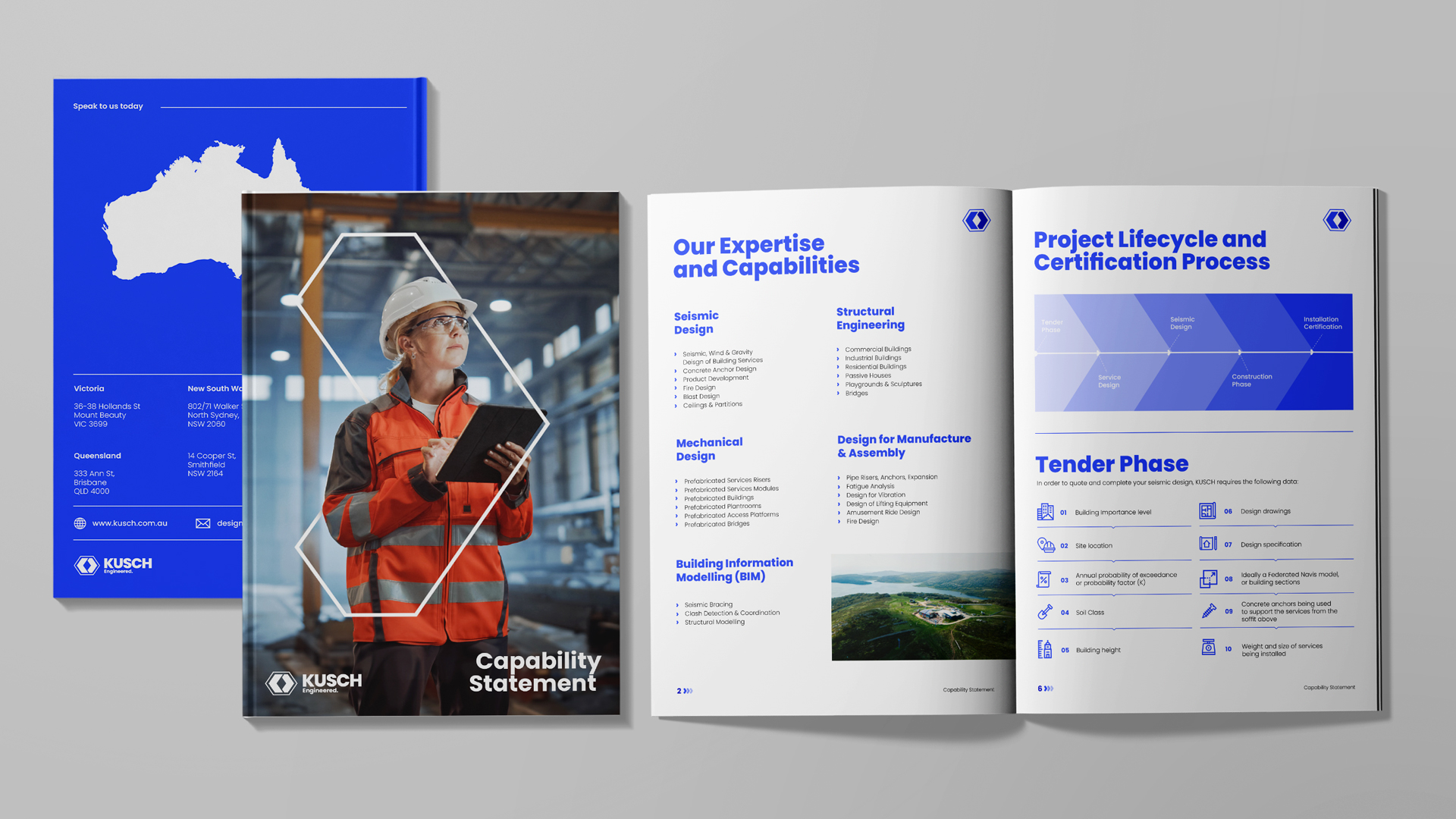
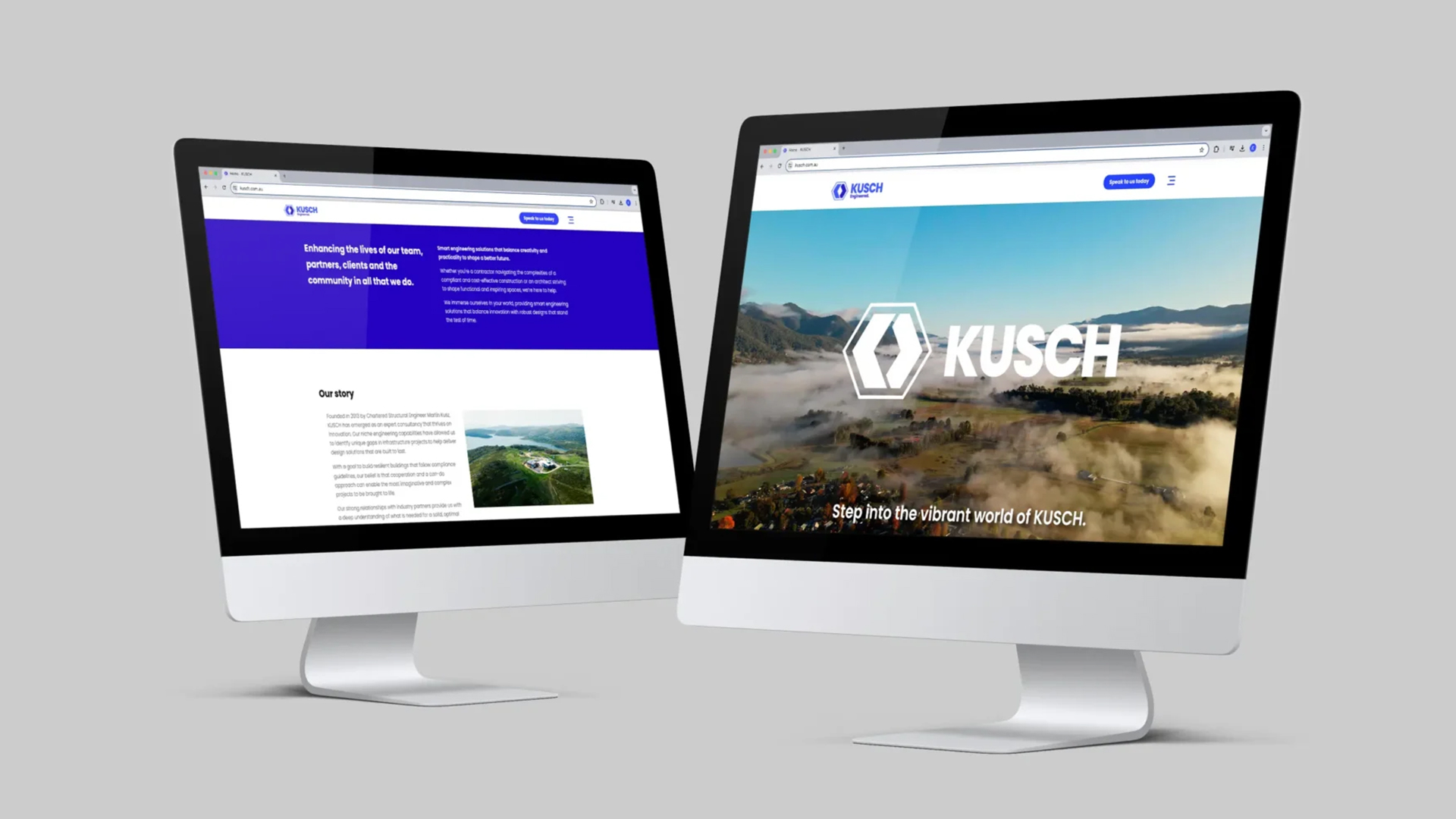
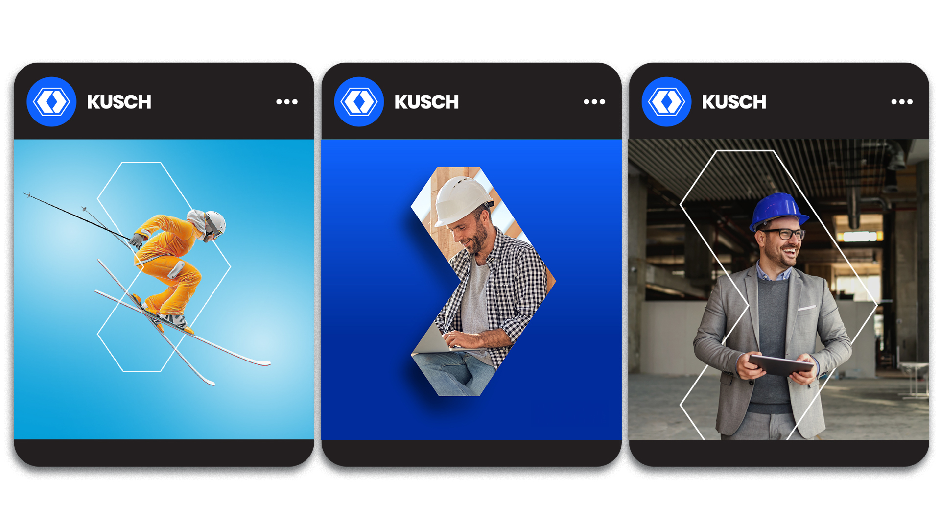
Kusch is an Australian smart engineering solutions company that balances creativity and practicality to shape a better future.
They aimed to rebrand because their brand identity did not reflect the high quality and professionalism consistently delivered to clients.
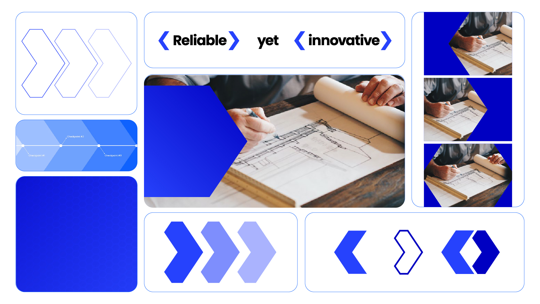
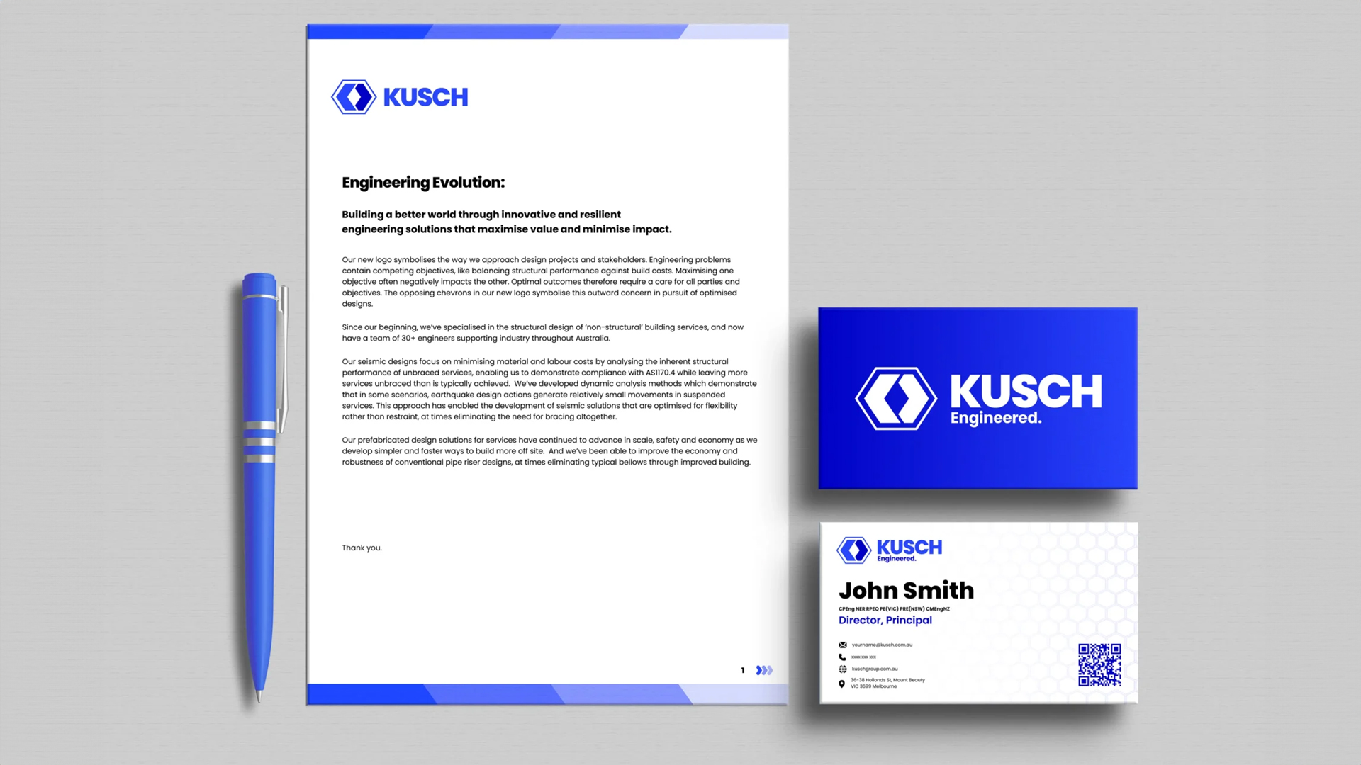
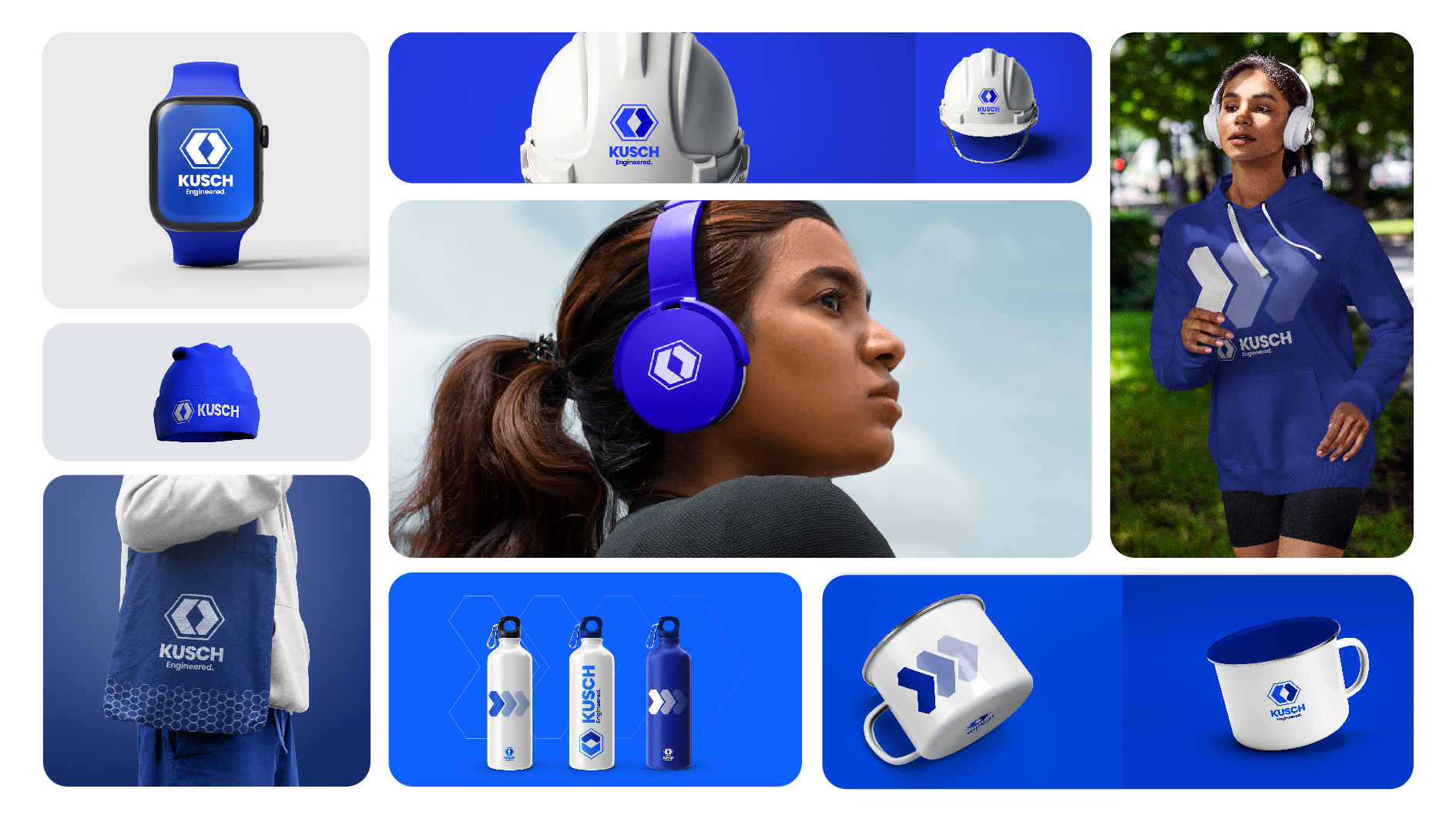
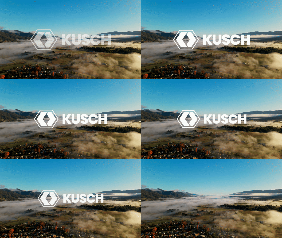
We identified an opportunity for Kusch to establish itself as the market leader. We transitioned from an abstract, intertwined mark to a more identifiable and bold design that aligns with various brand touchpoints.
ENCORE HOLDINGS VISUAL IDENTITY
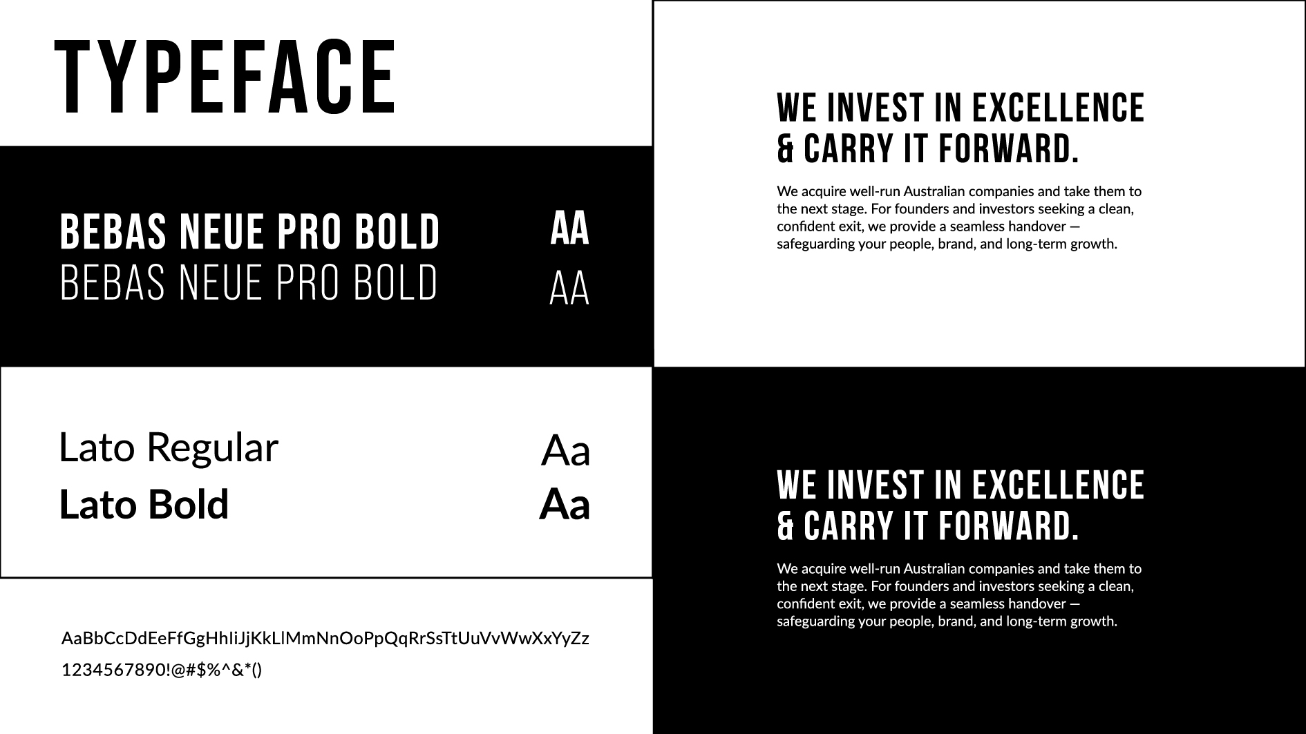
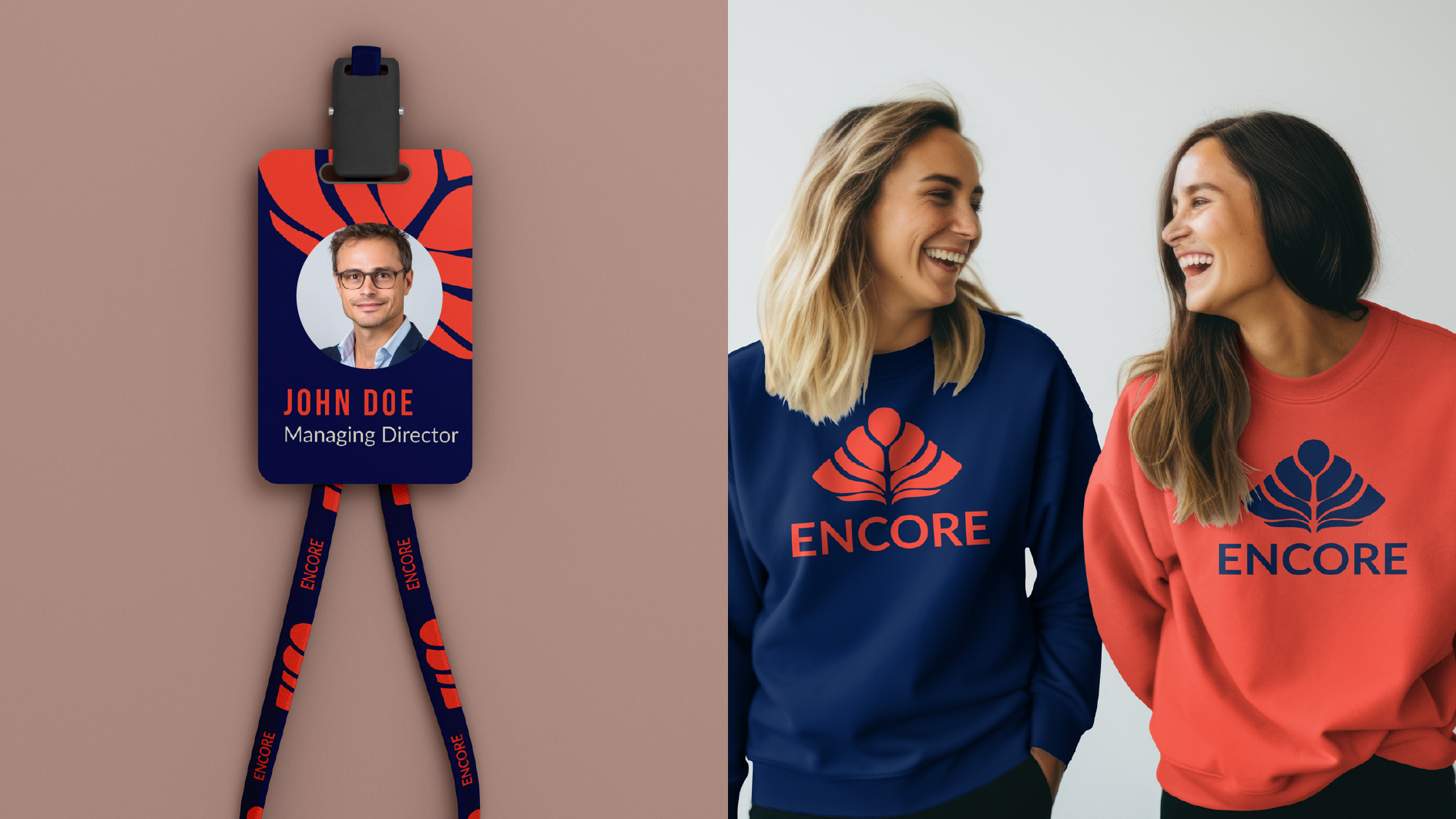
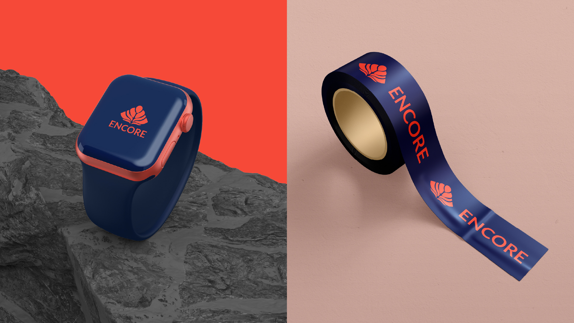
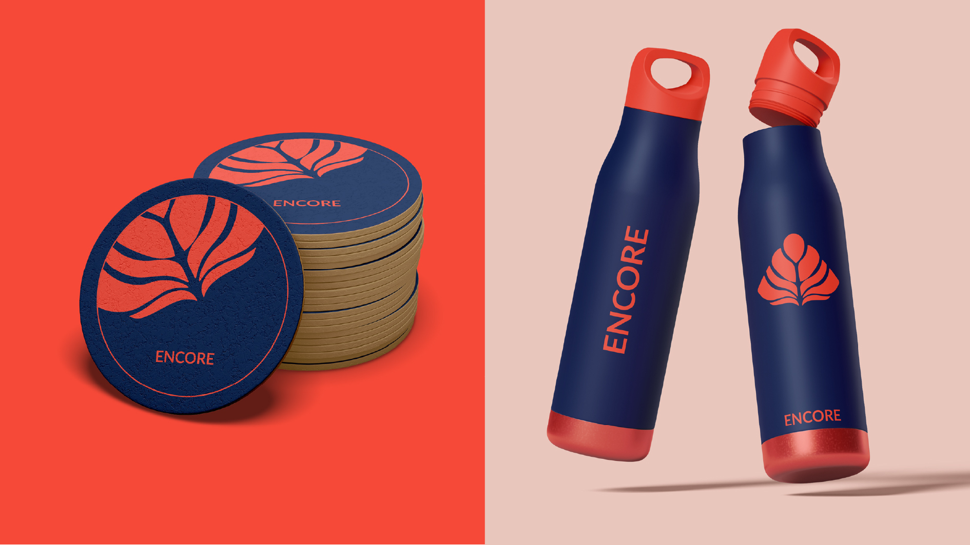

DESCRIPTION
www.encoreholdings.com.au
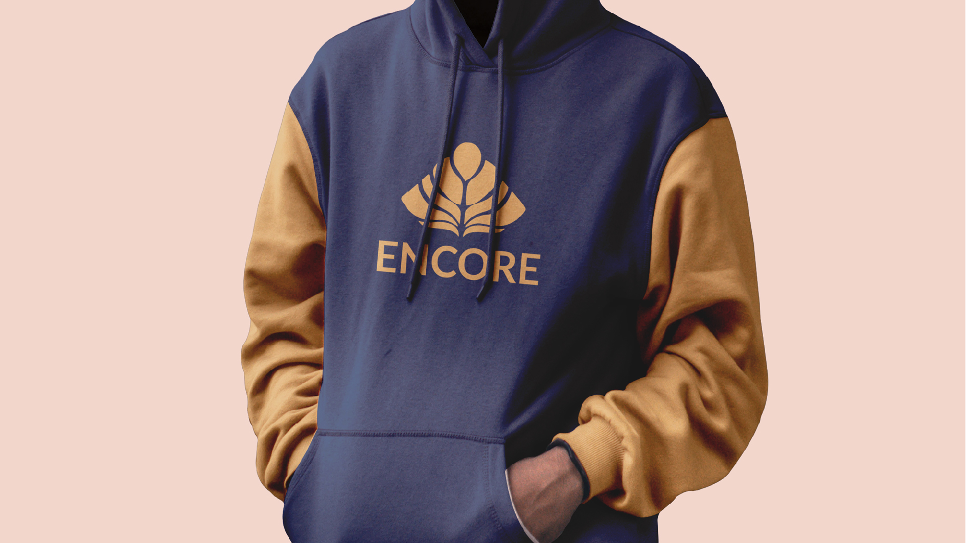
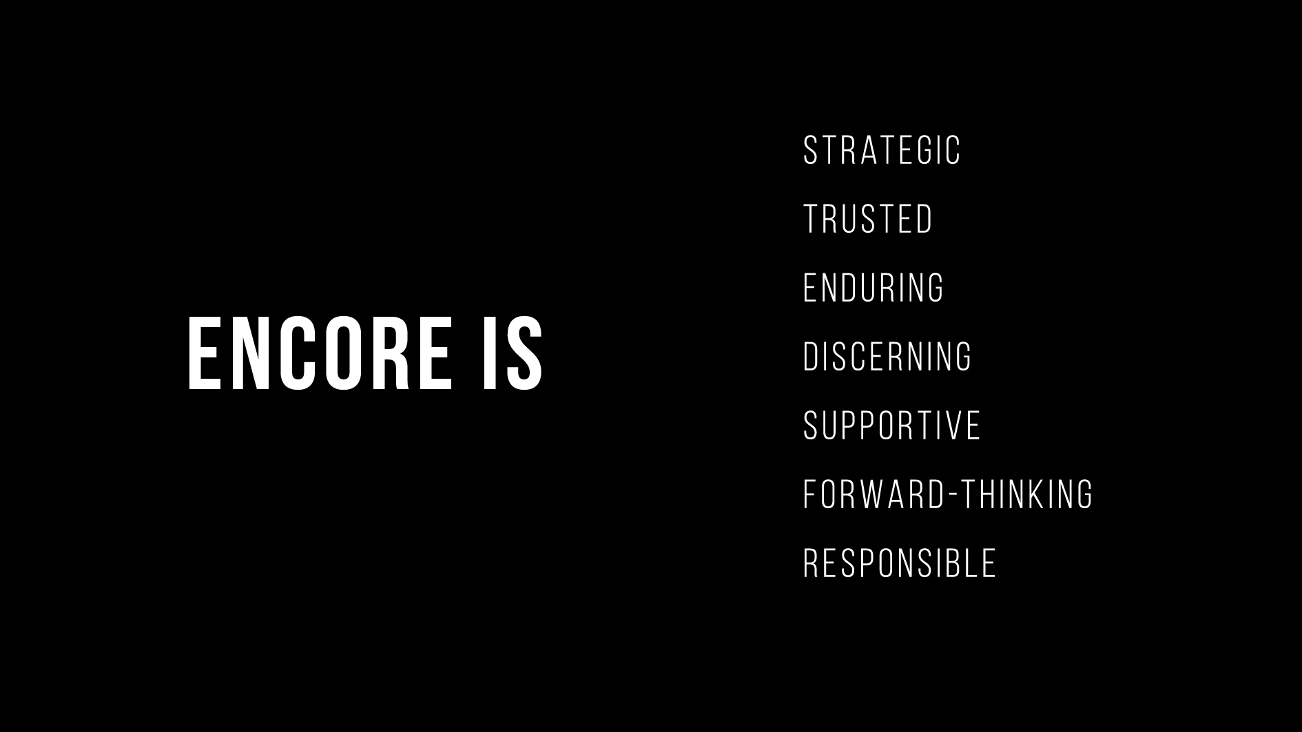
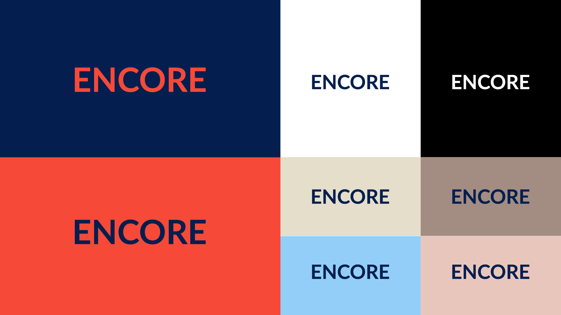
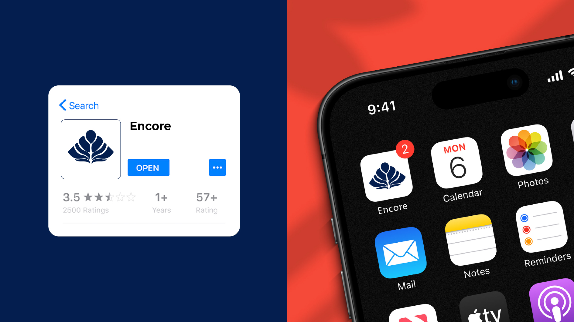
Encore Holdings is an Australian investment and management company that creates long-term value across diverse industries.
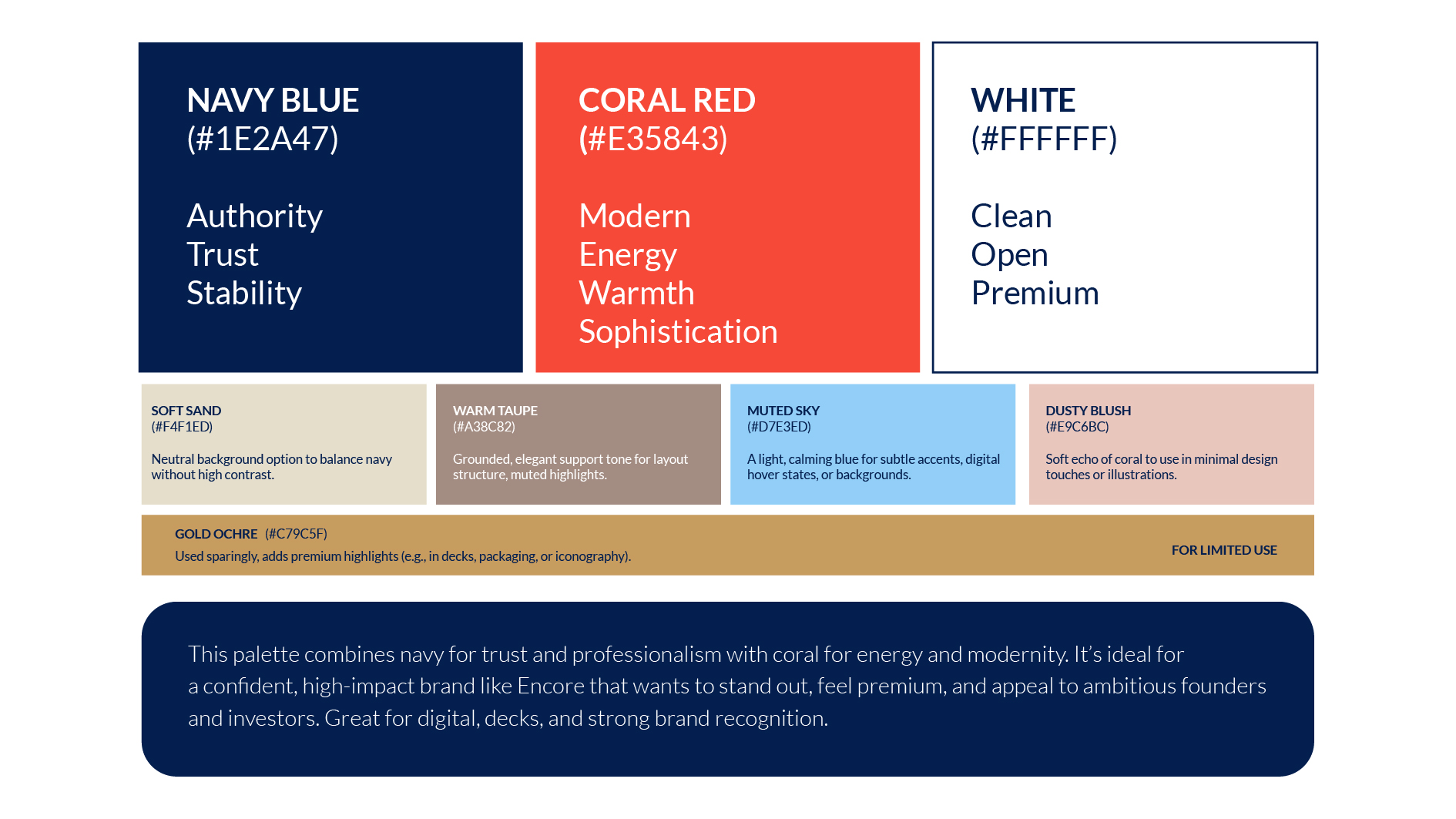
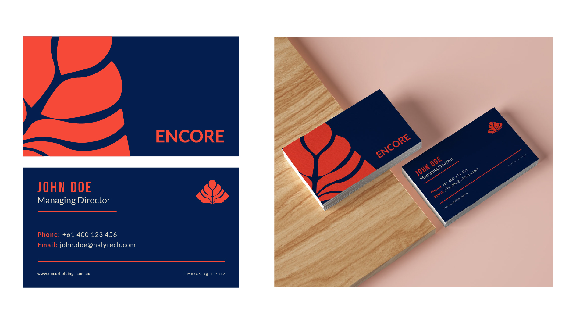
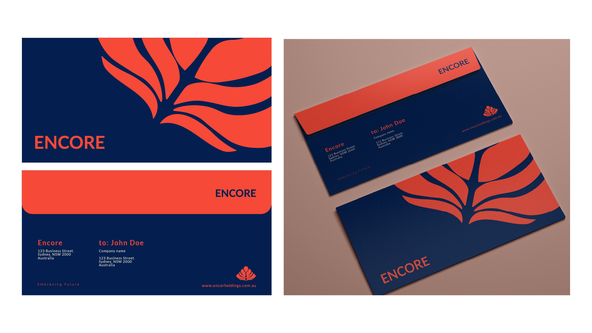
They aimed to rebrand because their identity did not reflect the sophistication and credibility of their portfolio.
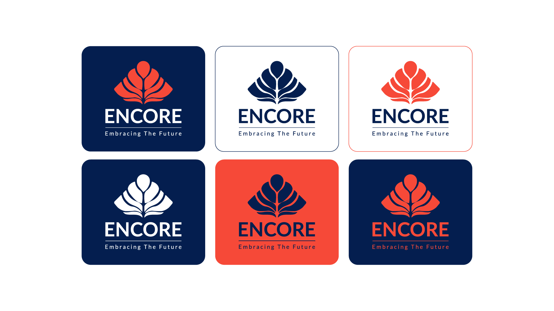
I saw an opportunity for Encore to strengthen its position as a trusted partner. I shifted the brand from a conventional corporate look to a refined and modern design that communicates stability and ambition across all touchpoints.
Blitz Productions LOGO, VISUAL IDENTITY
DESCRIPTION
www.blitz.productions
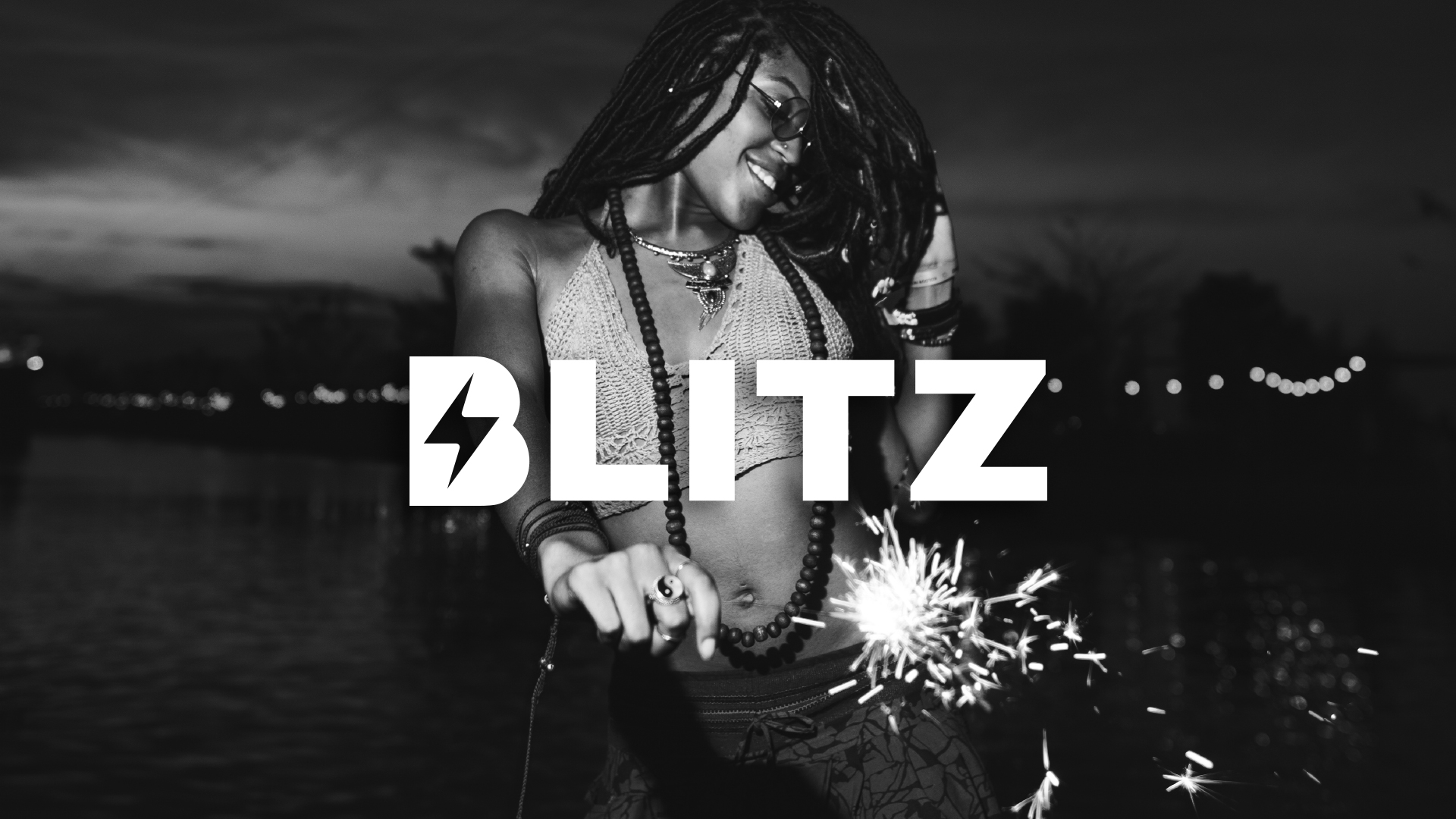
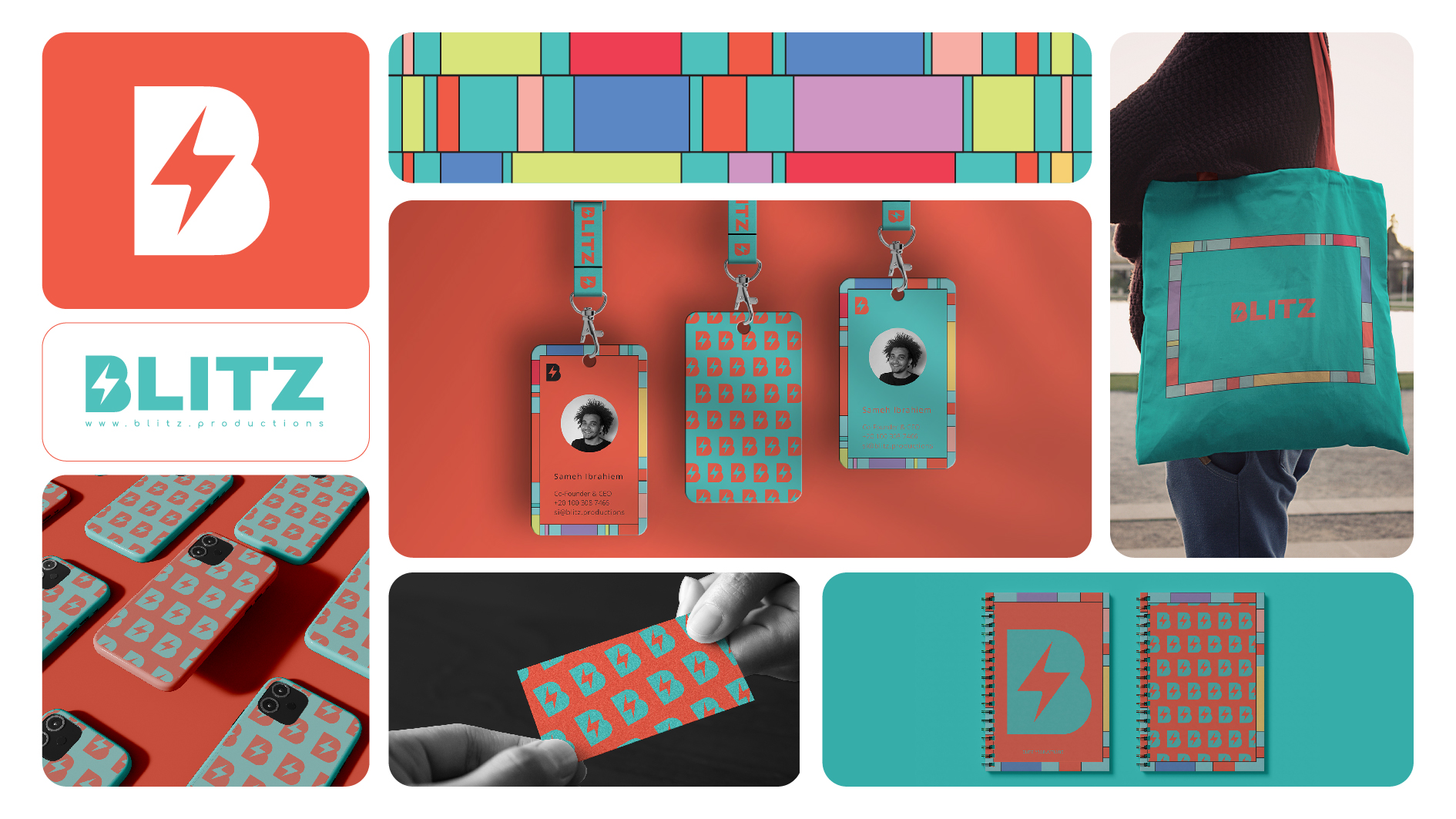
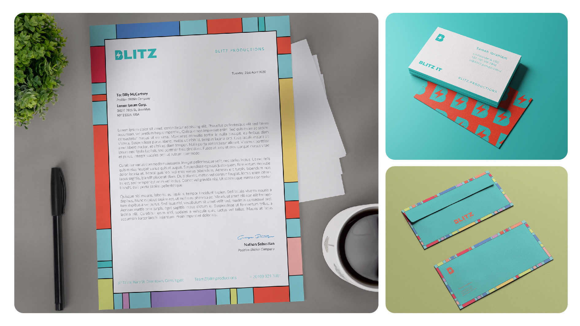
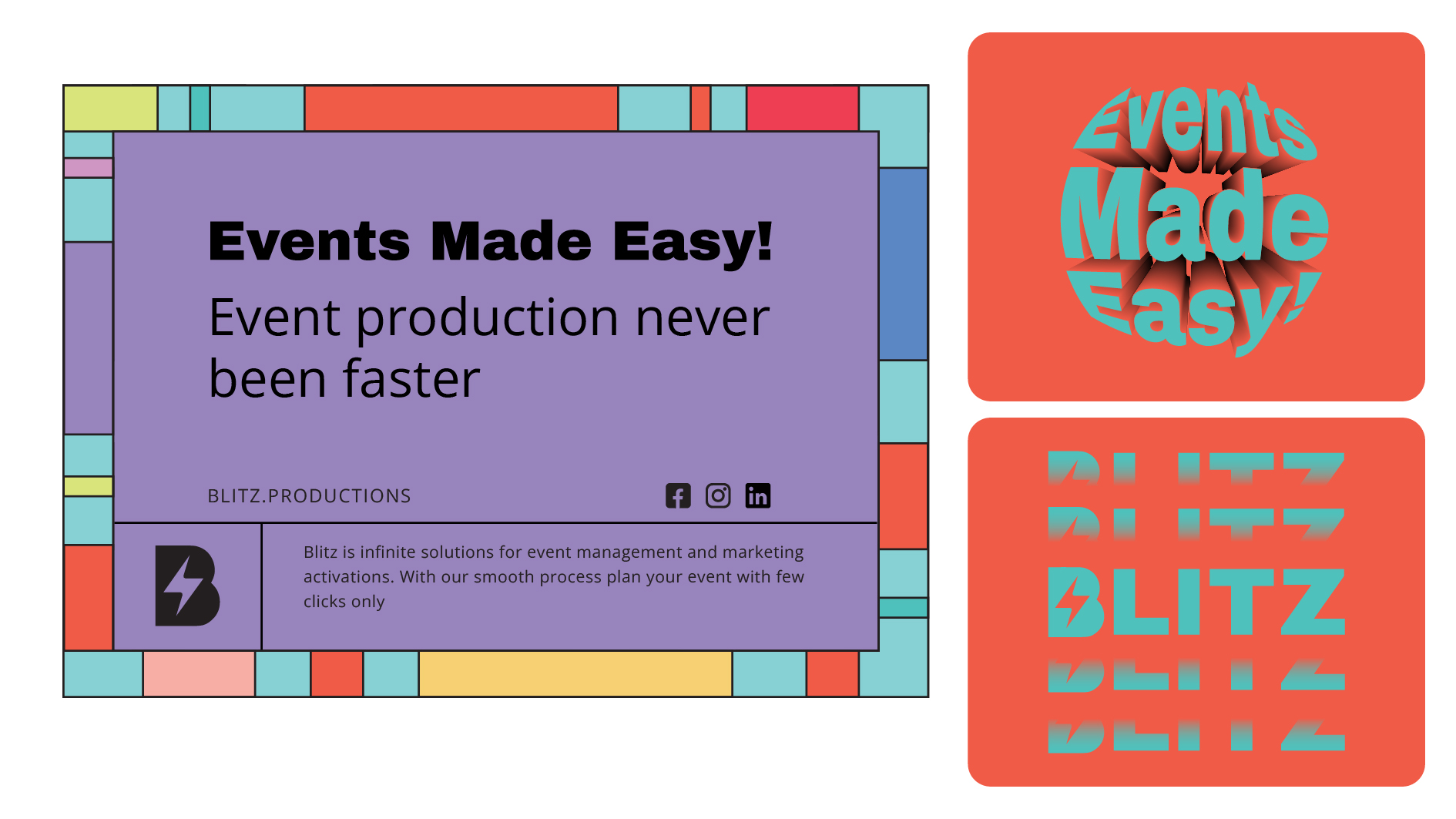
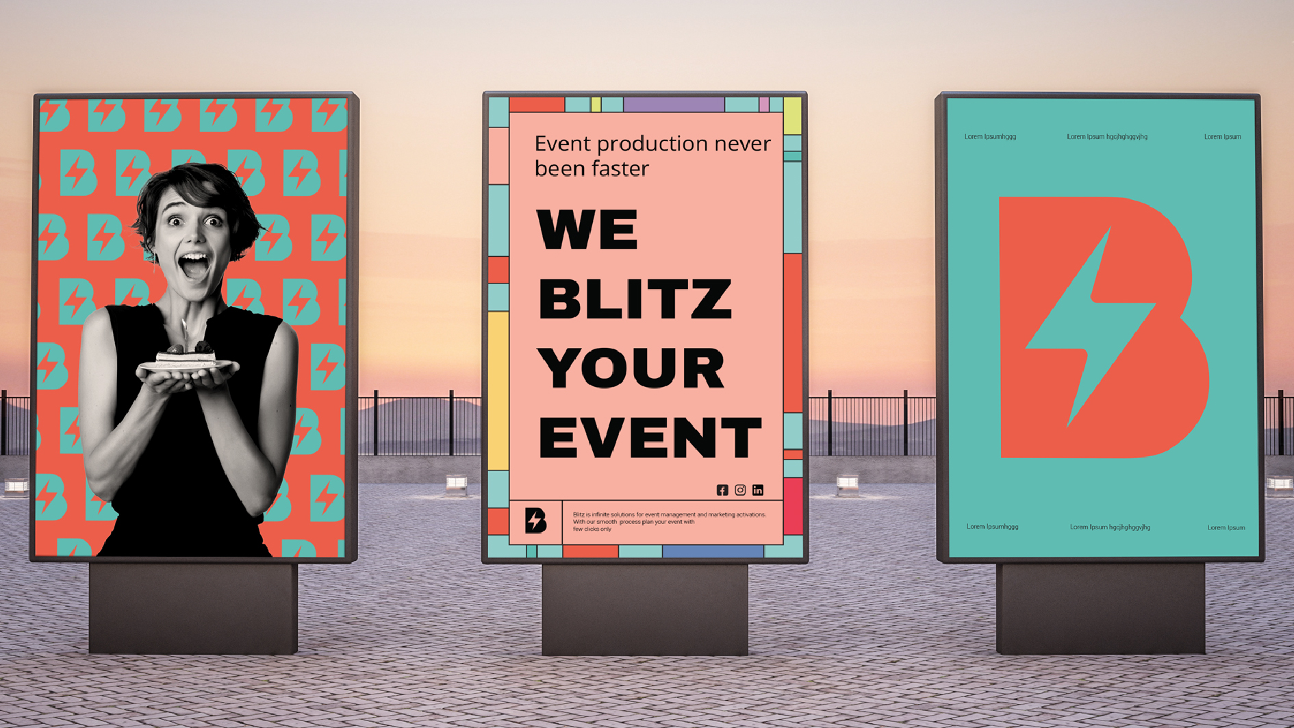
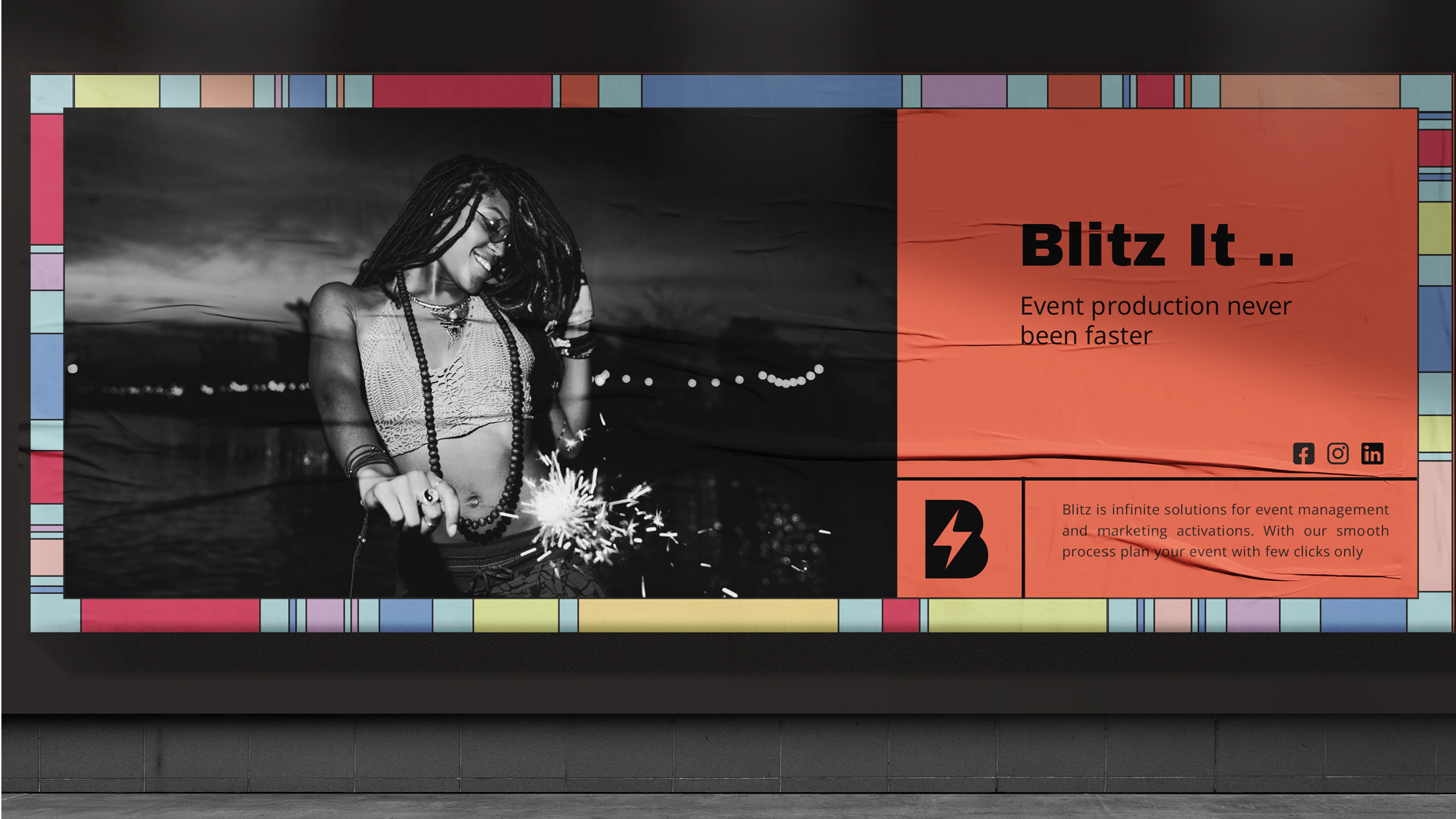
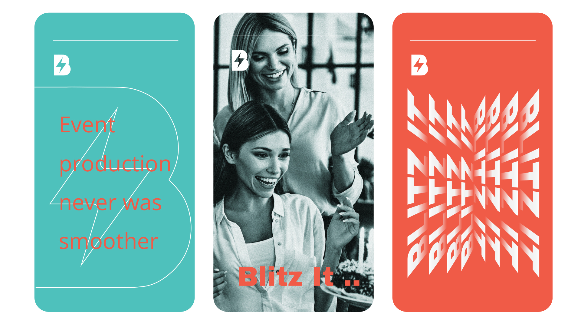
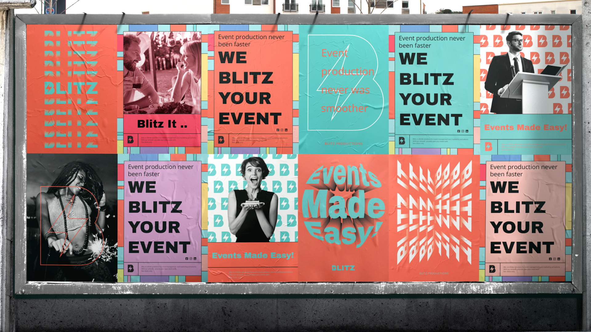
To assist Blitz Productions in launching their brand effectively in the digital space, Blitz's brand identity revolves around a bold logo mark and a diverse color scheme.
The brand identity reflect the effortless user experience customers enjoy when they create their events with Blitz using just a few clicks.
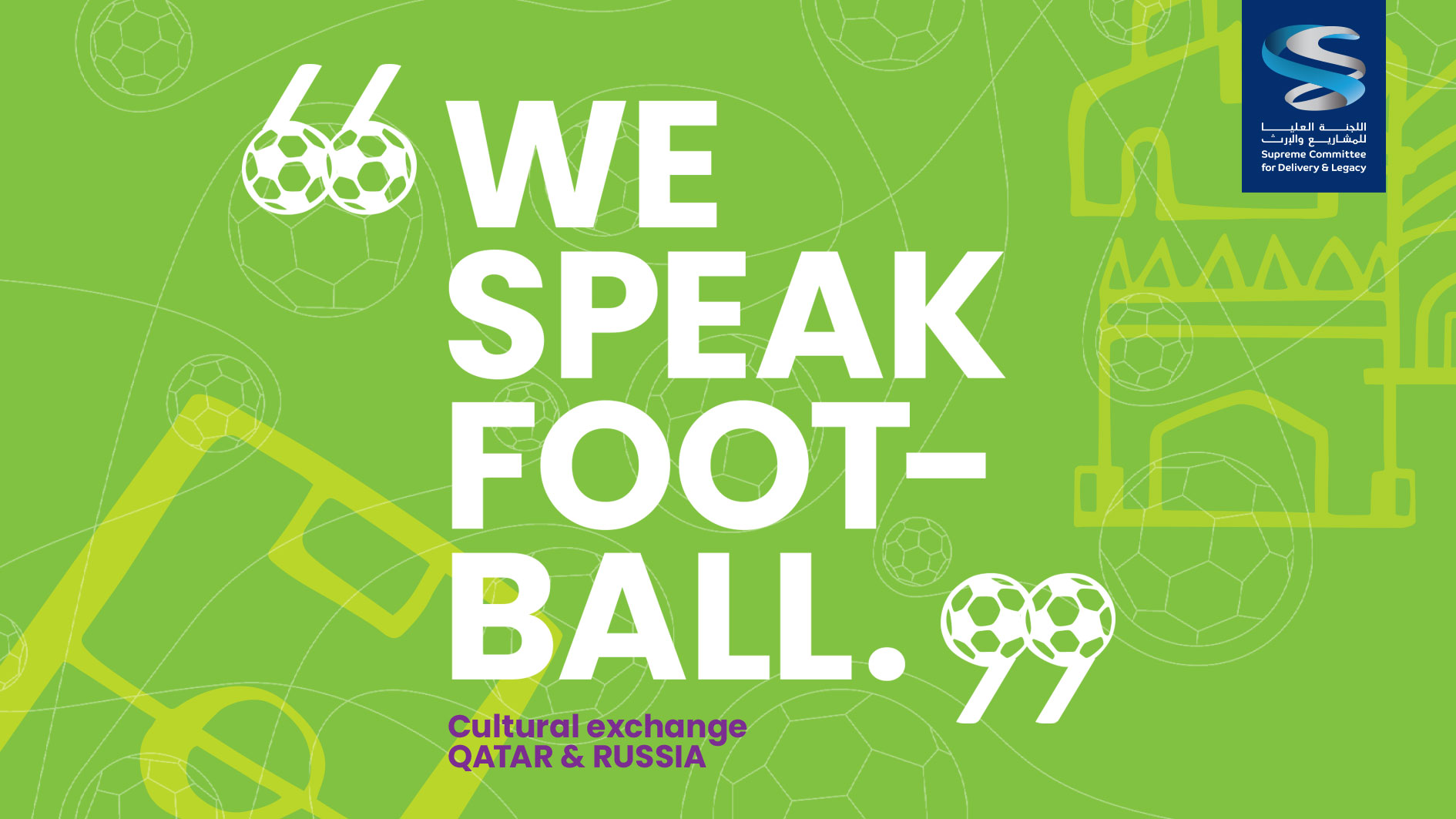
We Speak Football CAMPAIGN DESIGN
DESCRIPTION
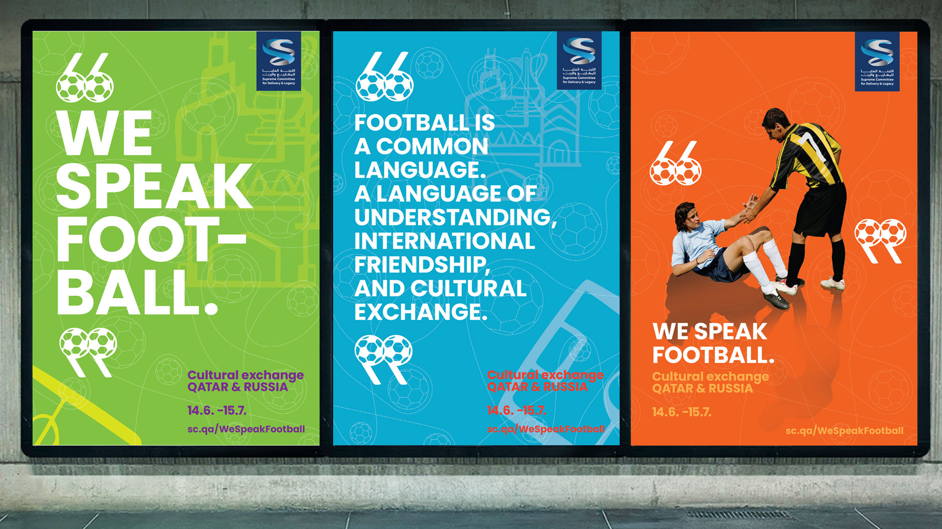
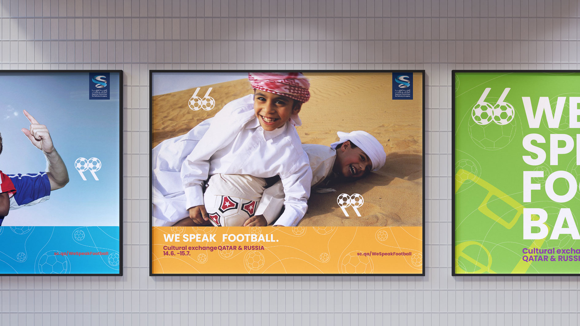
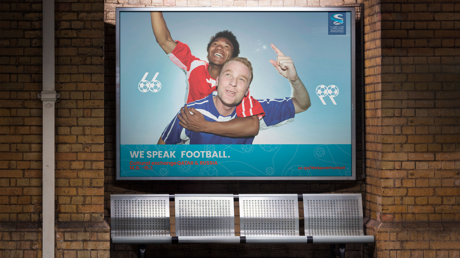
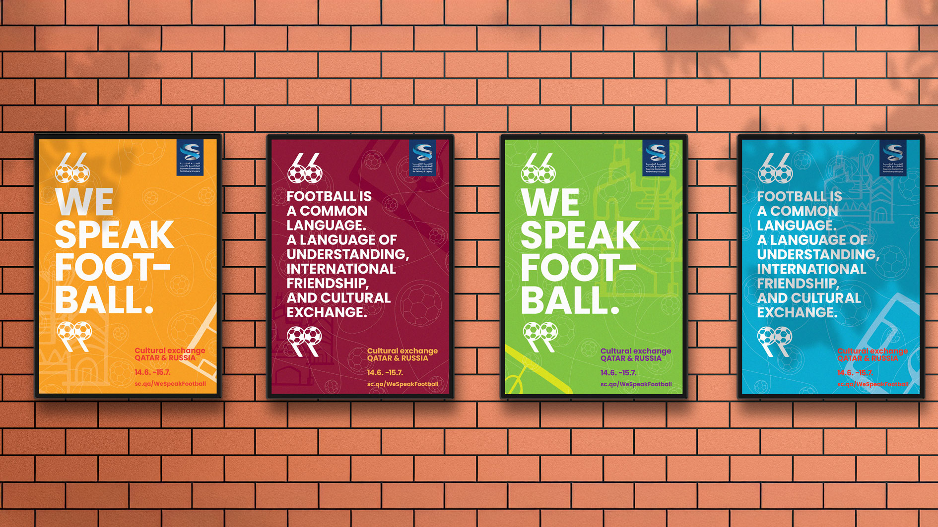
Football is a language everyone understands.
a bridge for friendship, culture, and connection.
When we share this passion, conversations flow easily, no matter where we’re from or what language we speak.
This campaign celebrates people communicating through football, showing friendship beyond borders, teams, and nations.
From Russia to Qatar and everywhere in between—we all speak football.
Digital SOCIAL MEDIA, UI UX & DIGITAL ADS
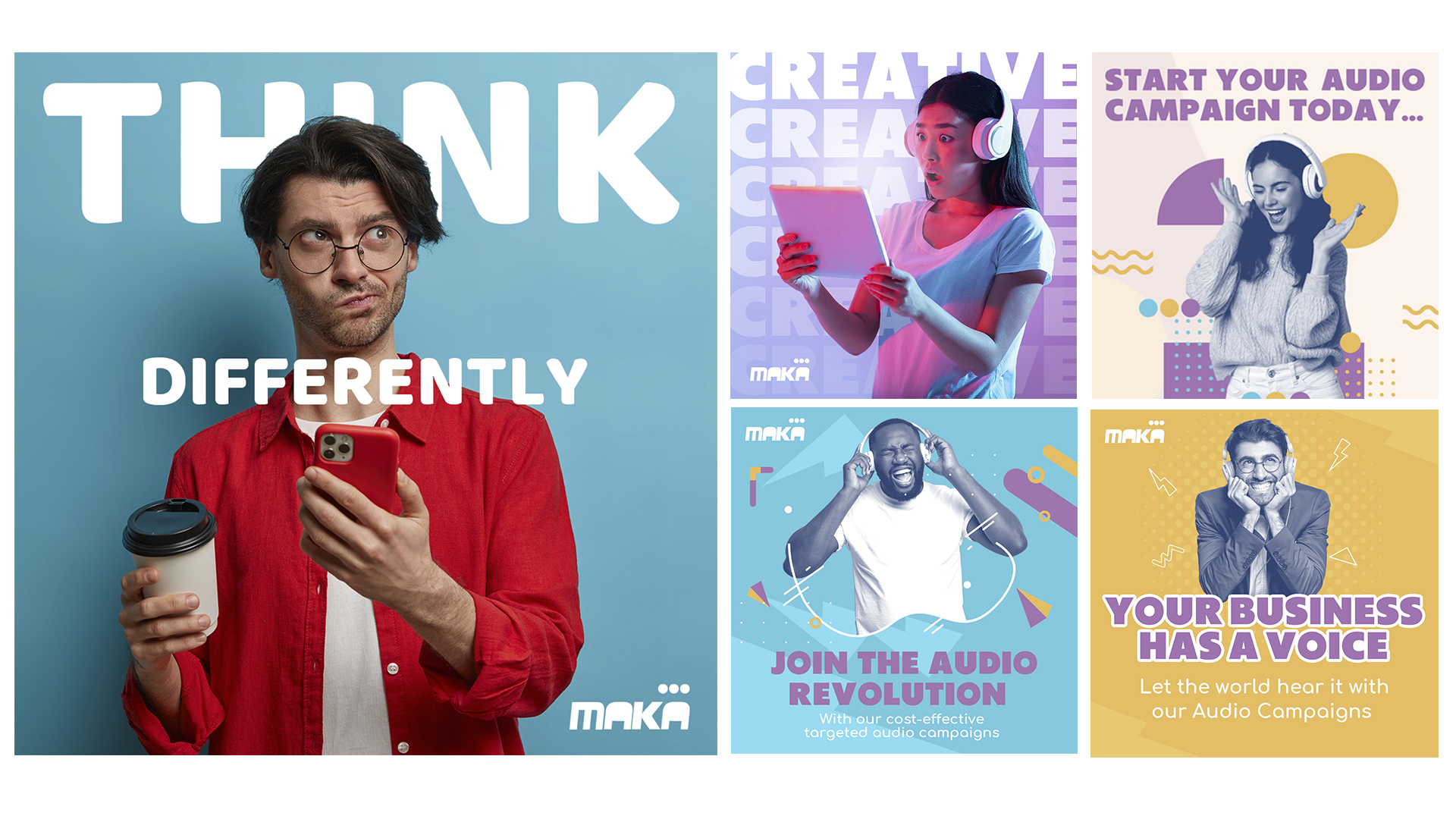
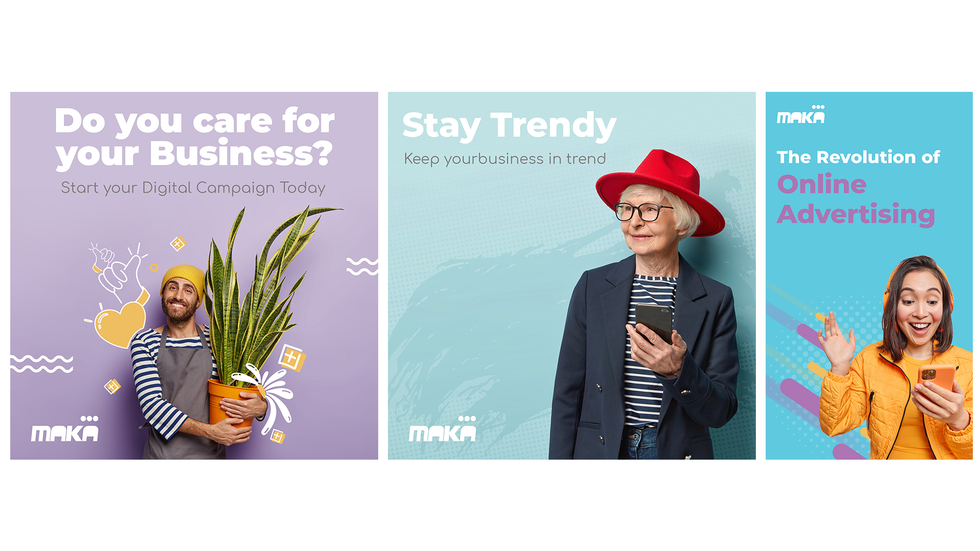
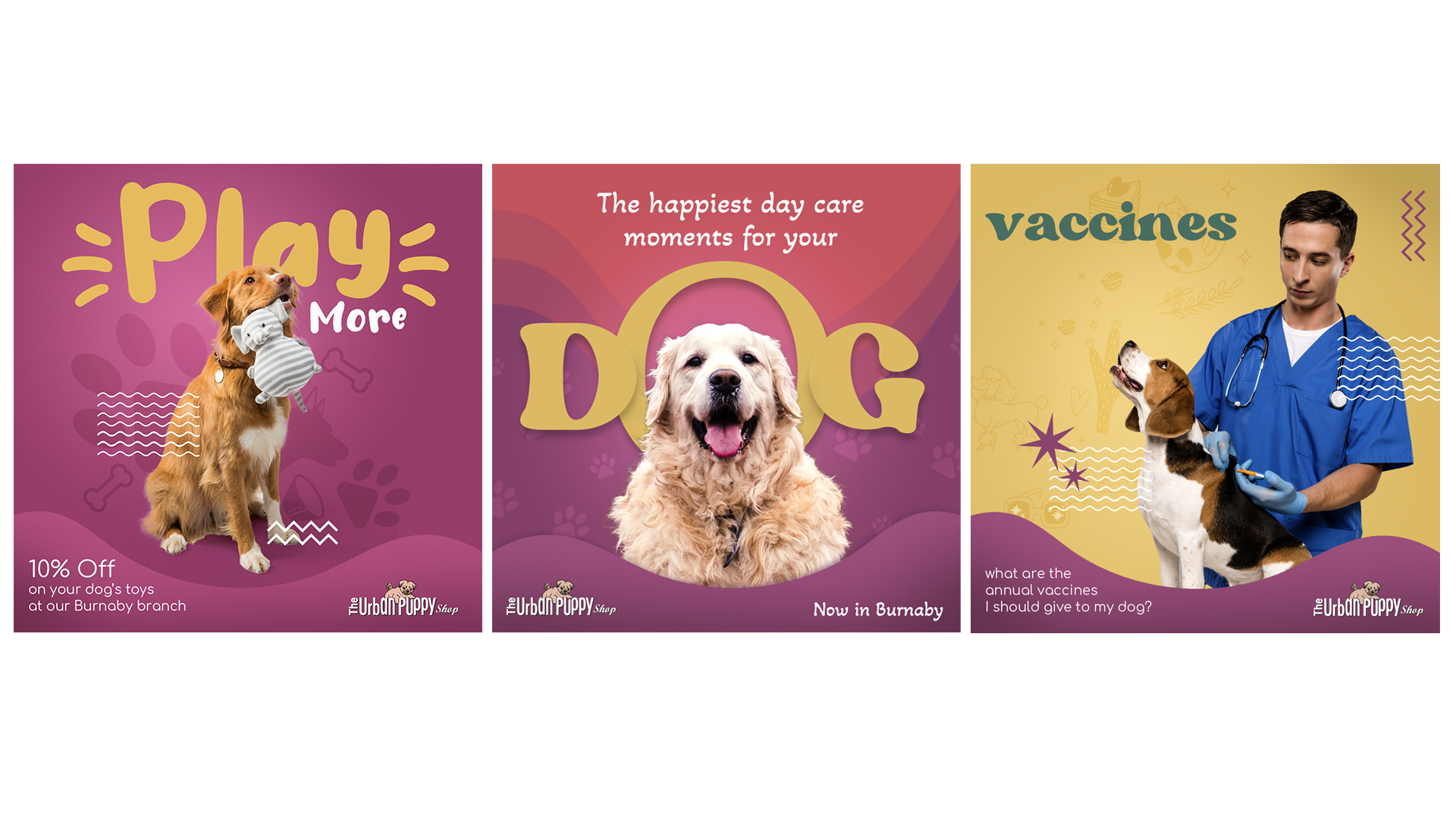
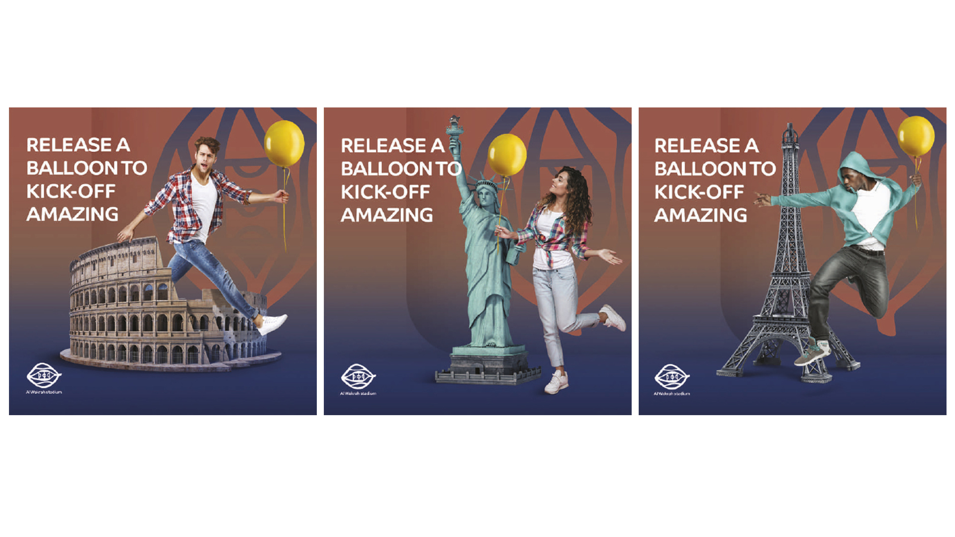
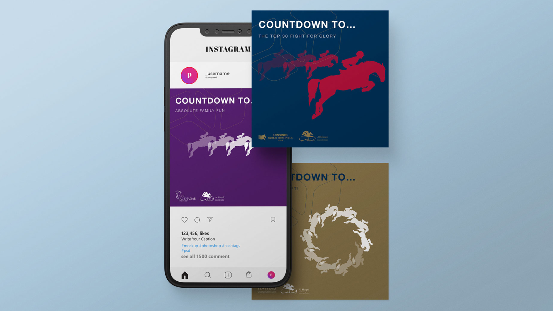
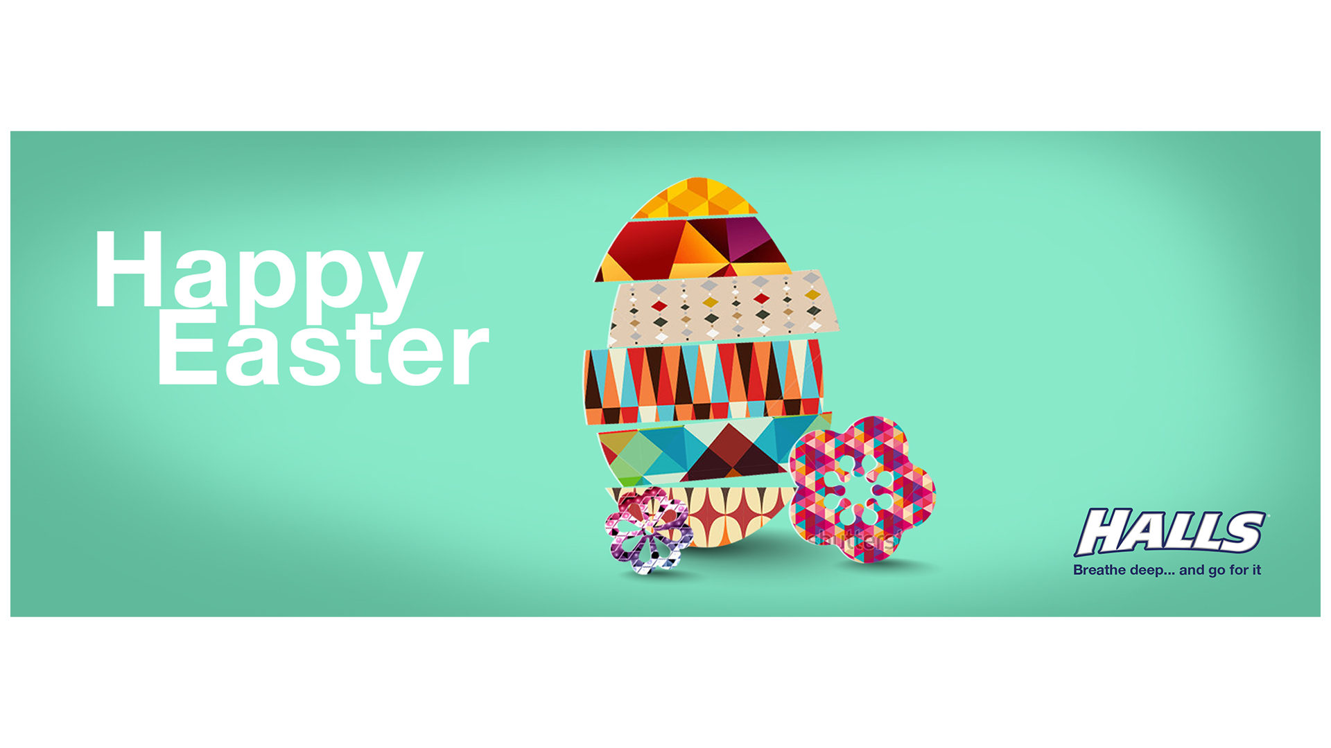
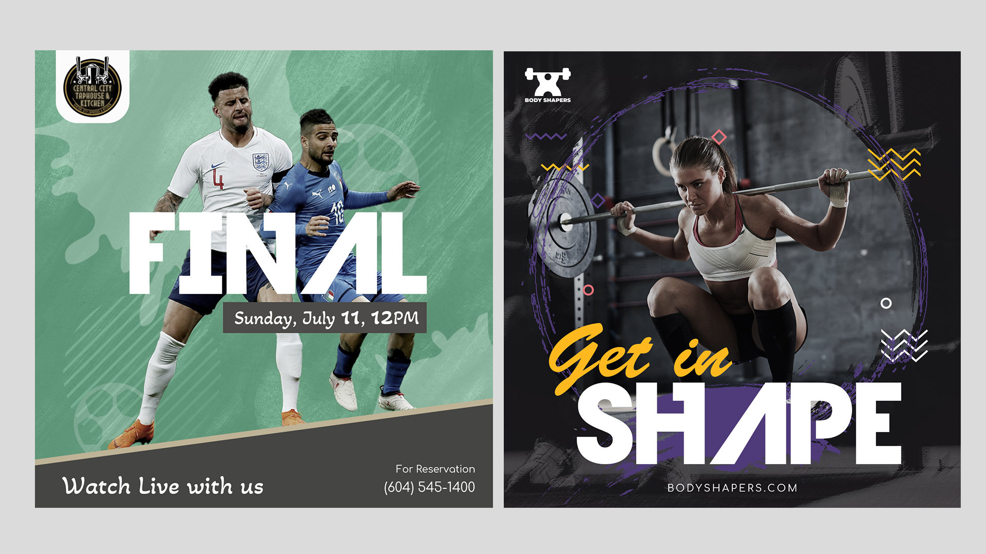
DESCRIPTION
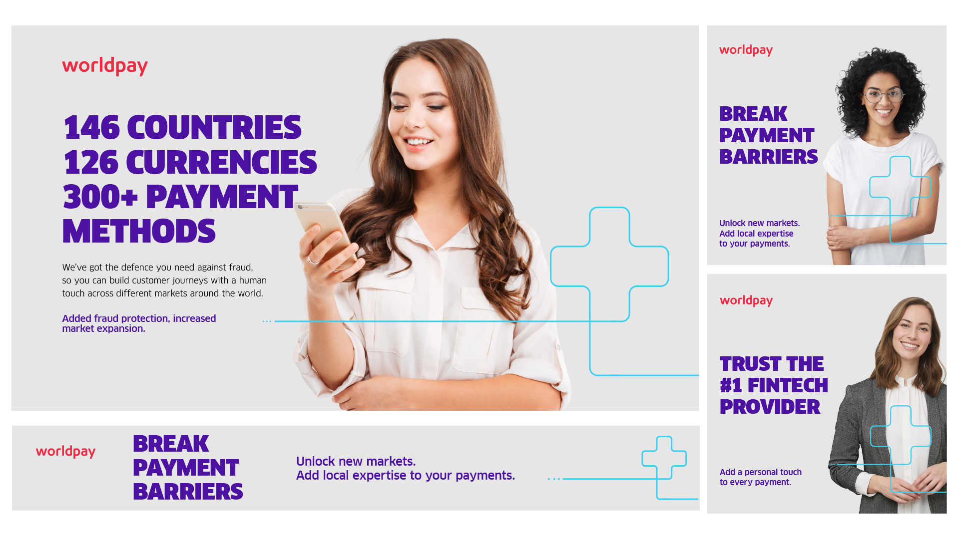
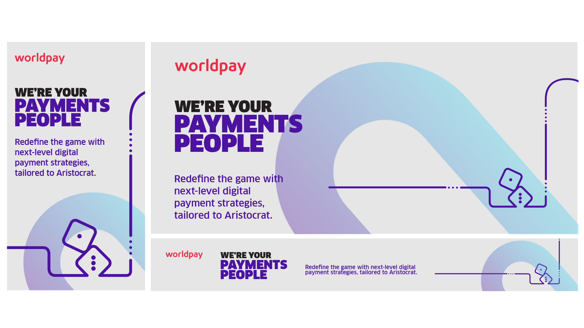
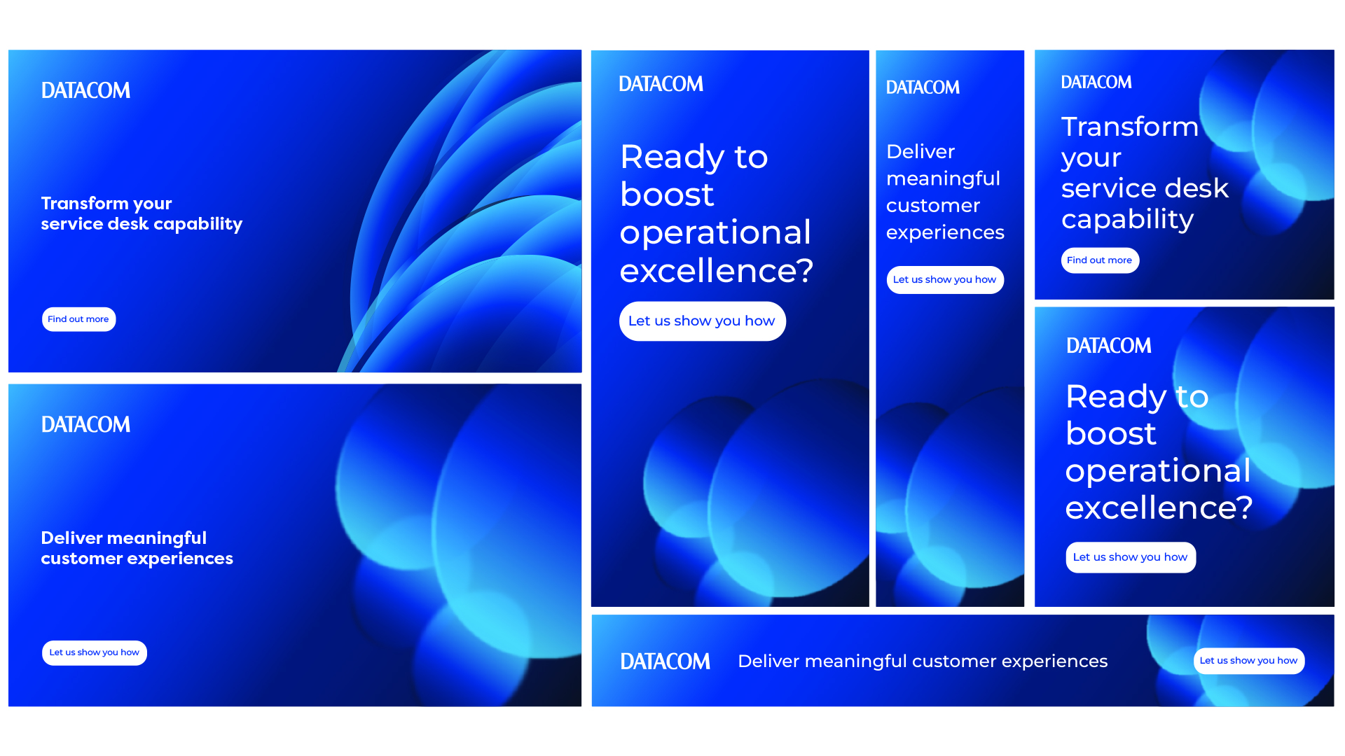
A variety of digital assets for social and digital campaigns!
Great Escapes LOGO, VISUAL IDENTITY
DESCRIPTION
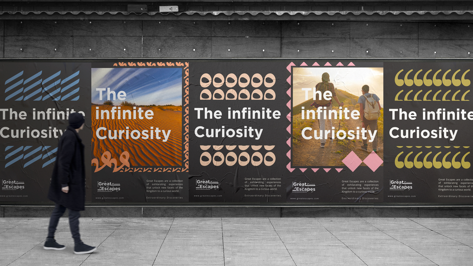
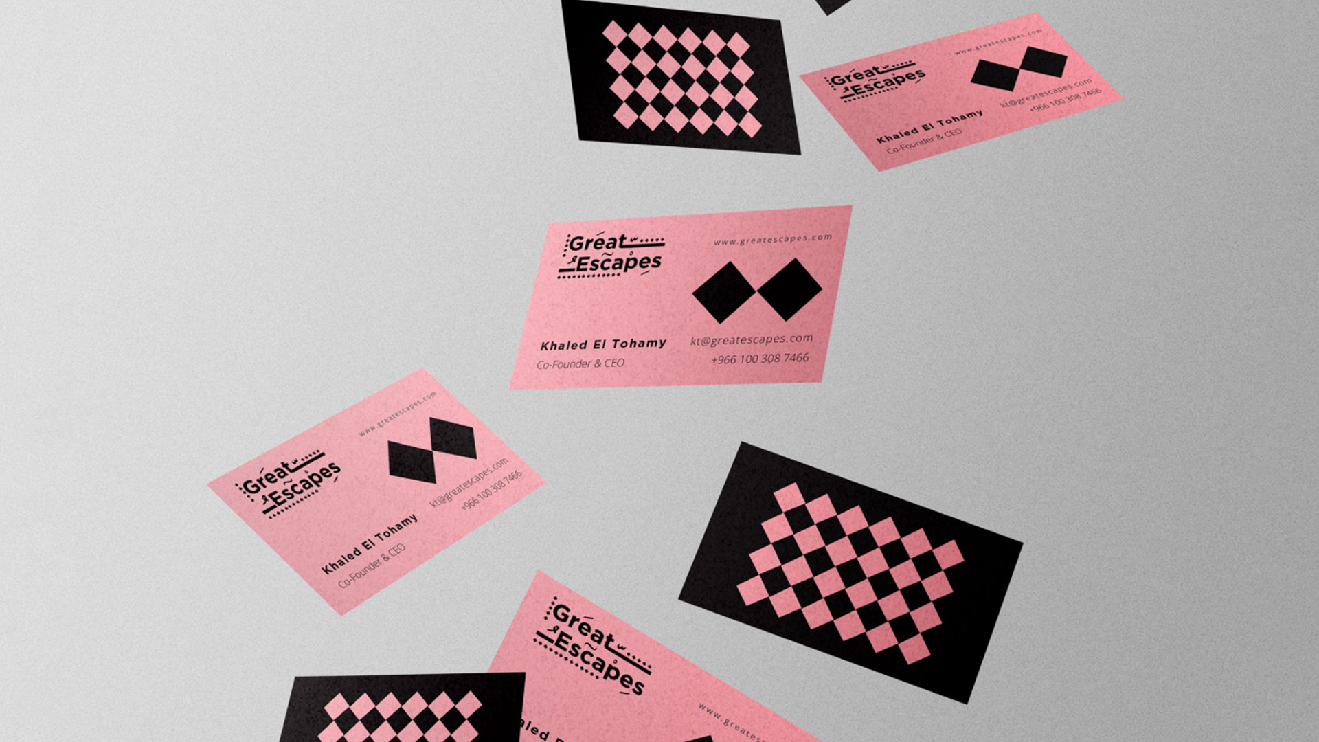
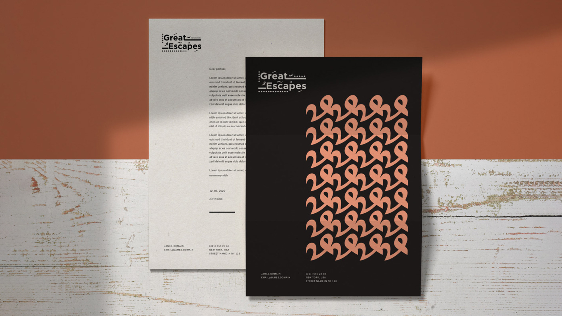
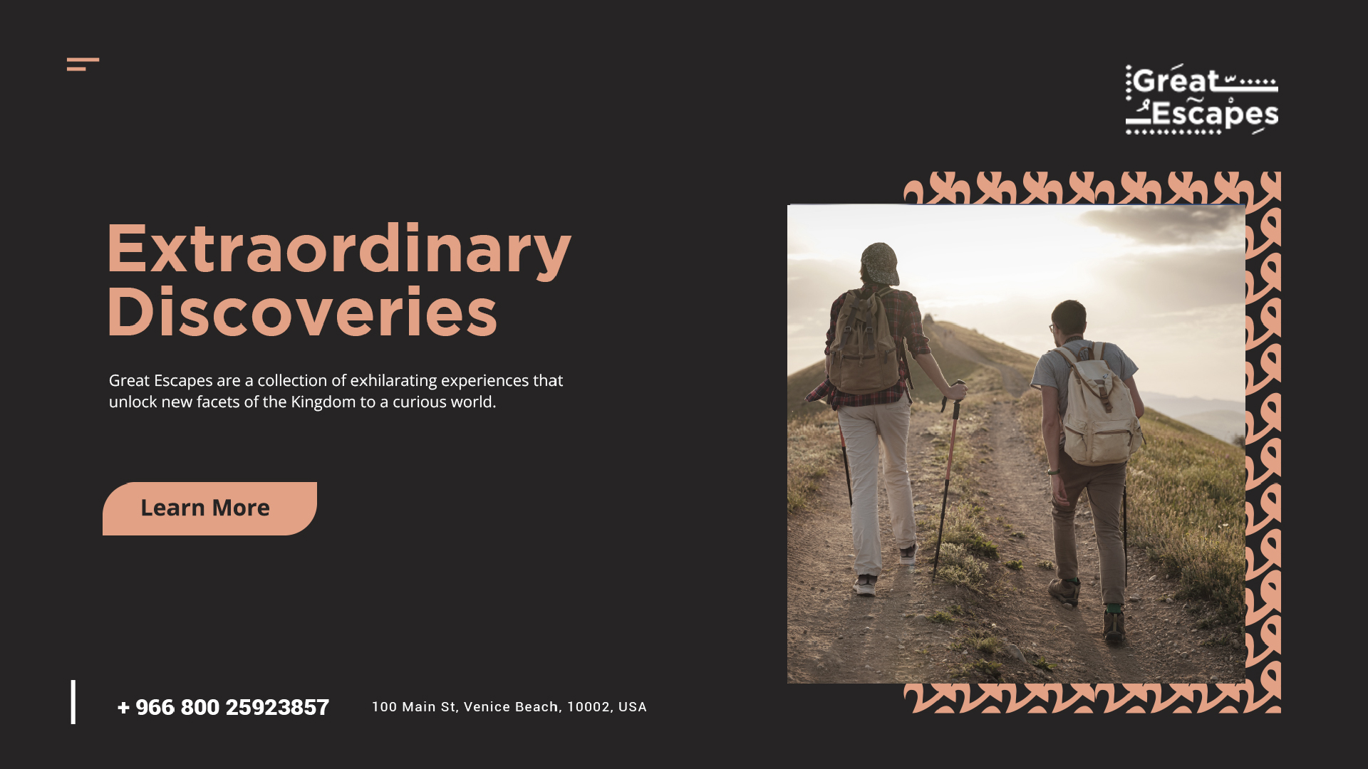
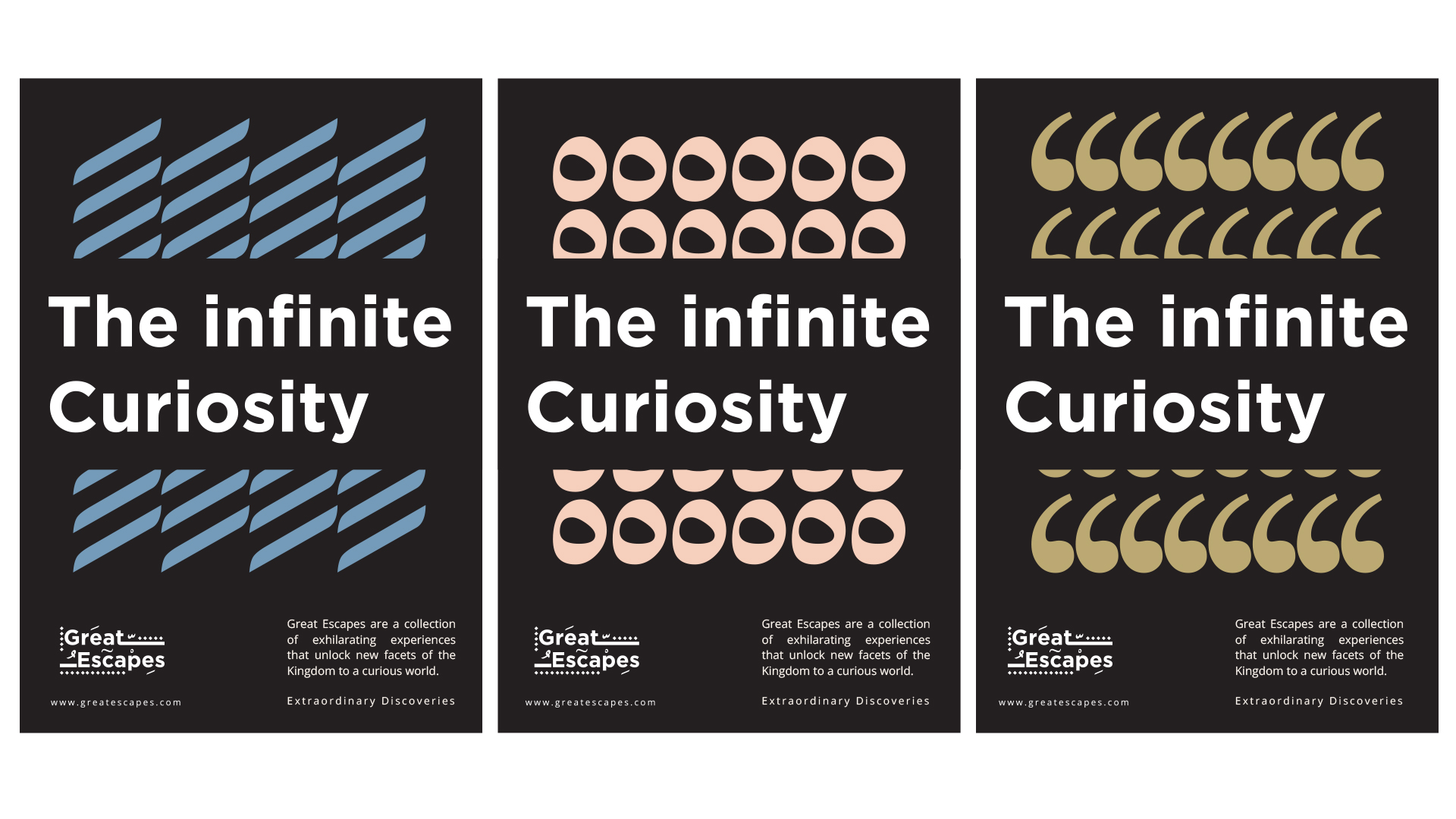
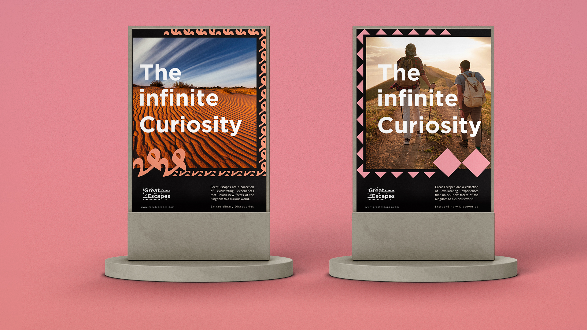
Great Escapes are a collection of exhilarating experiences that unlock new facets of the Kingdom to curious world, exist to inspire more people to enjoy and discover the wonders of Saudi.
Qatassia CAMPAIGN DESIGN
DESCRIPTION
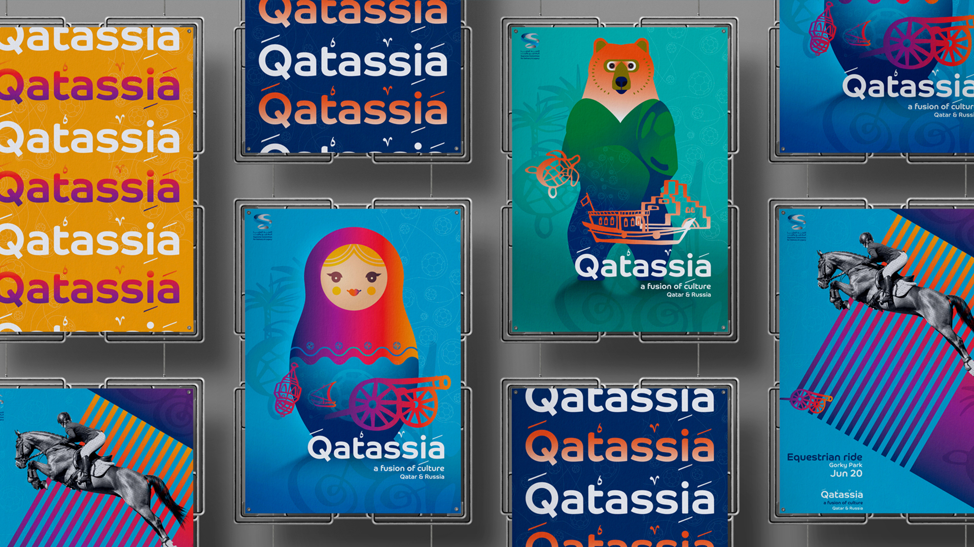
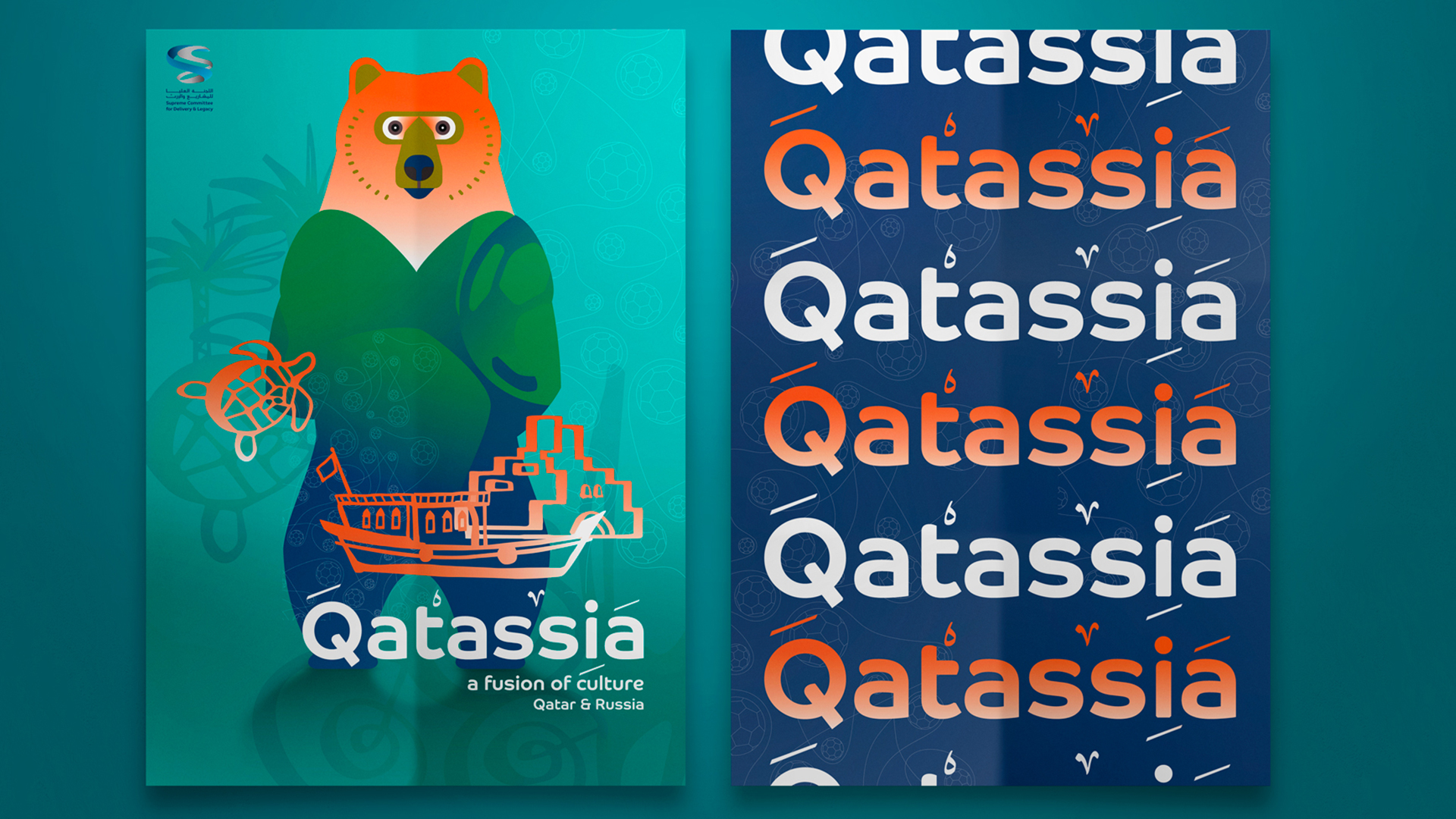
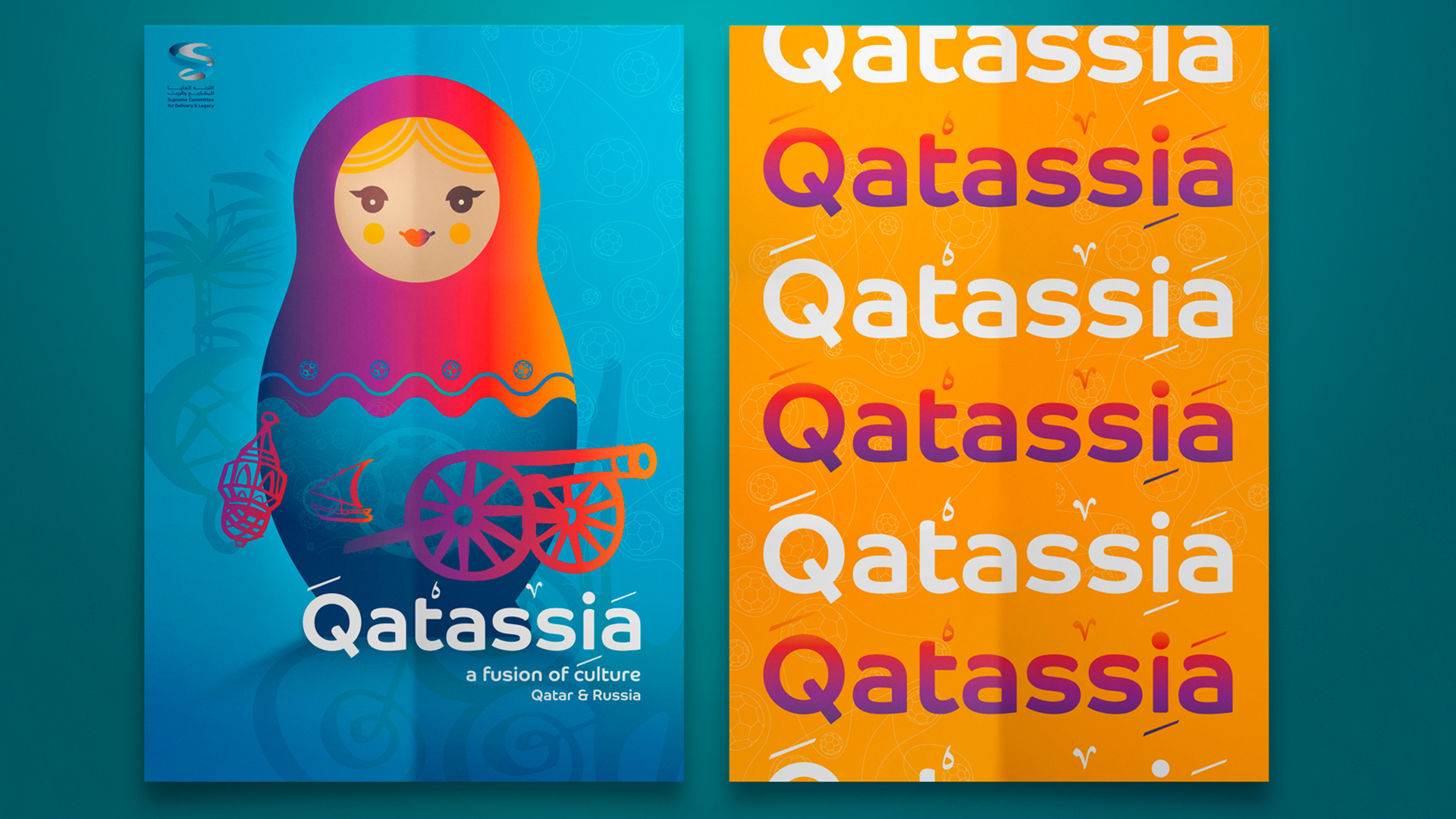
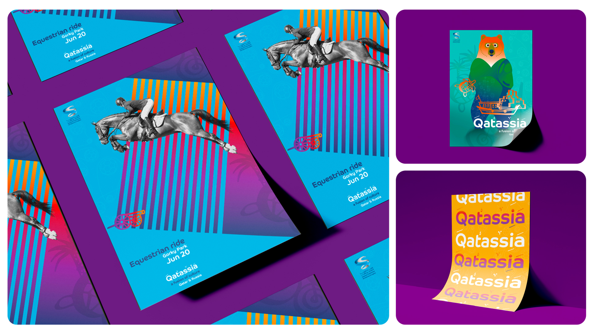
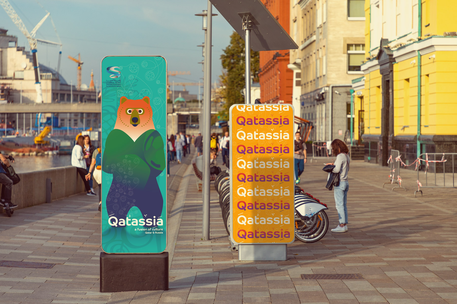
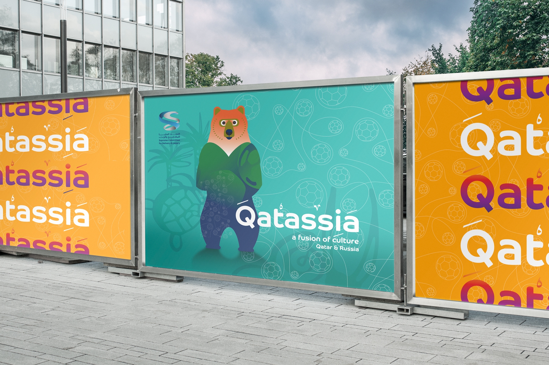
Challenge: In 2018, Qatar and Russia engaged in cultural cooperation, highlighted by Qatar's Supreme Committee for Delivery & Legacy during the Russian World Cup. At the closing ceremony, Russia announced Qatar as the 2022 World Cup host.
Solution: The concept "Qatassia" blends letters from each country's name. The visuals feature vibrant, contemporary graphics of cultural icons from both nations, capturing the World Cup's dynamic excitement. Classic Russian graphic art is also referenced in the design of communication materials.
Key Visuals ATL, BTL, Retail and OOH
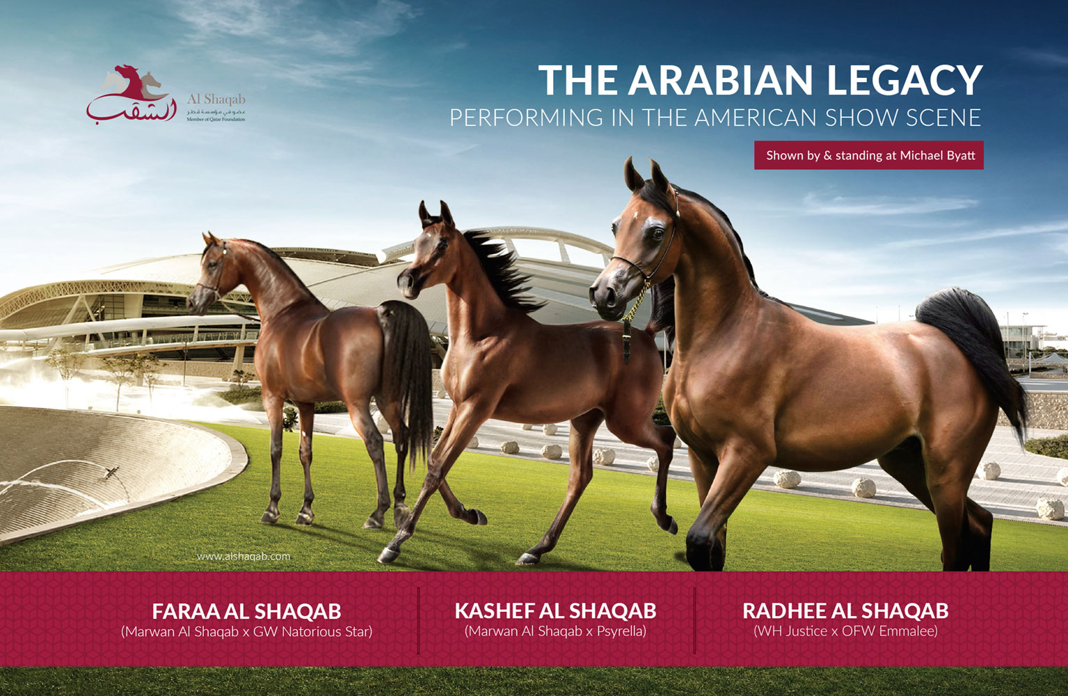
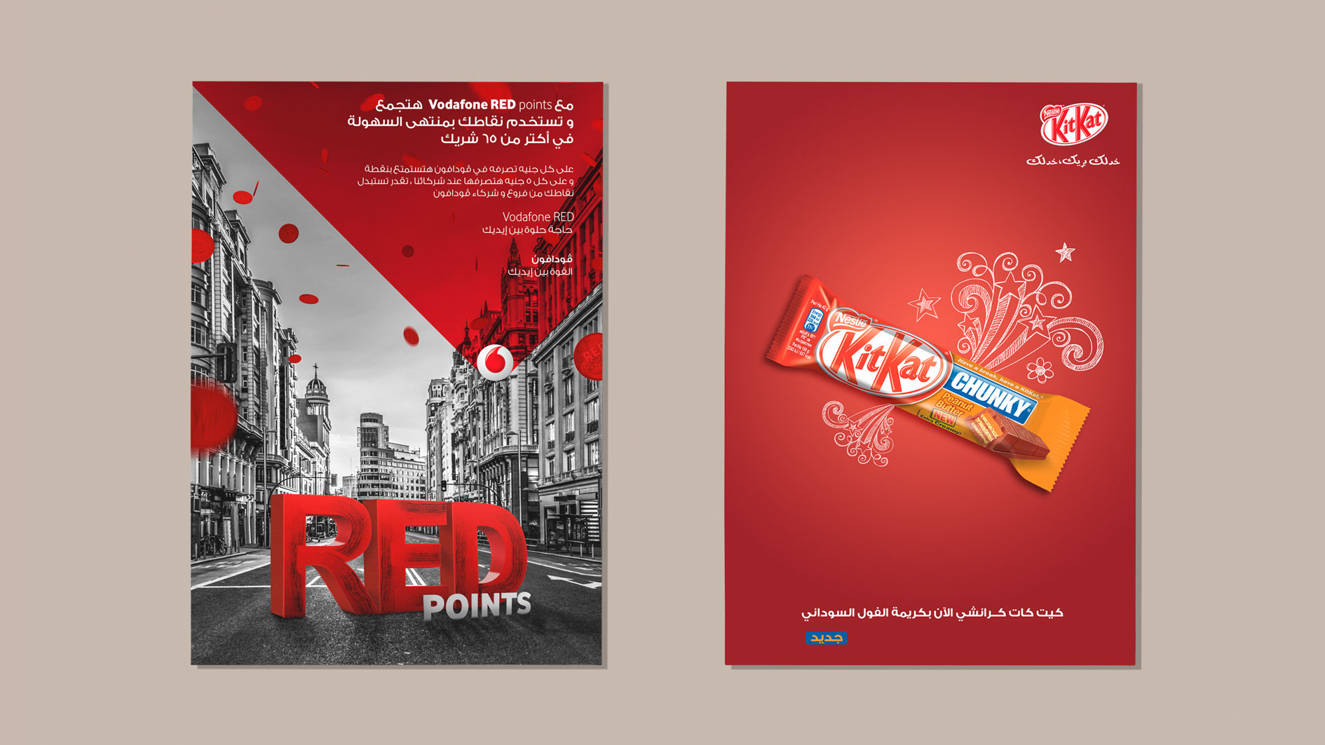
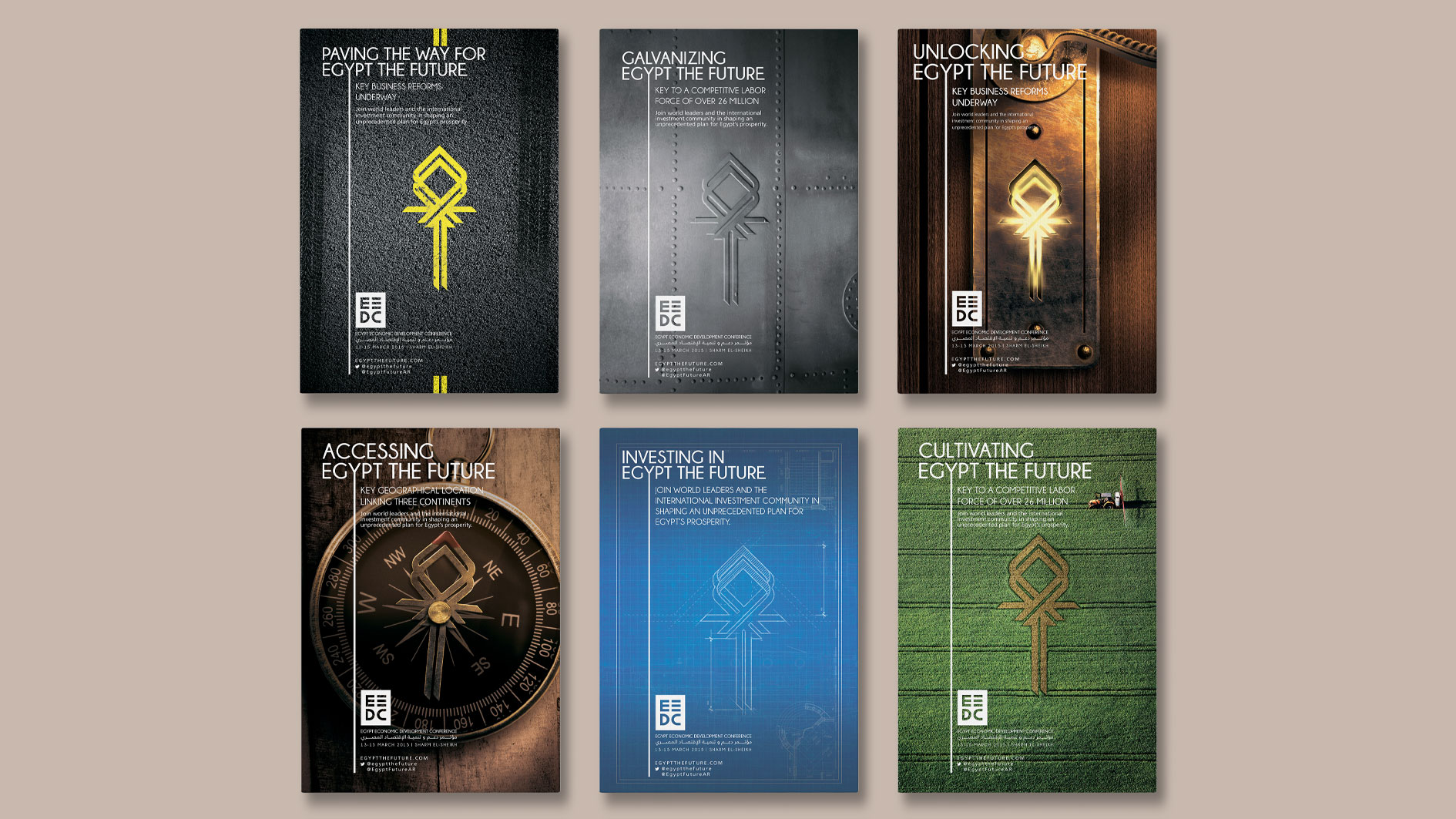
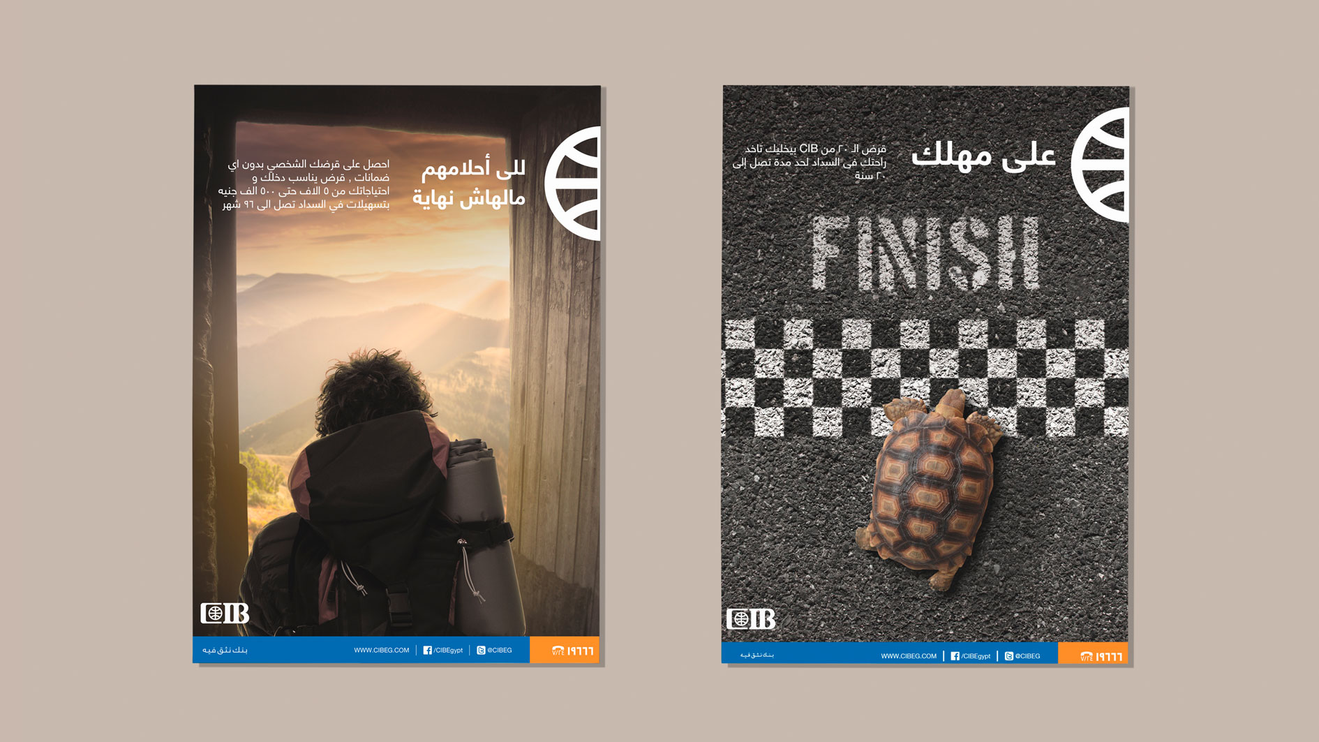
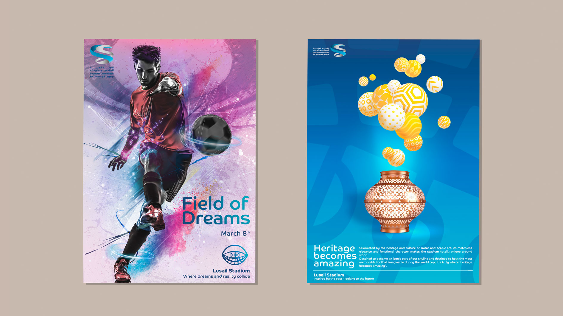
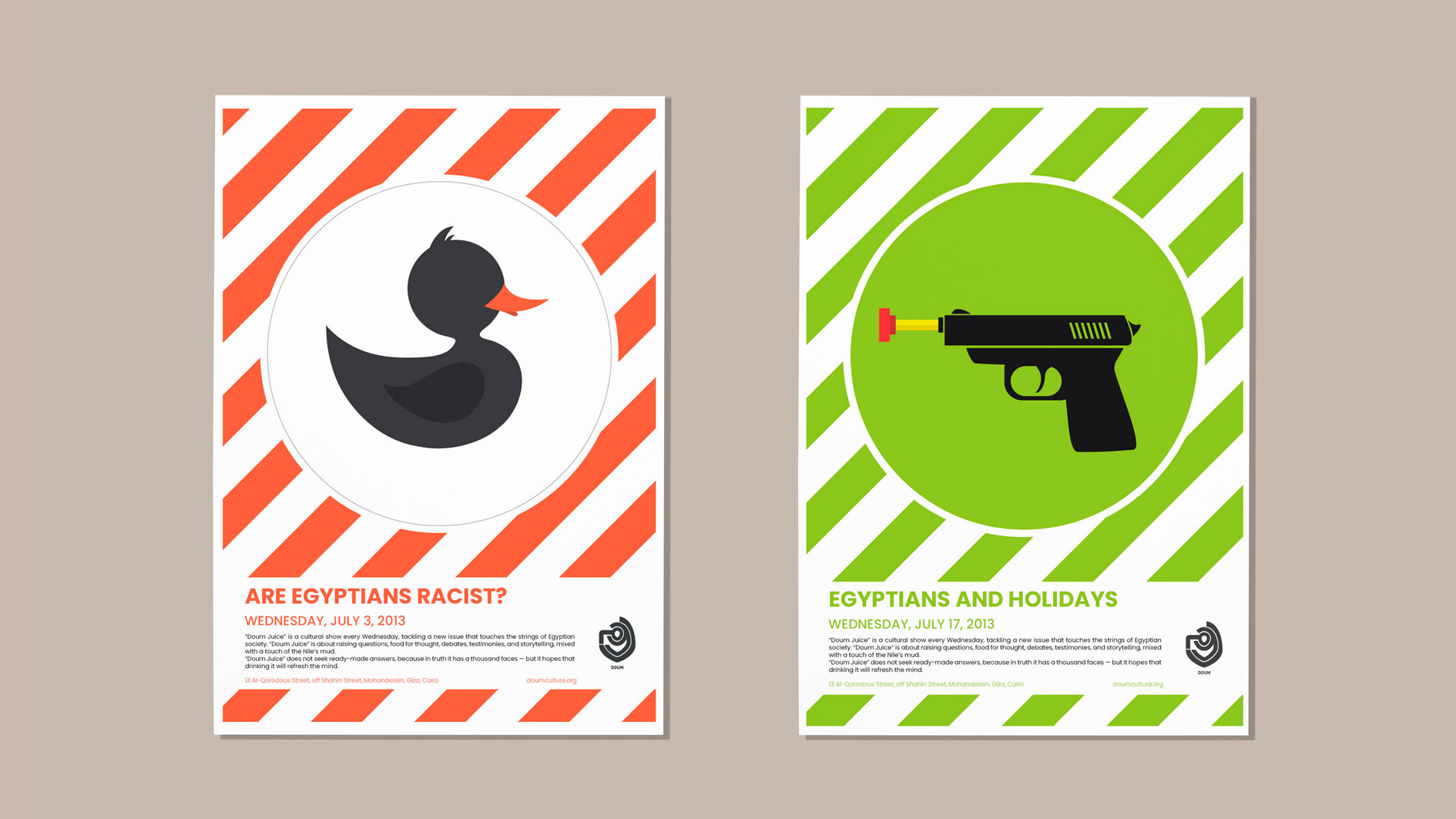
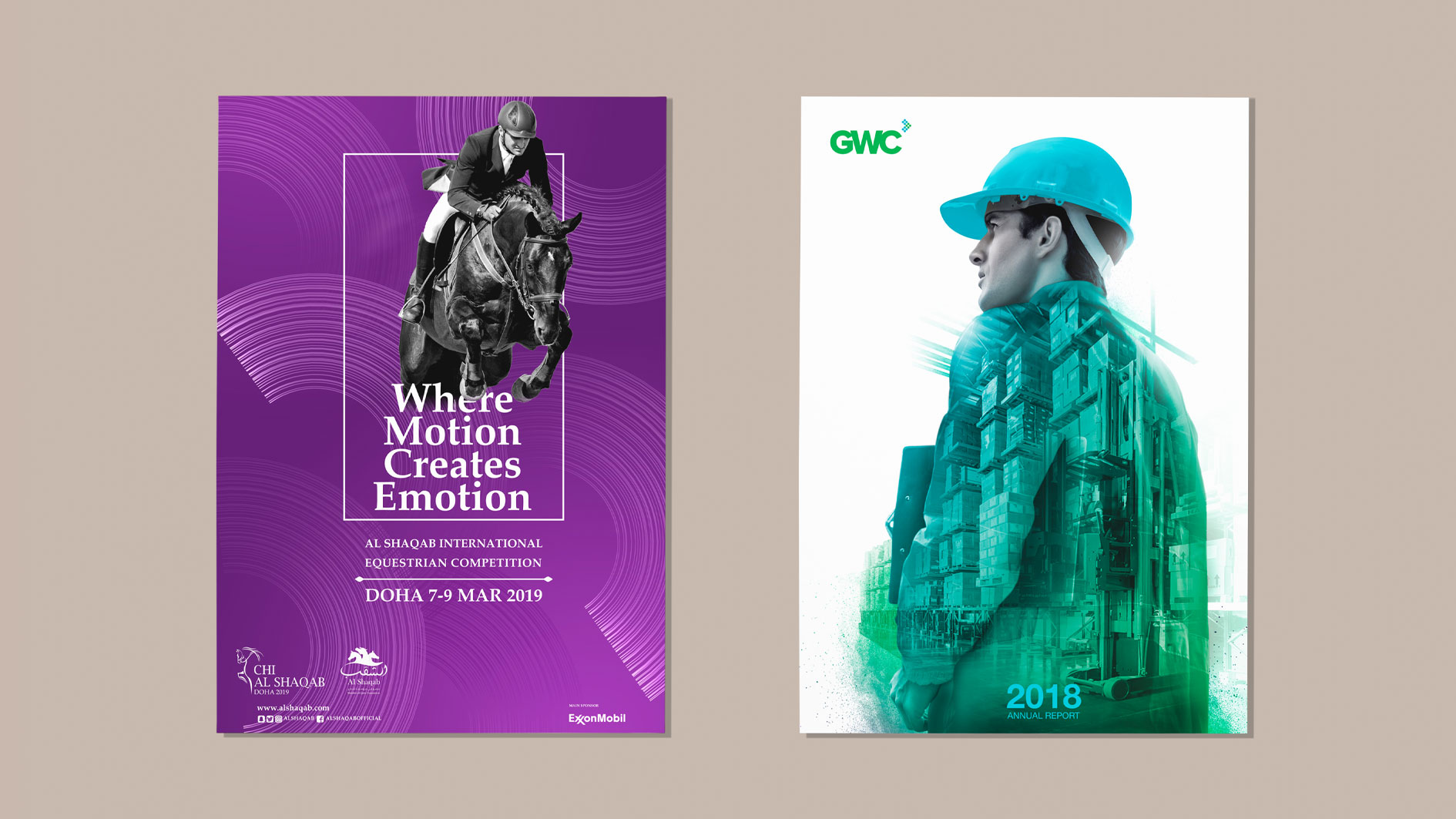
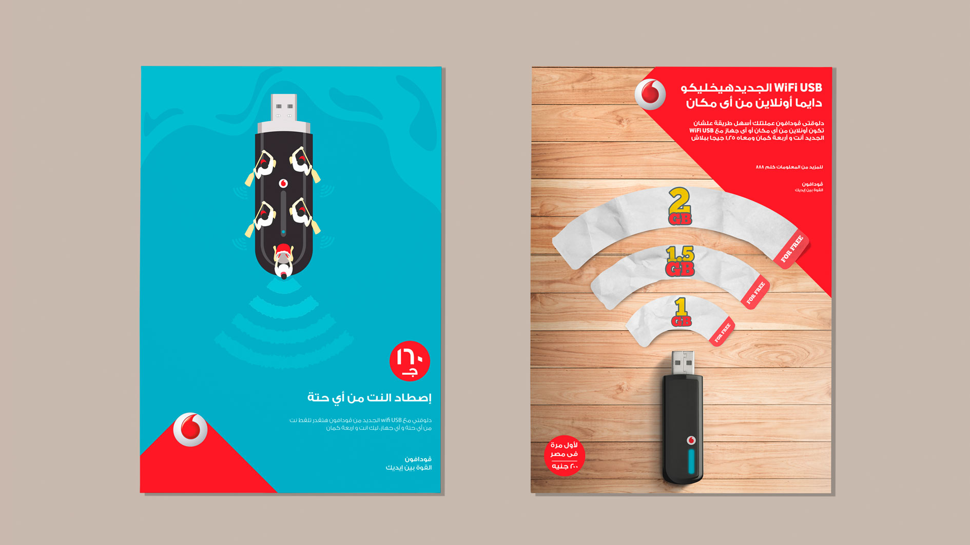
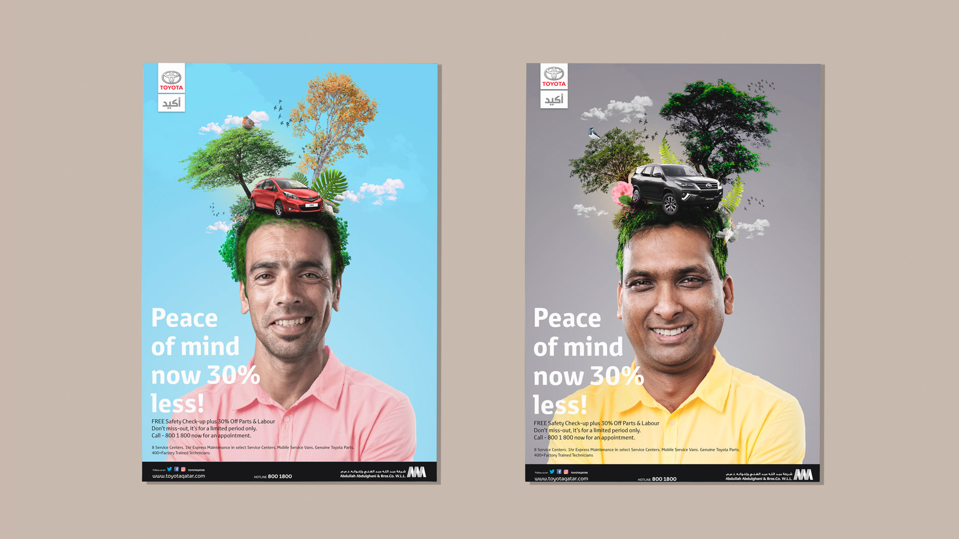
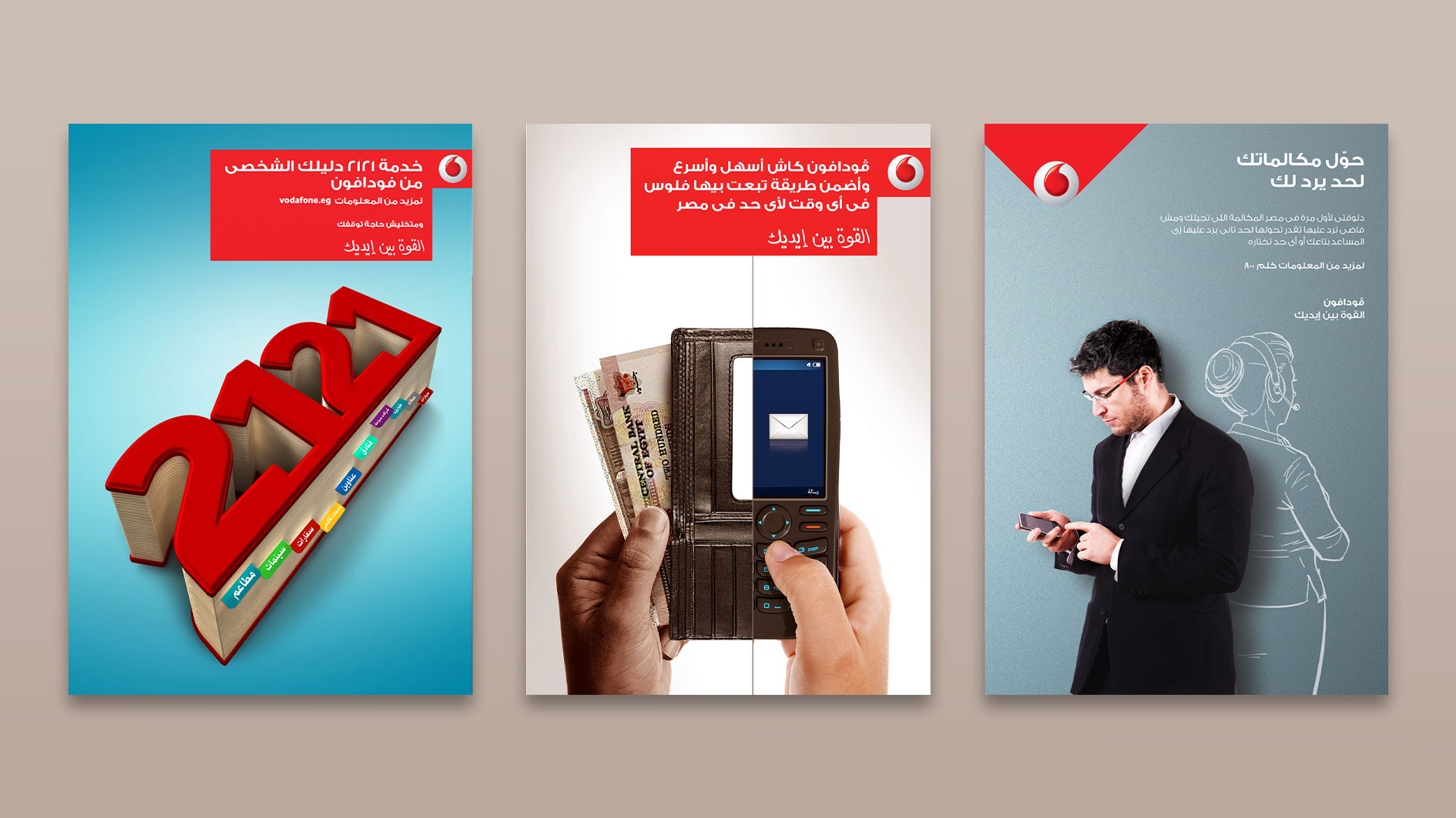
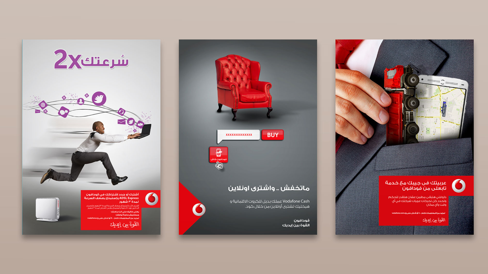
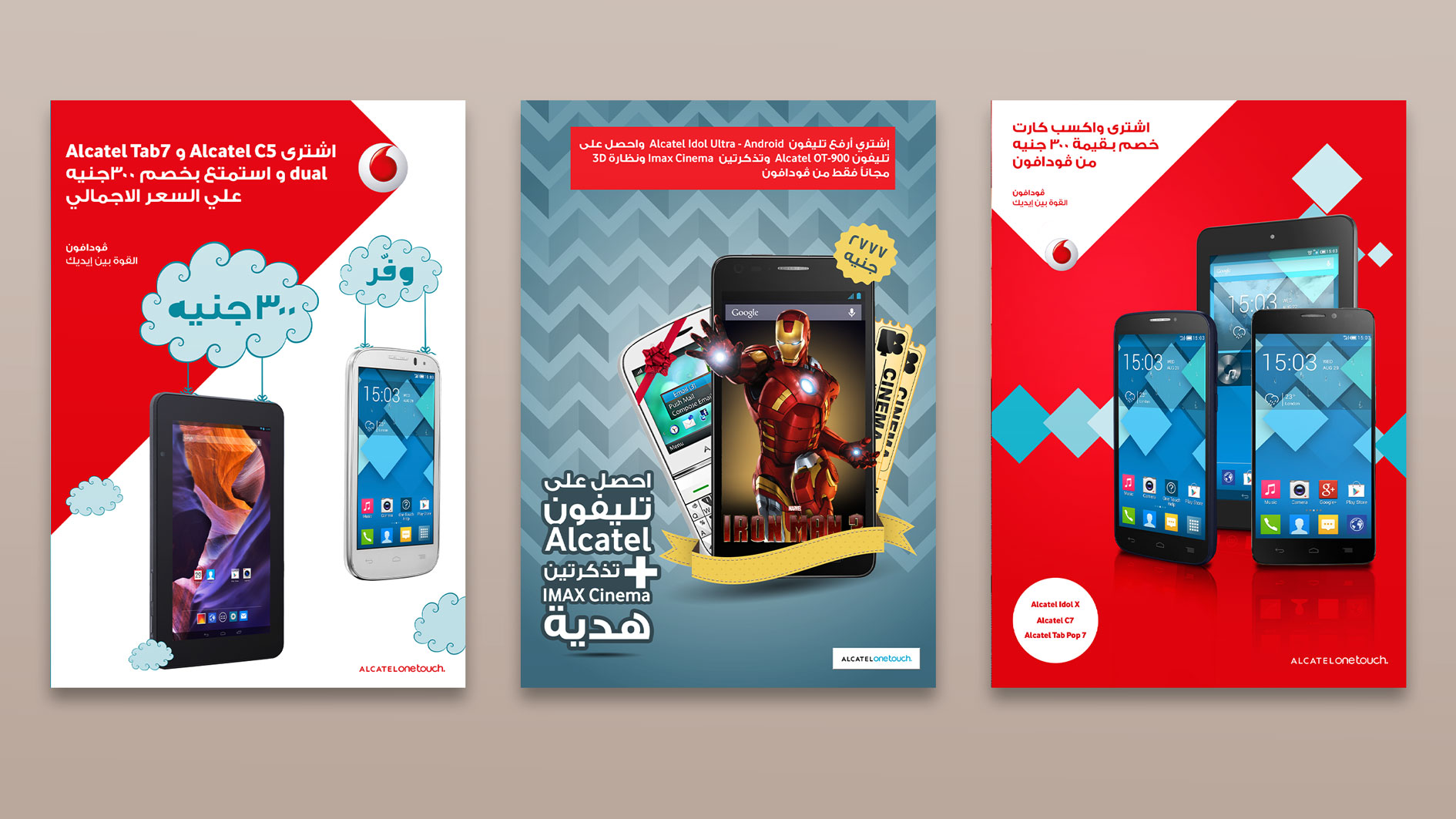
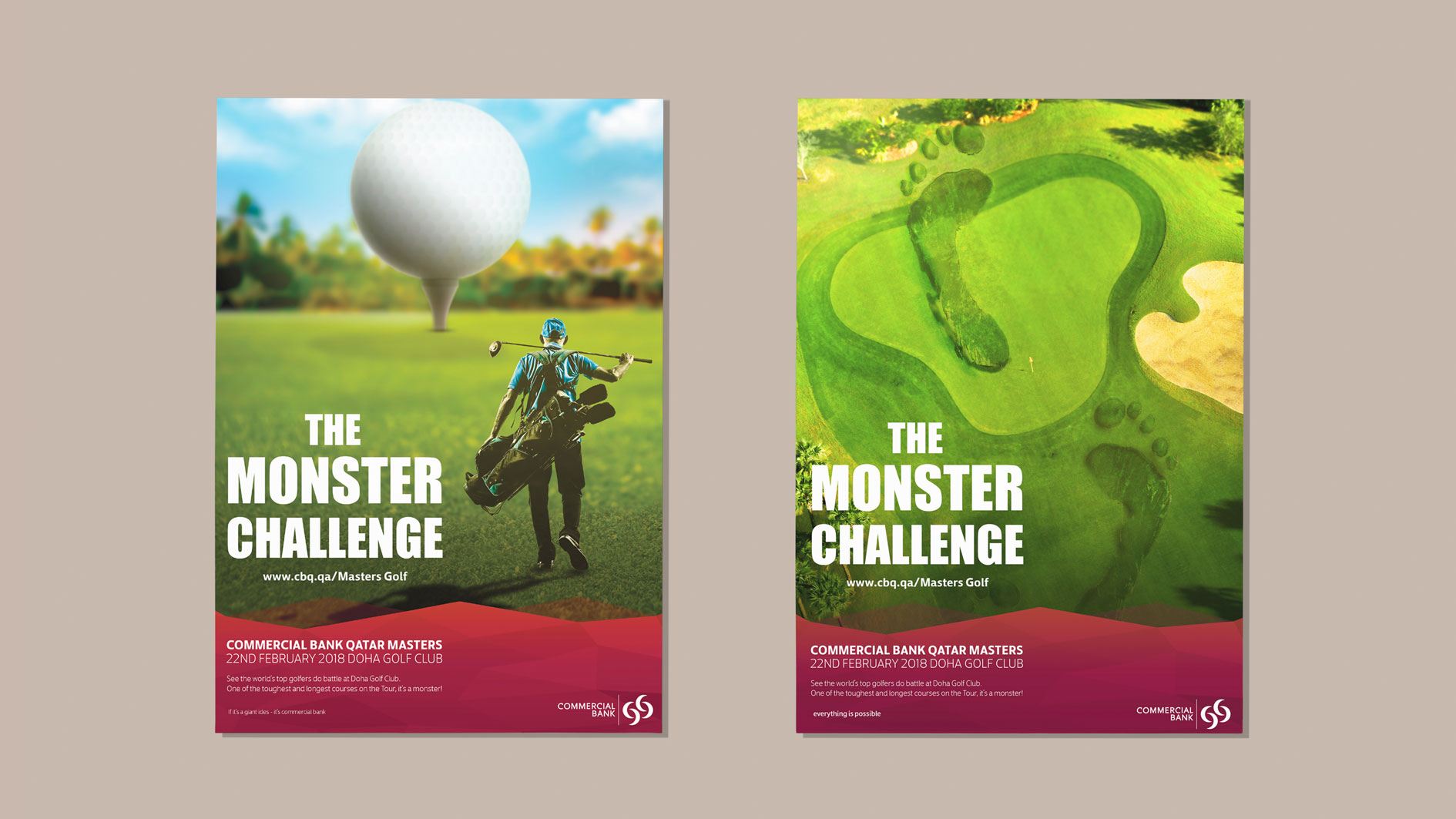
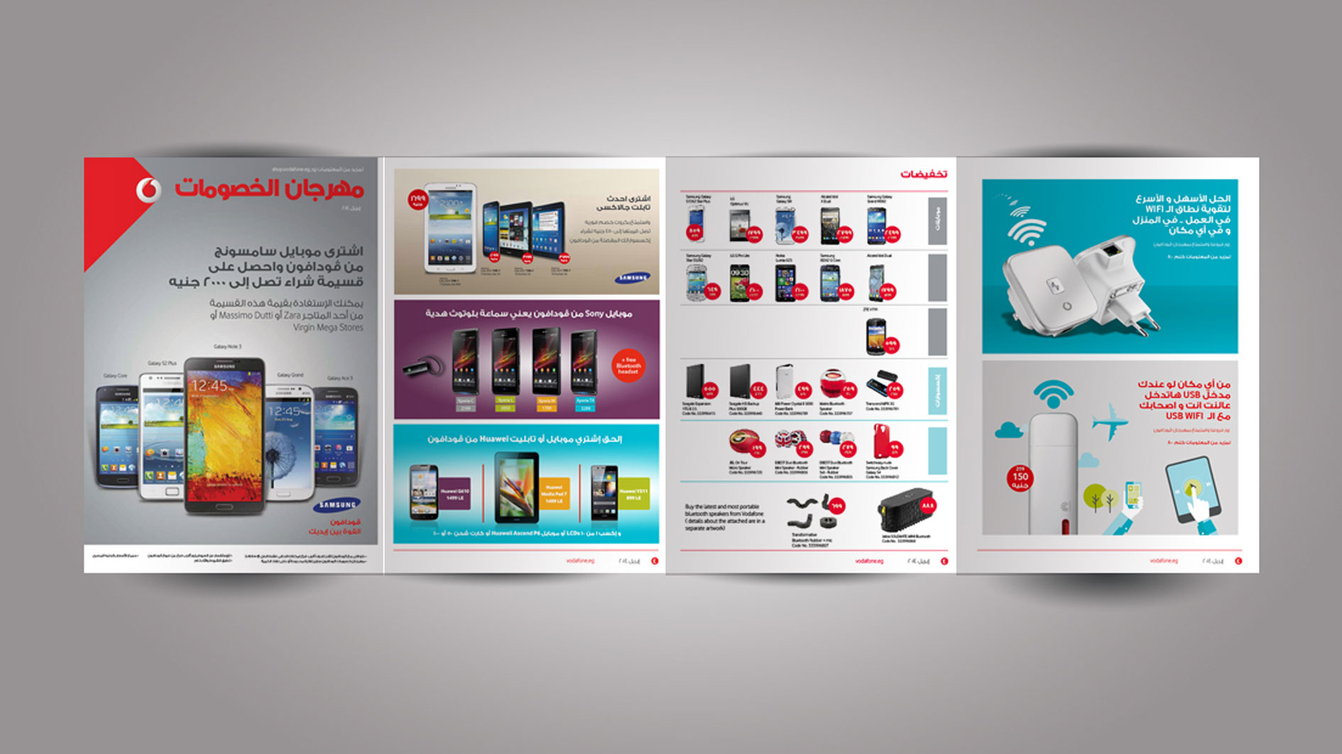
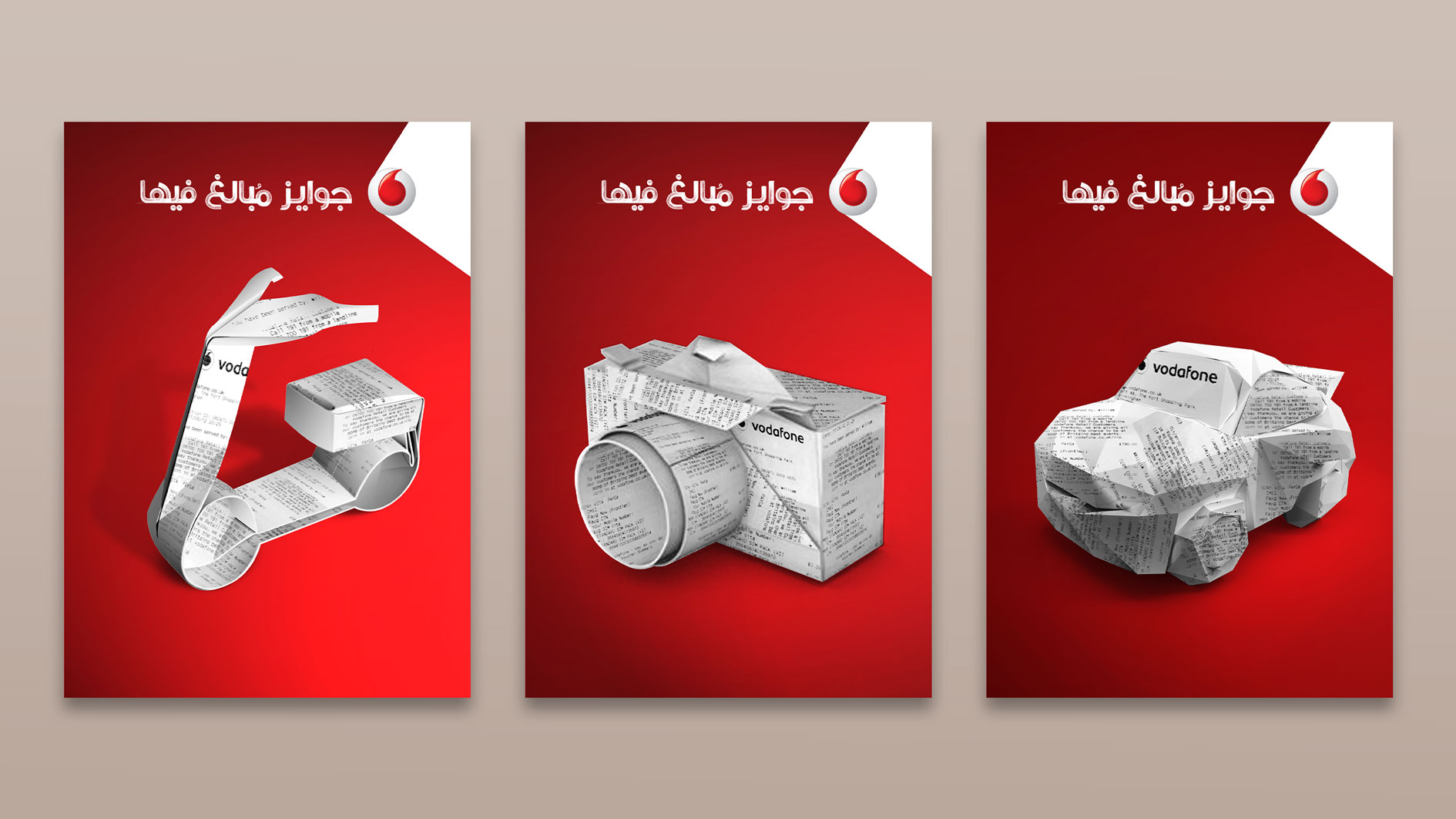
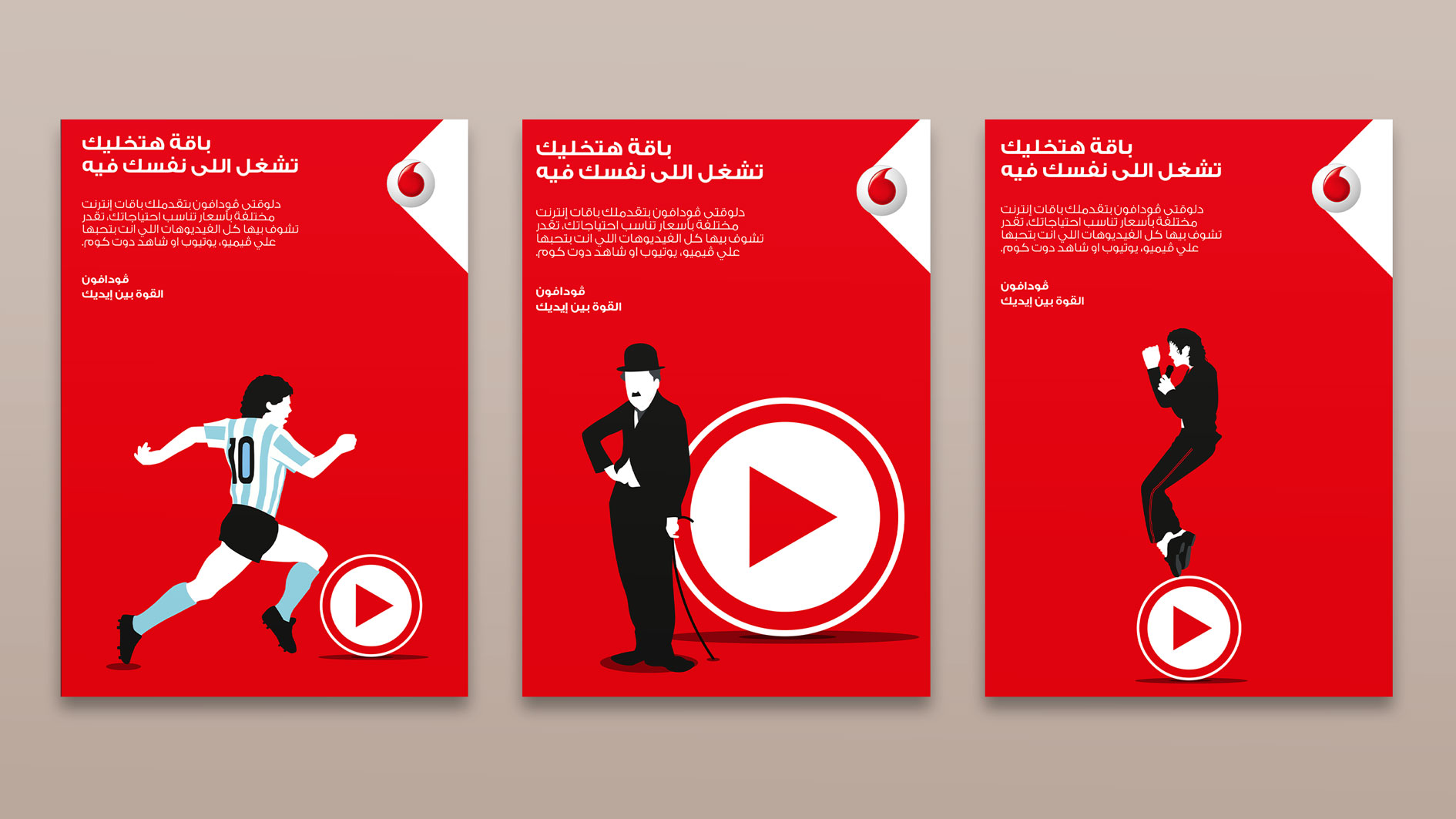
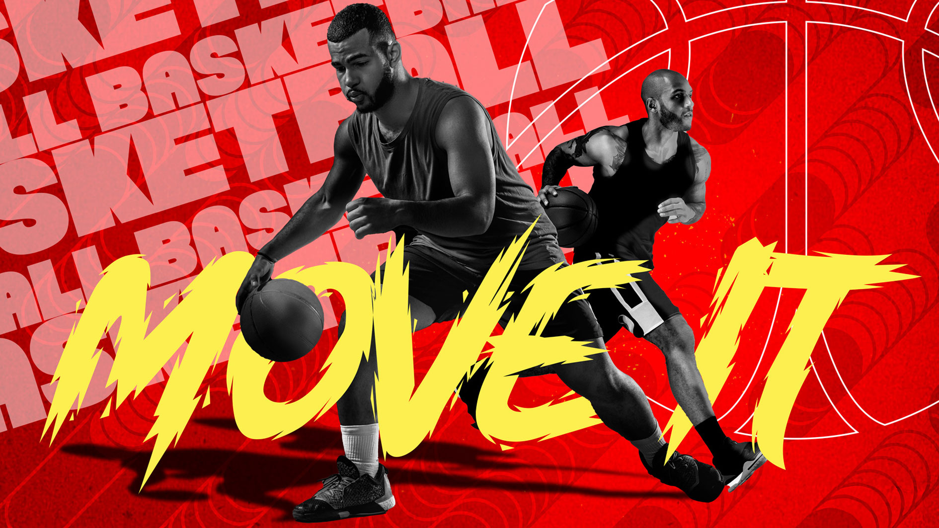
DESCRIPTION
This showcases a collection of key visuals developed across ATL, BTL, retail, and collateral materials. Each piece reflects a strategic approach to communication, ensuring designs are not only visually striking but also tailored to their specific medium and audience.
Midrar LOGO, VISUAL IDENTITY
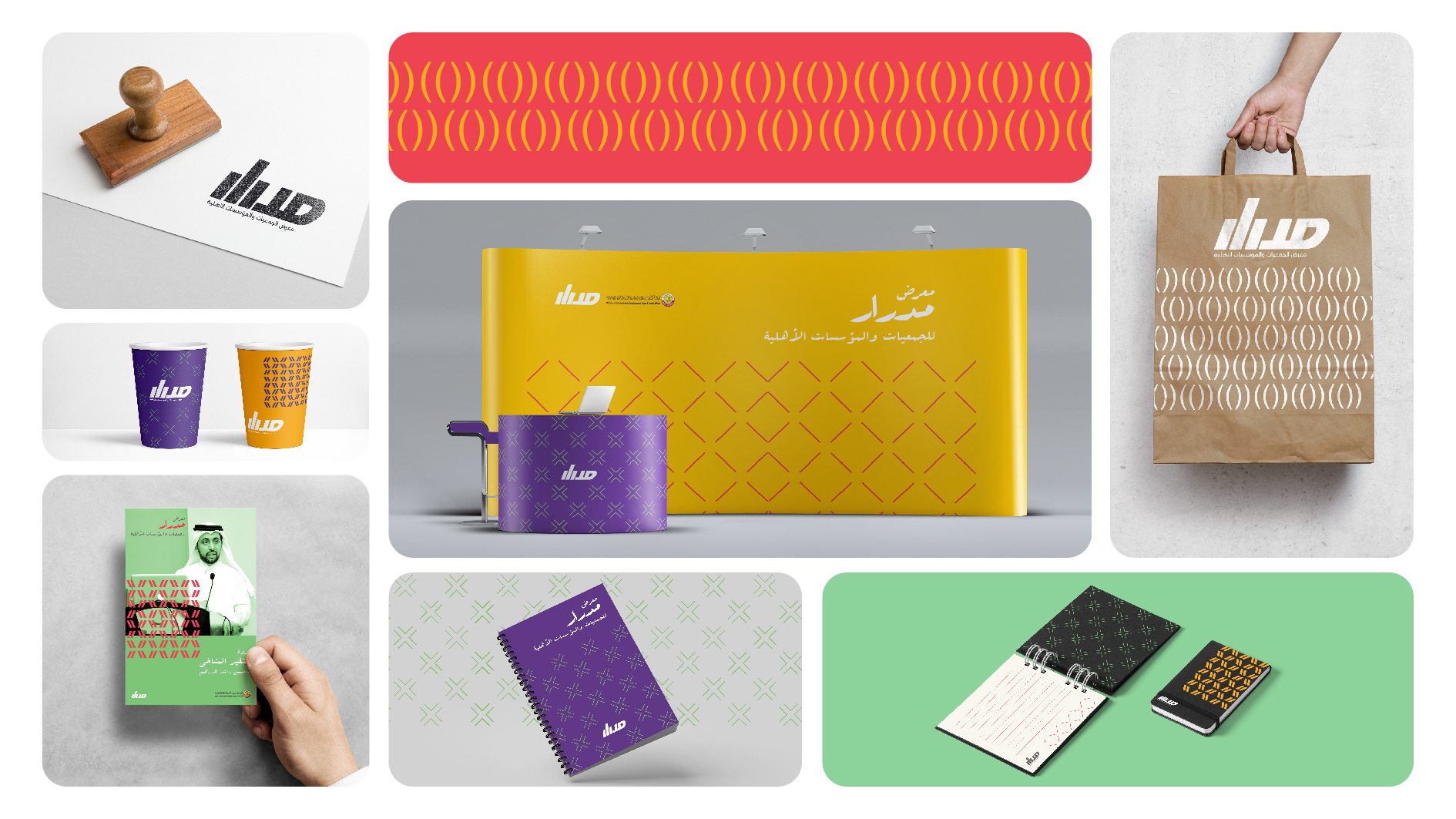
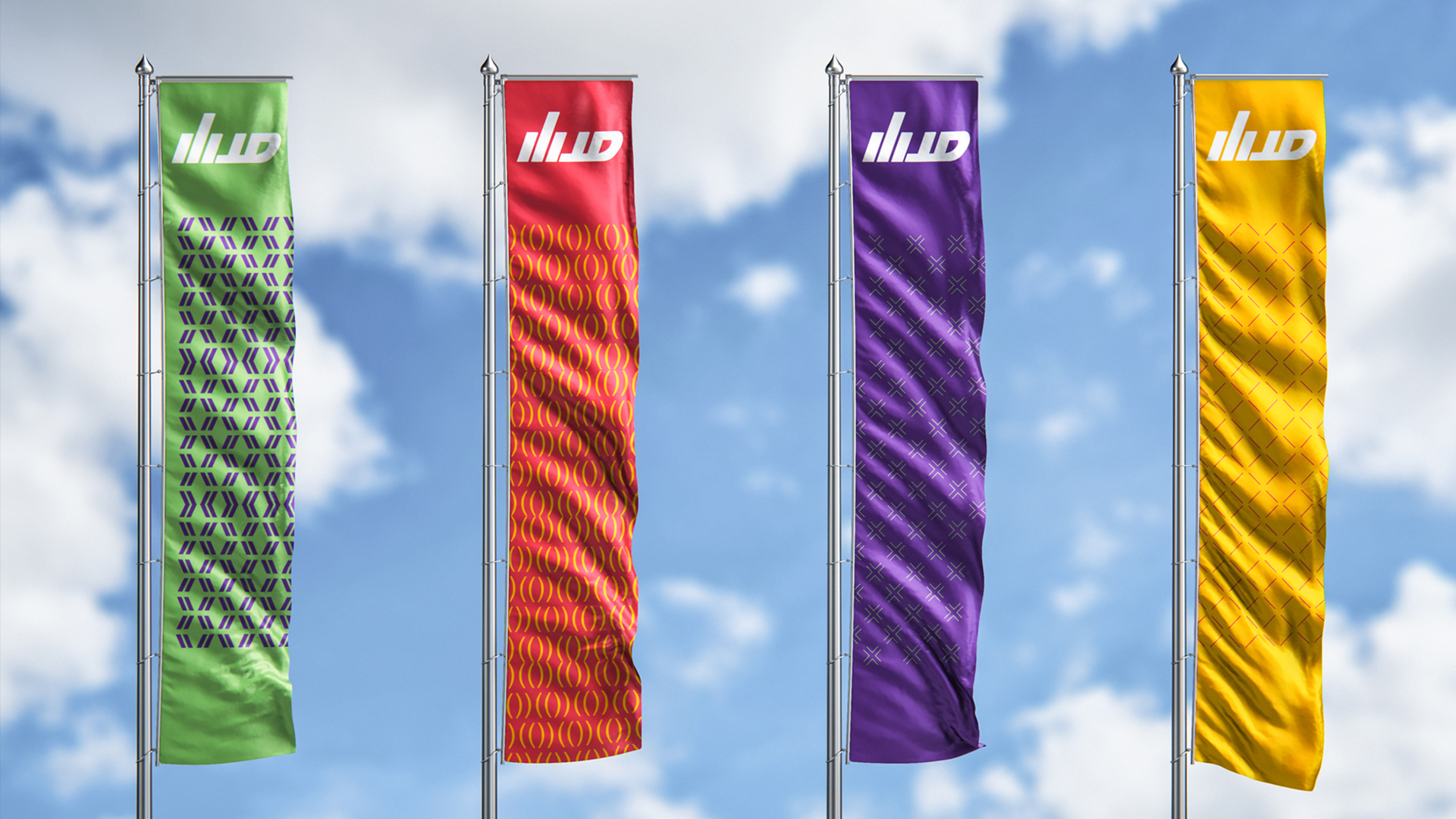
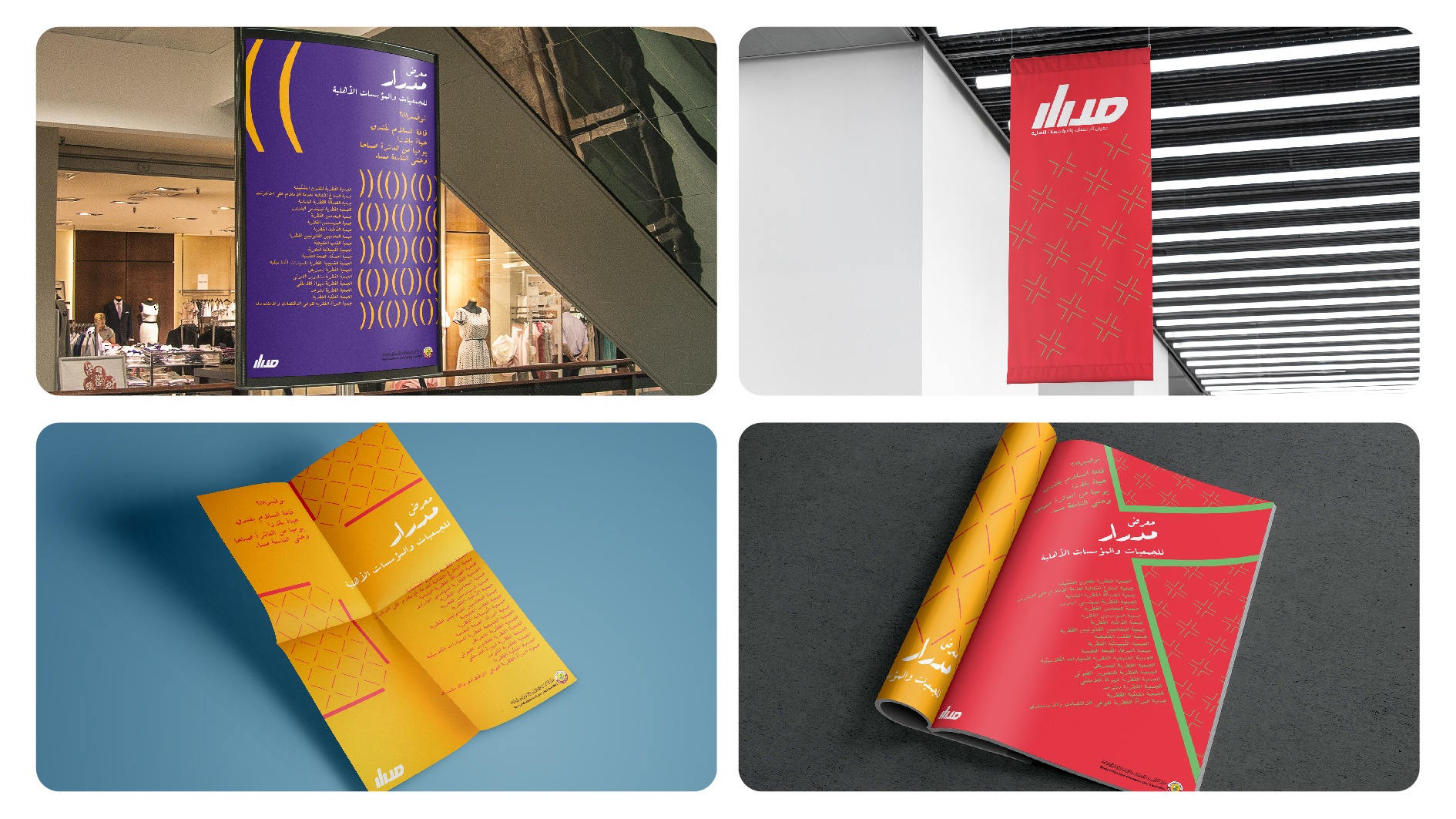
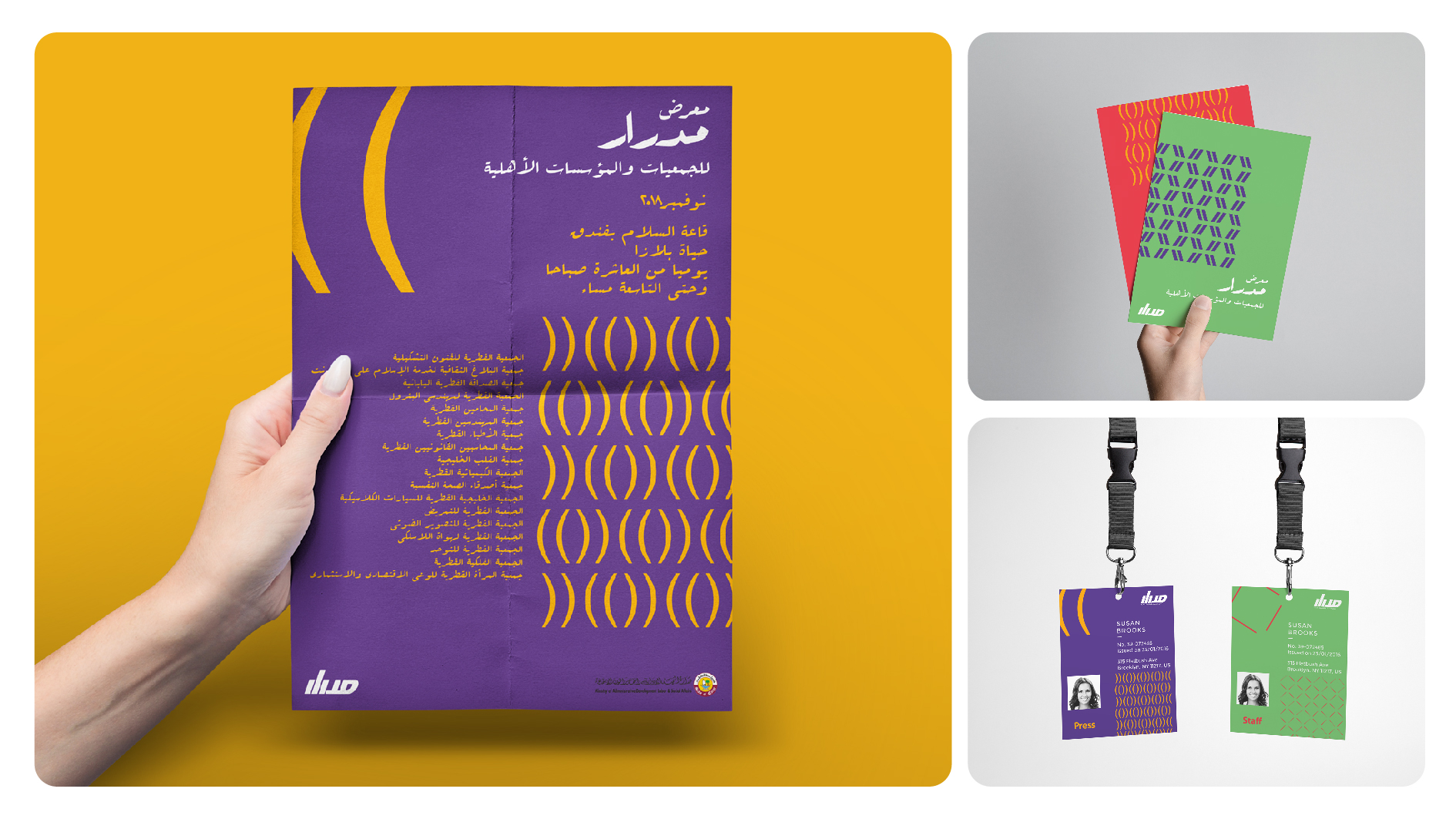
DESCRIPTION
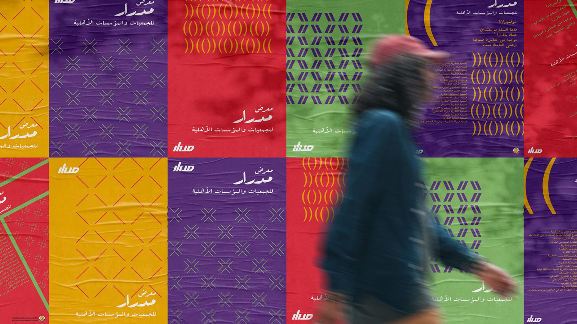
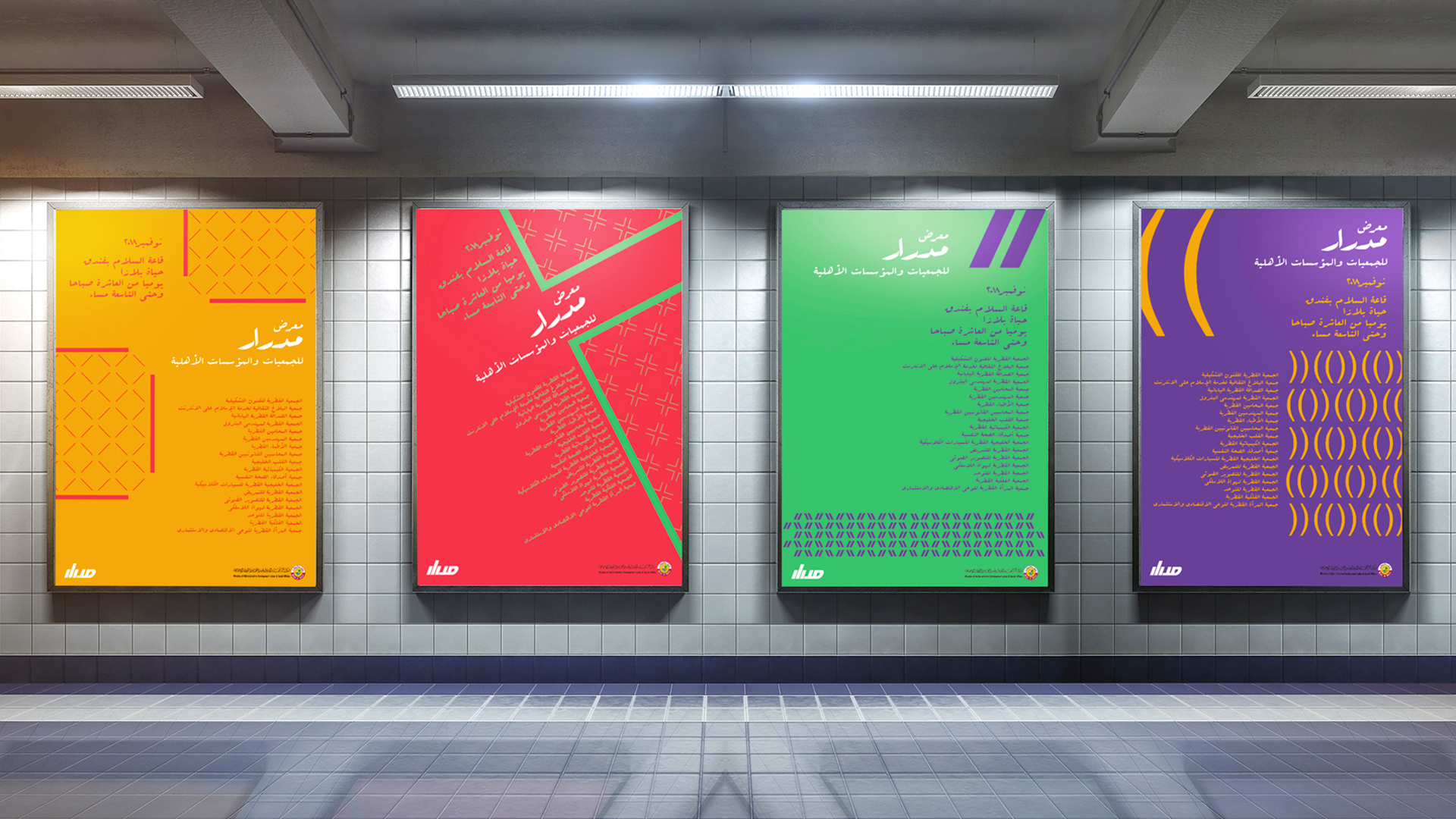
Challenge: Launching an exhibition for NGOs "Meet & Talk" seeks to provide a platform for those interested in Qatar's social development.
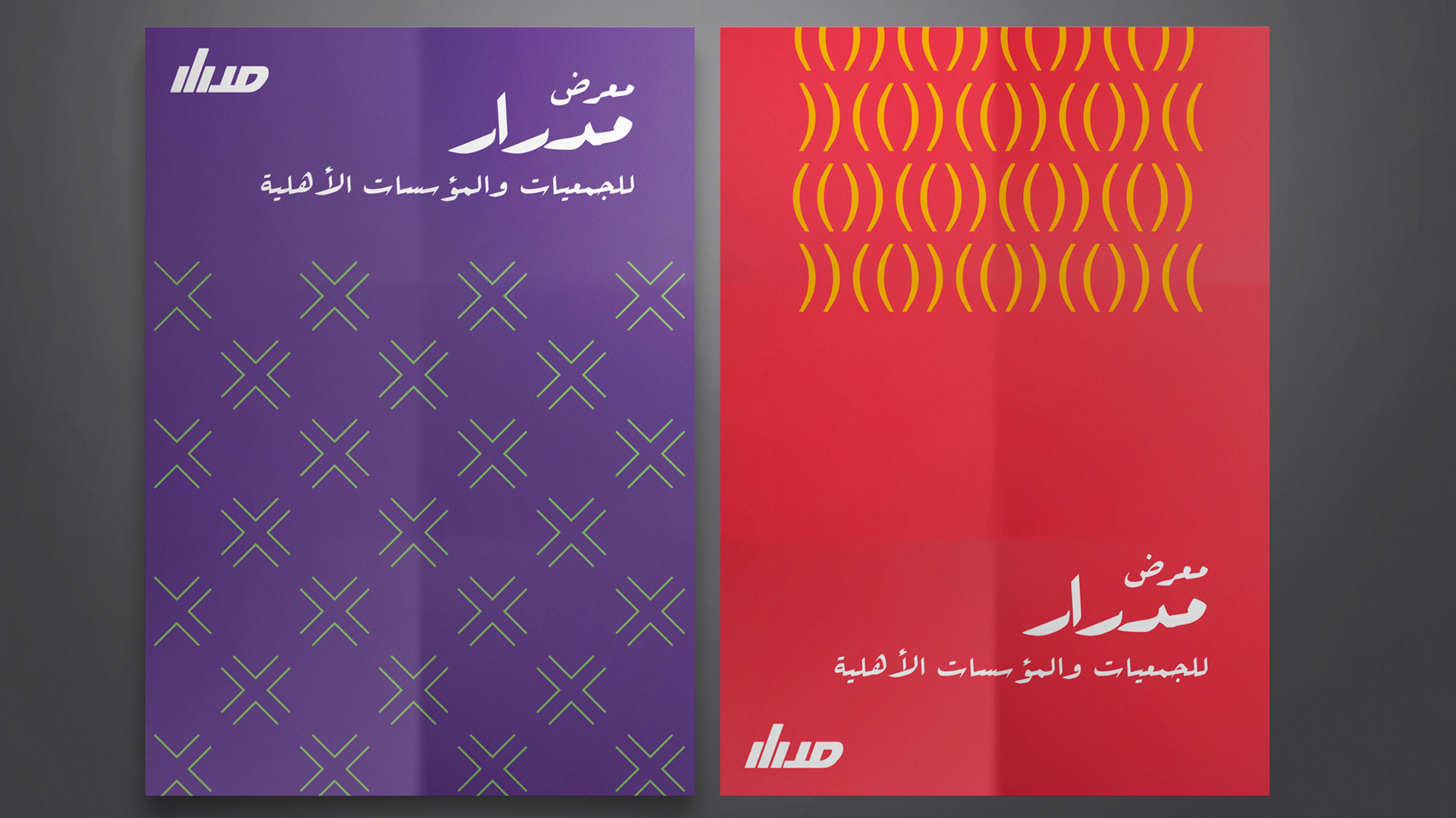
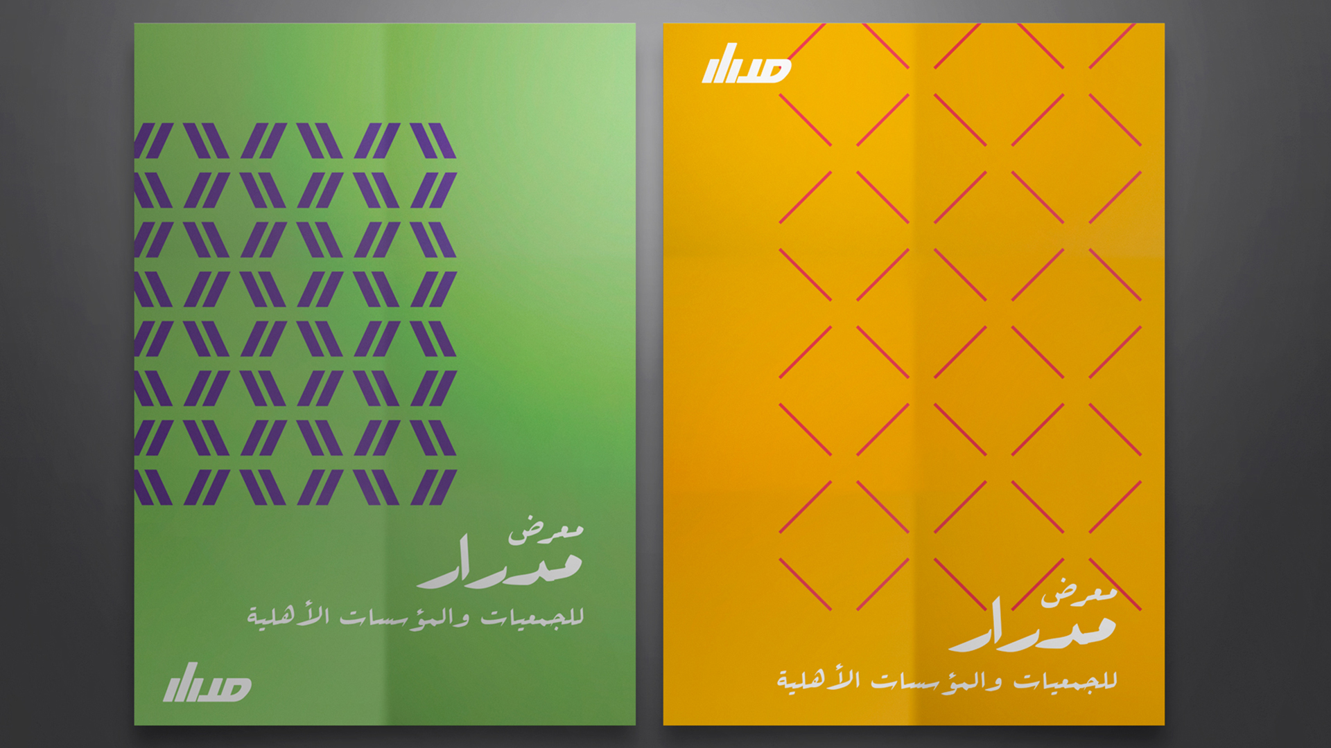
Solution: The name "Midrar" was chosen because it means "Generator" in Arabic, symbolizing how continuous meetings and discussions fuel development in the country.
Patterns inspired by Arabic quotation marks were created in four diverse colors to represent society. These were used to craft four key visuals and communication materials for the Midrar exhibition, ensuring cohesive branding across all materials.
A Time Traveller CAMPAIGN DESIGN
DESCRIPTION
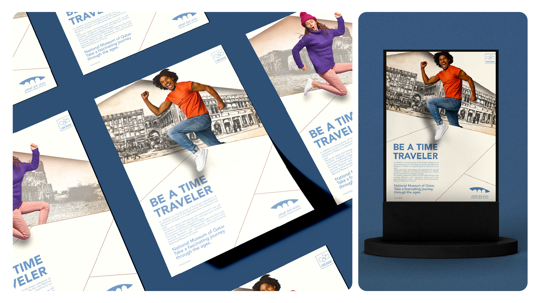
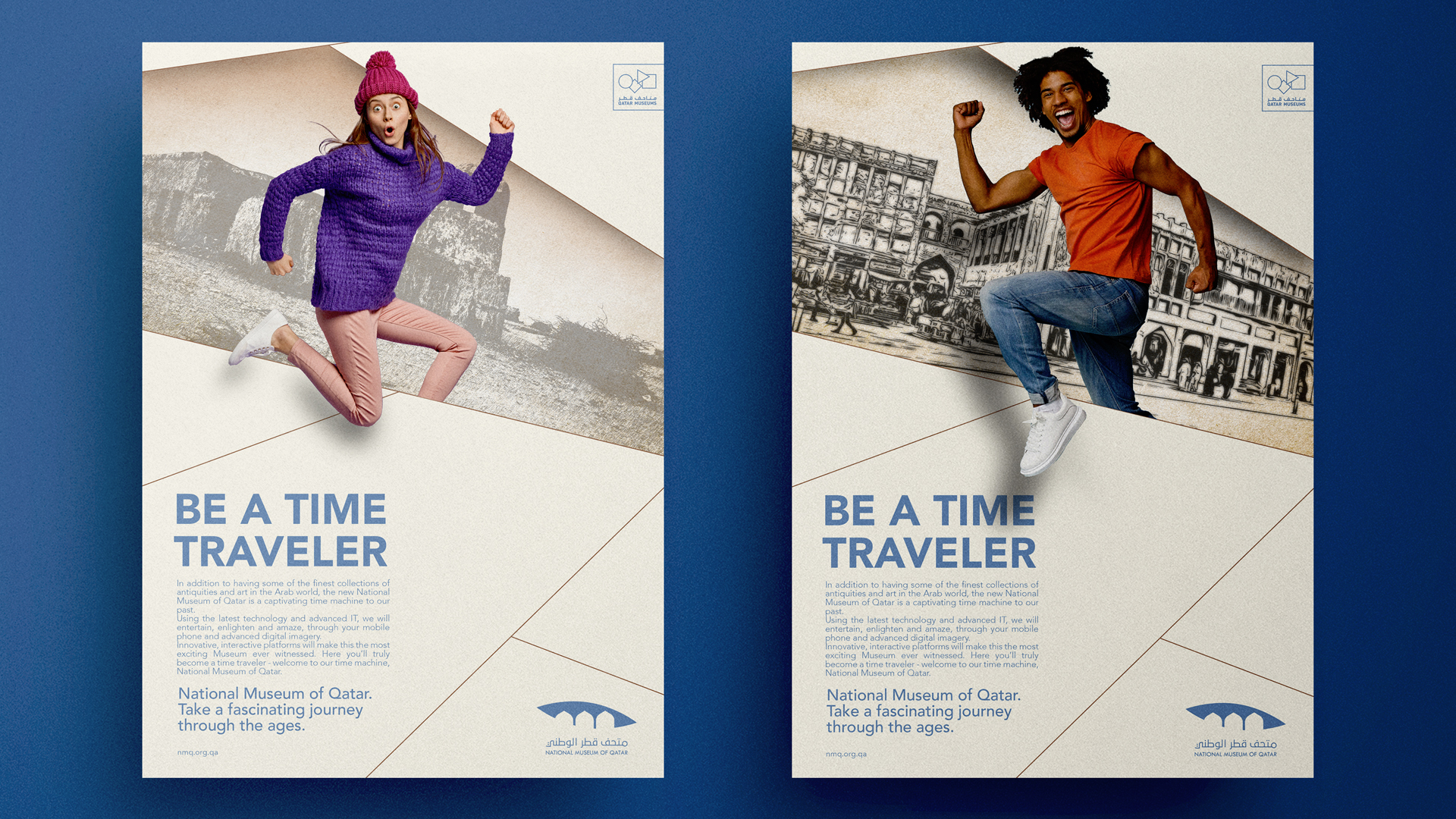
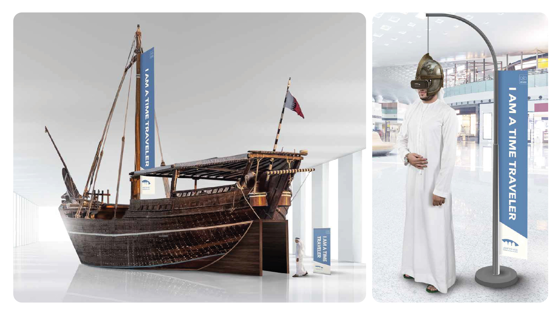
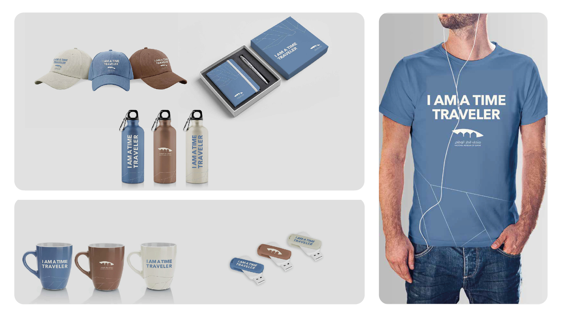
Challenge: The National Museum of Qatar offers more than the typical museum experience. Its vision is to create an immersive journey through innovation and technology, aiming to generate excitement and local buzz for its grand opening.
Solution: This concept emphasizes the museum's advanced nature and pioneering vision, sparking excitement and curiosity about our past, present, and future. The idea is that everyone who enters the museum becomes a time traveler, viewing the past from the future.
World's Hardest Puzzle SOCIAL MEDIA CAMPAIGN
DESCRIPTION
www.dementia.org.au
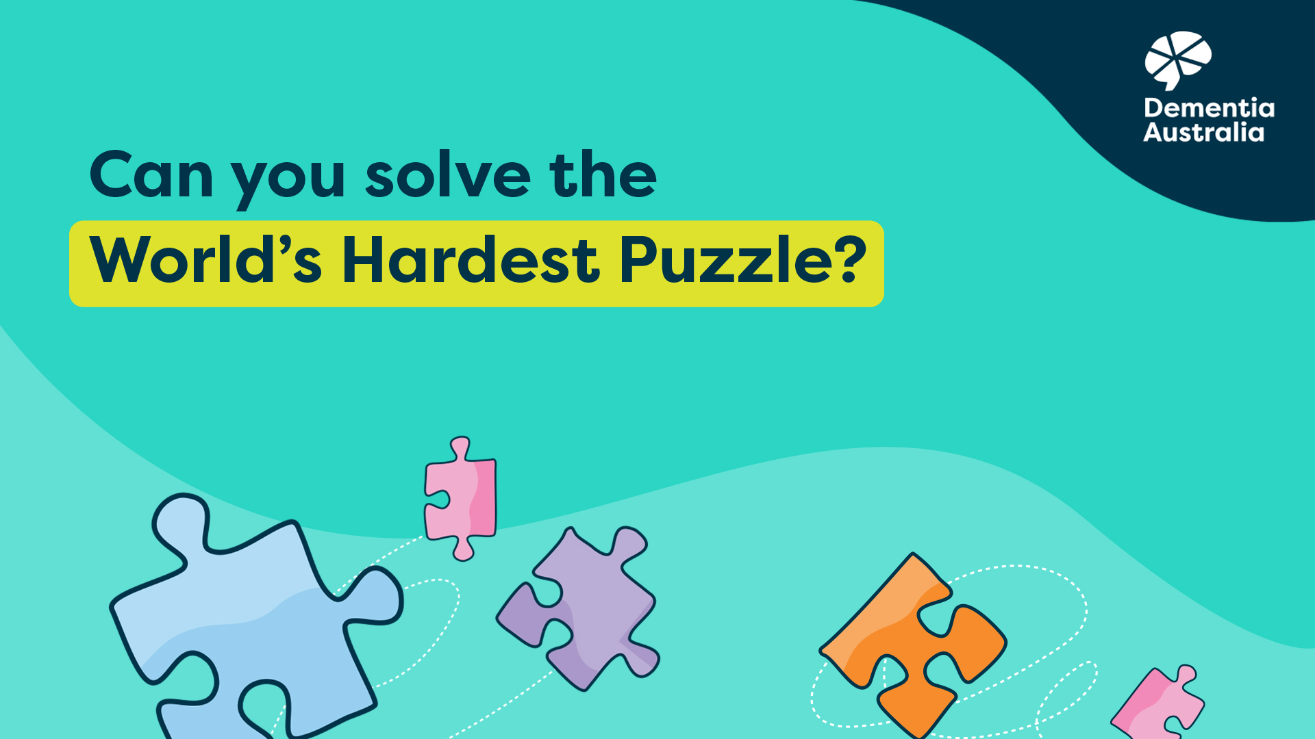
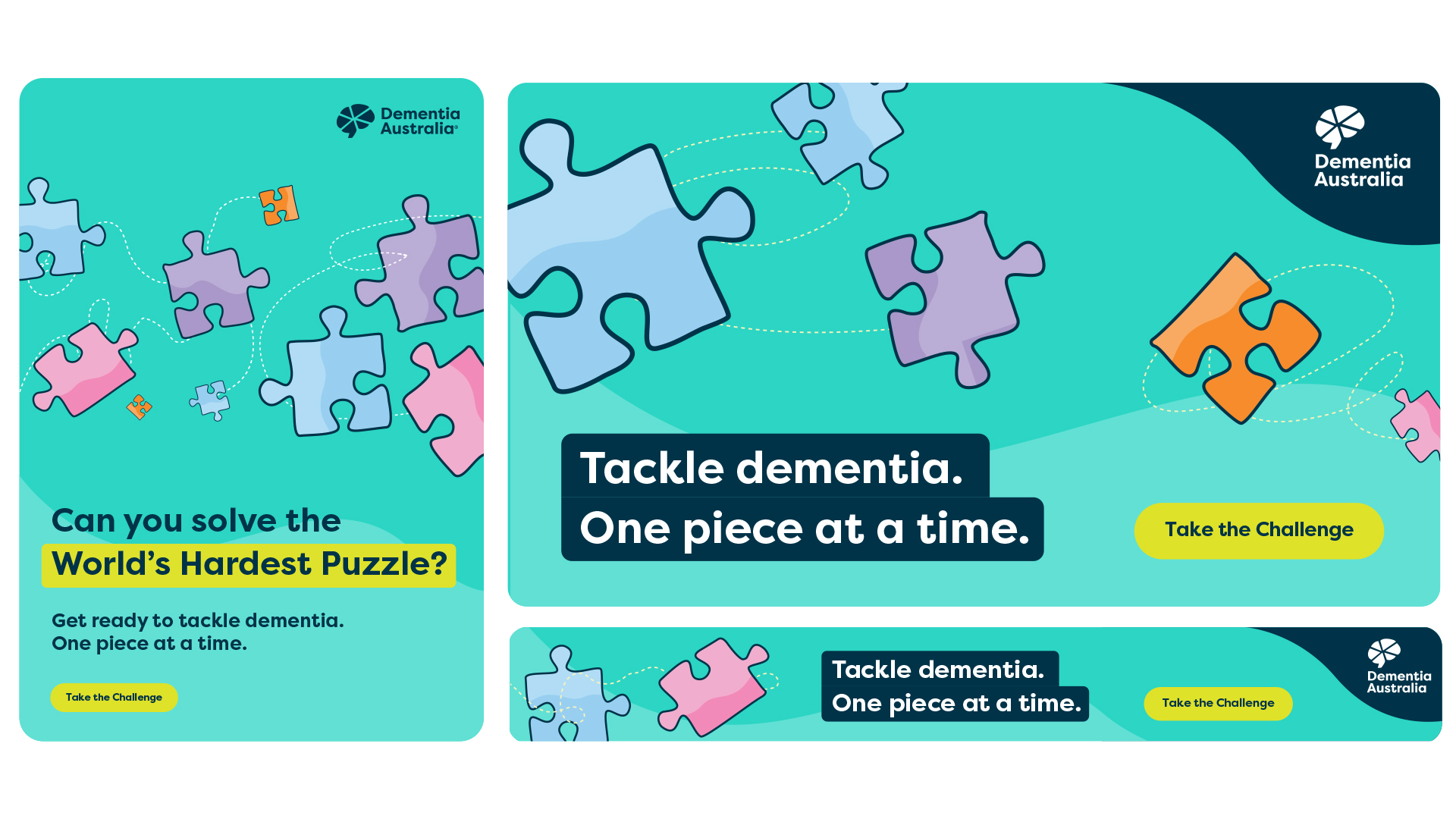
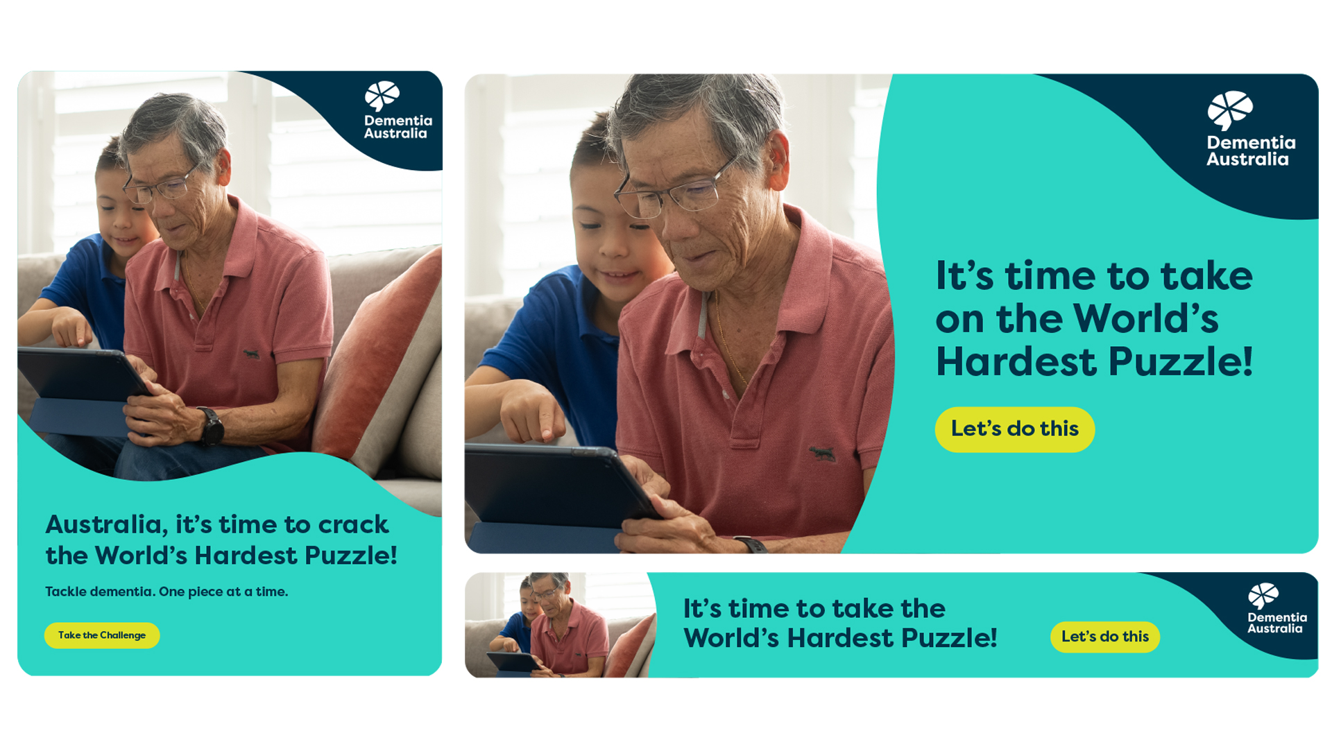
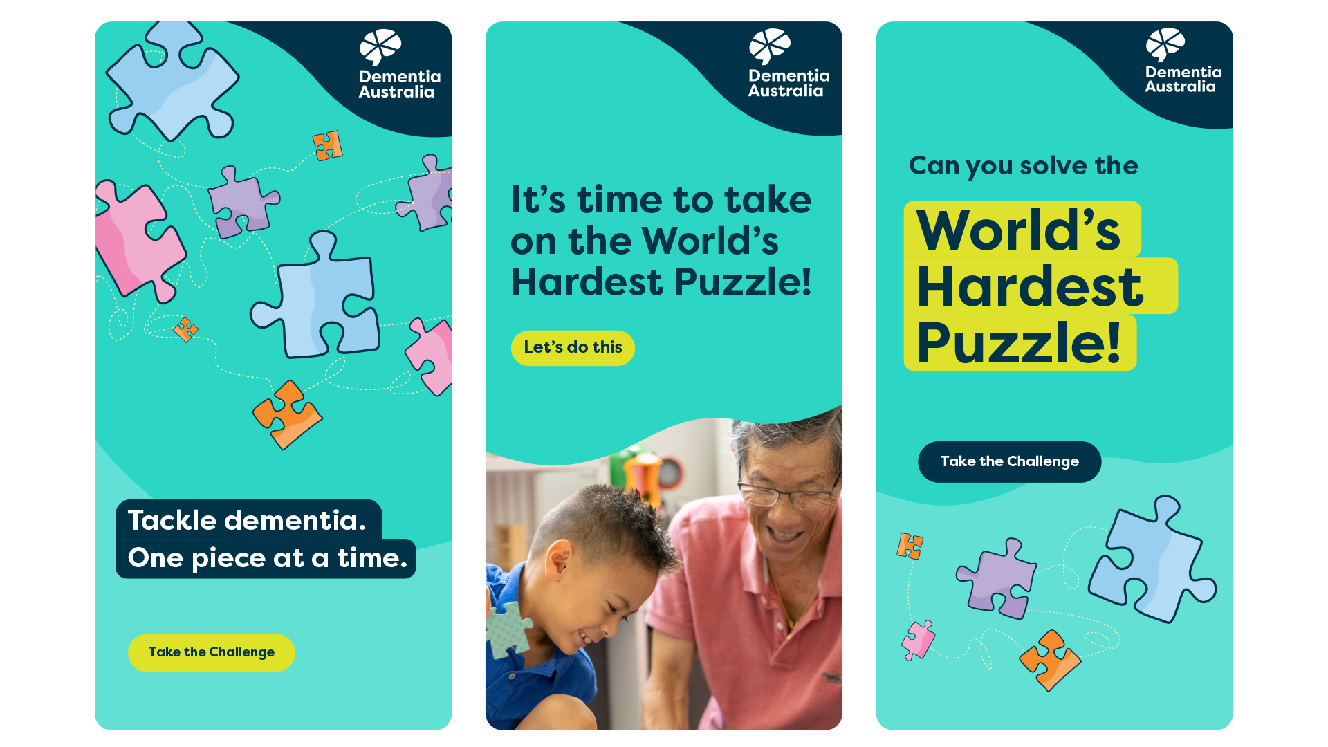
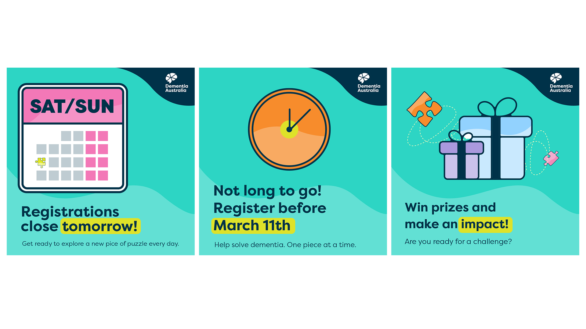
A social campaign by Dementia Australia aims to engage people with an online puzzle game to raise awareness about dementia and raise funds to support individuals affected by the condition.
DI_EGY 2 CAMPAIGN DESIGN
DESCRIPTION
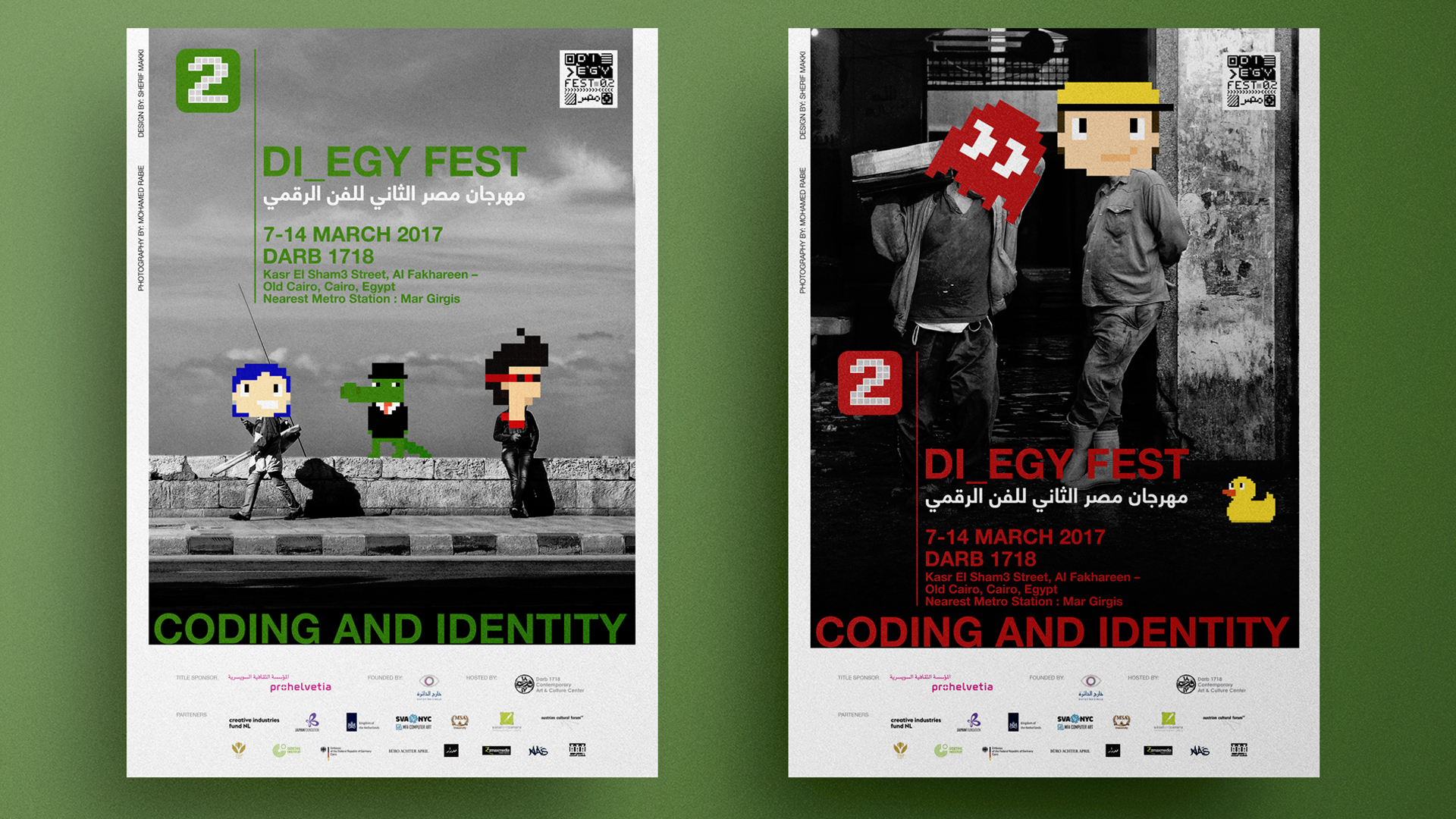
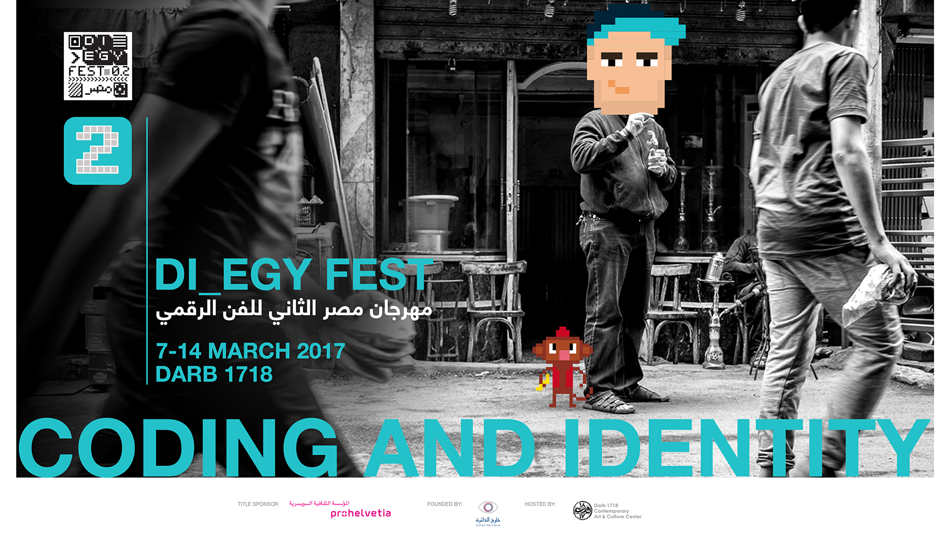
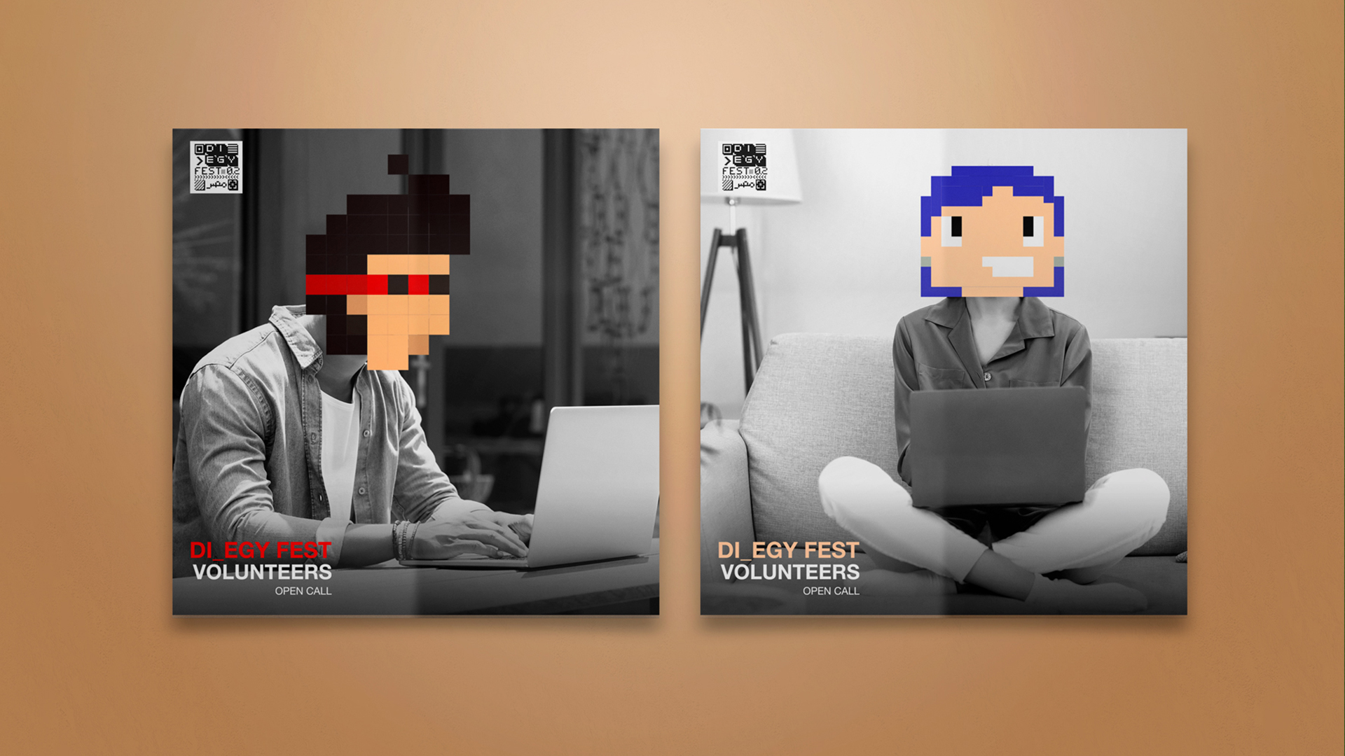
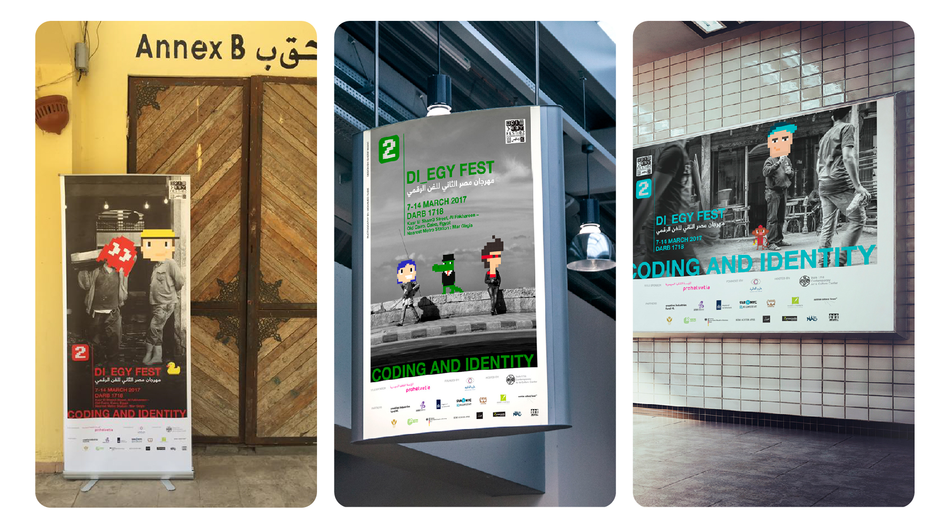
Coding is an integral part of Egyptians' daily lives, extending beyond digital realms. For instance, a coffee shop cashier might exchange money for color-coded plastic coins, each representing a different drink. These simple coding behaviors are prevalent throughout the city and reflect the people’s identities. To convey this, I used street photography by Mohamed Rabee and integrated pixel digital illustrations to bring the concept to life.
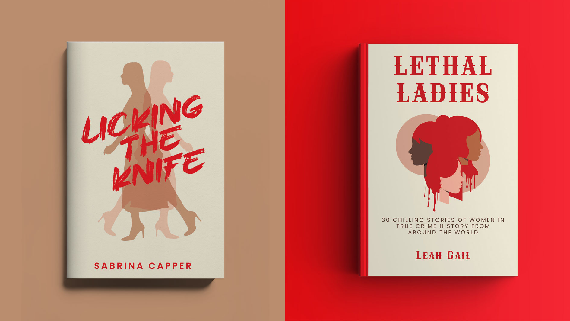
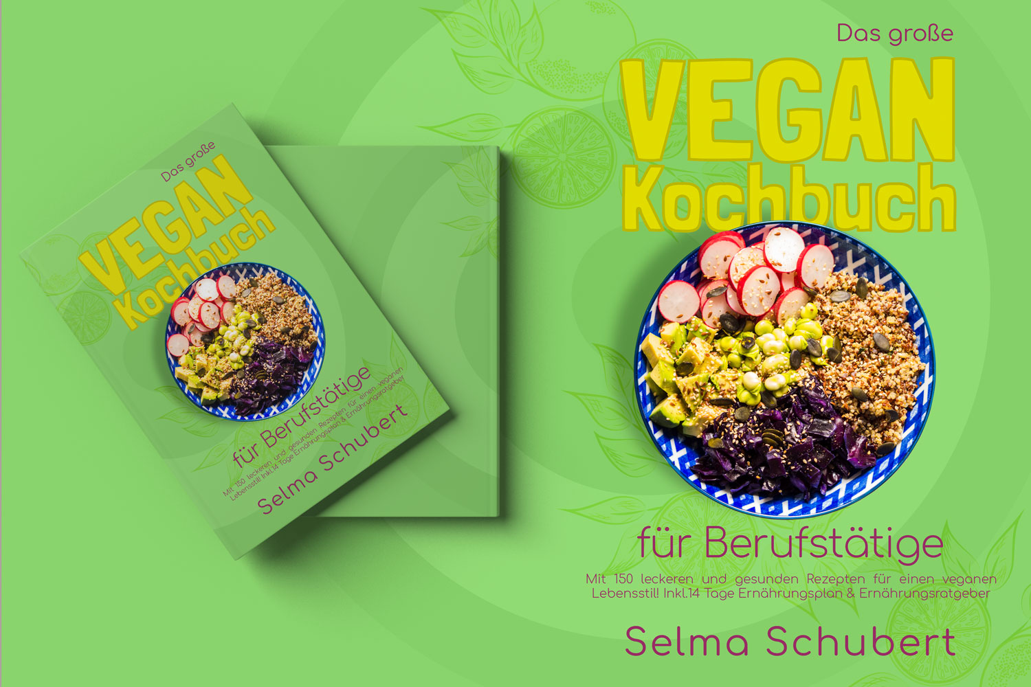
Book Covers
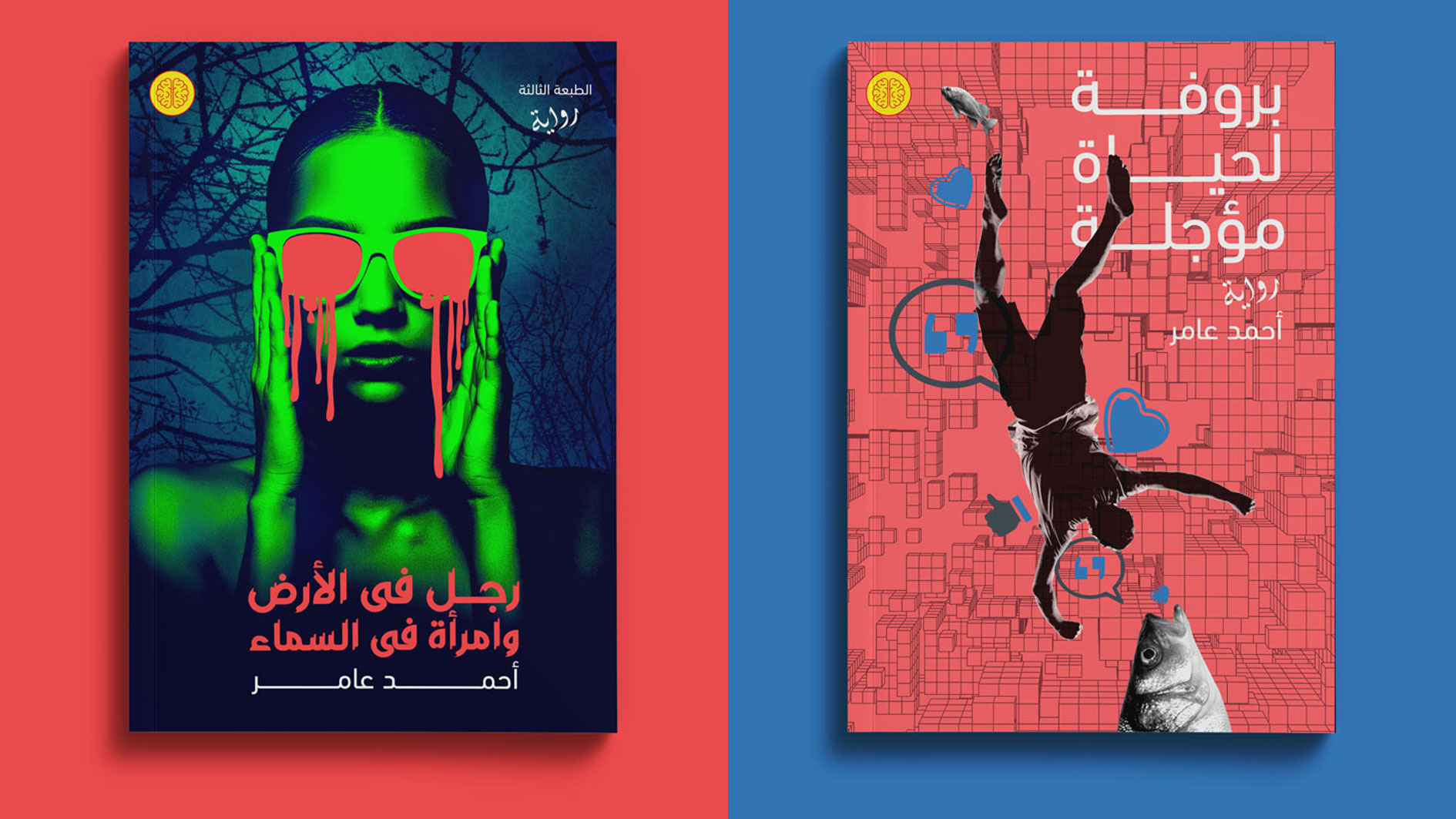
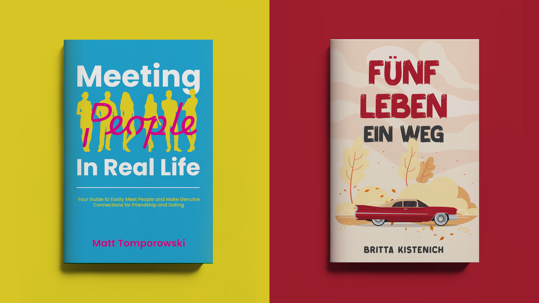
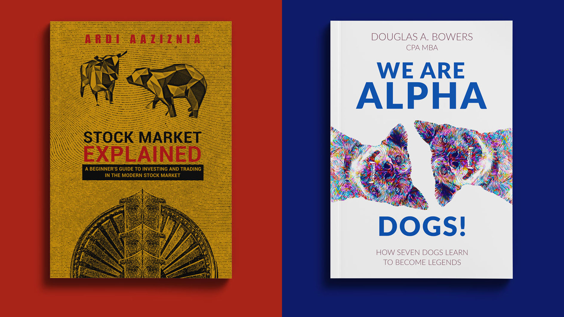
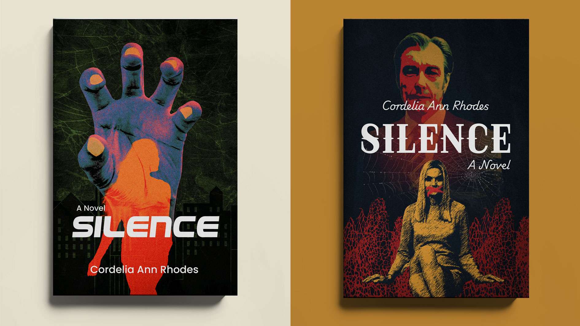
DESCRIPTION
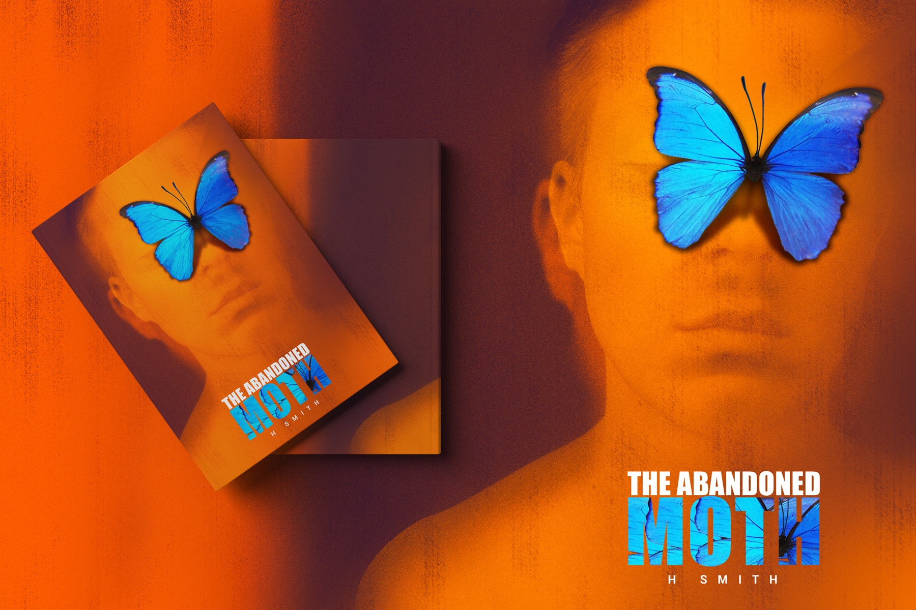
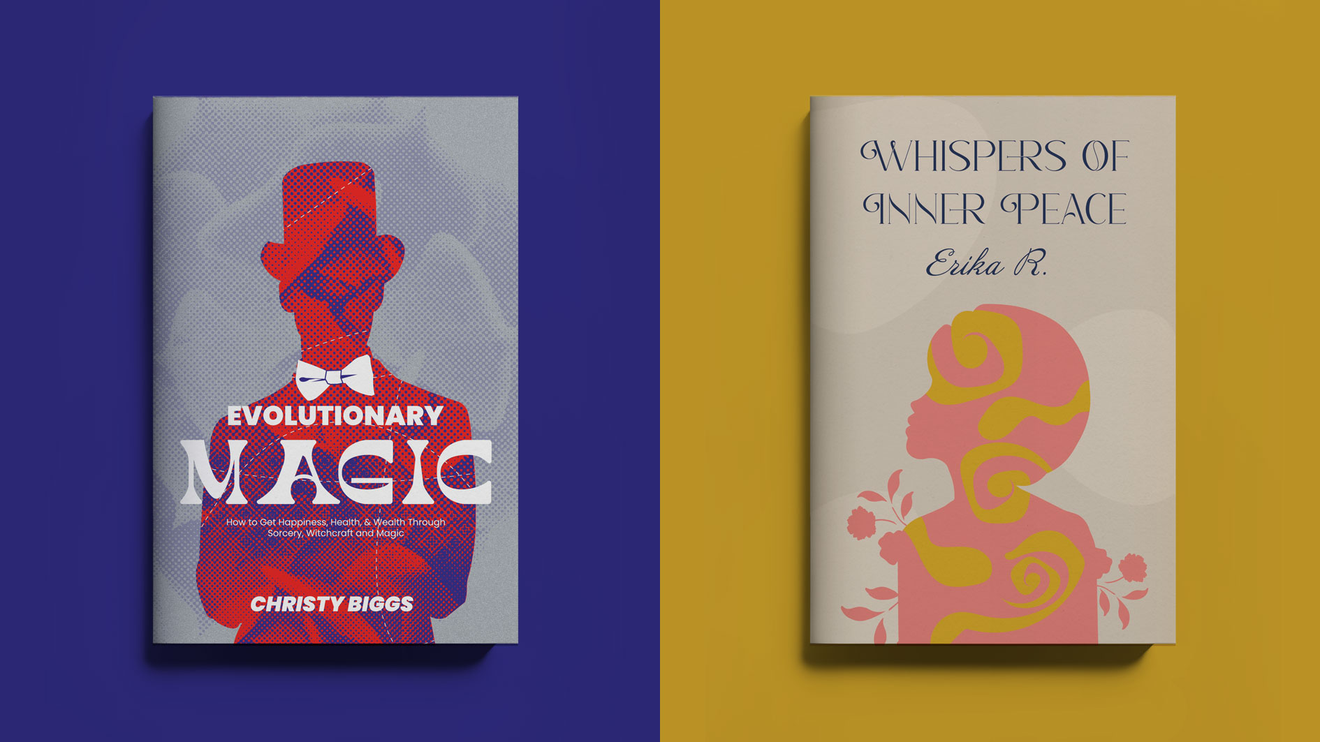
A variety of Book Cover design
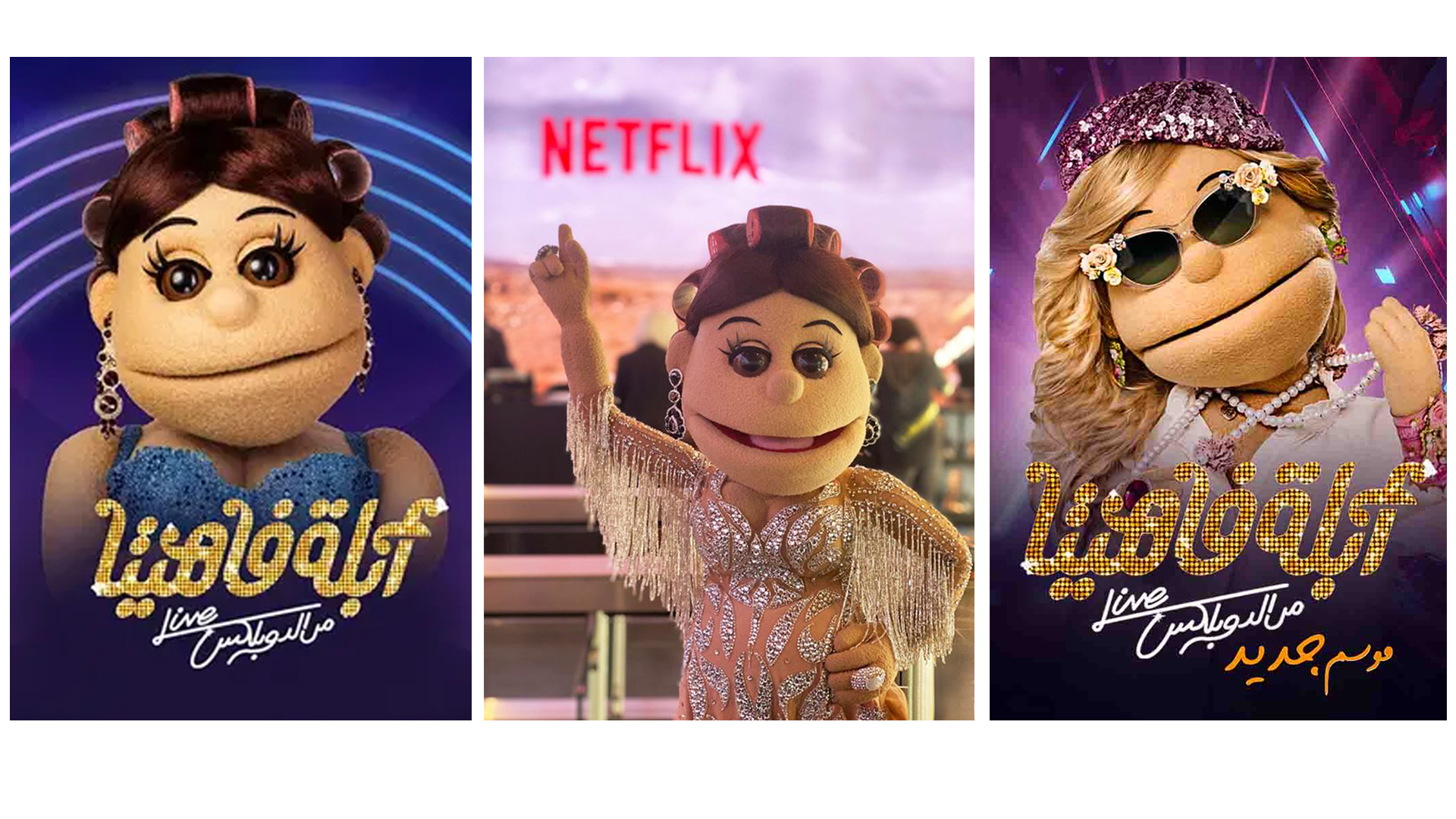
Abla Fahita
DESCRIPTION
Awards:
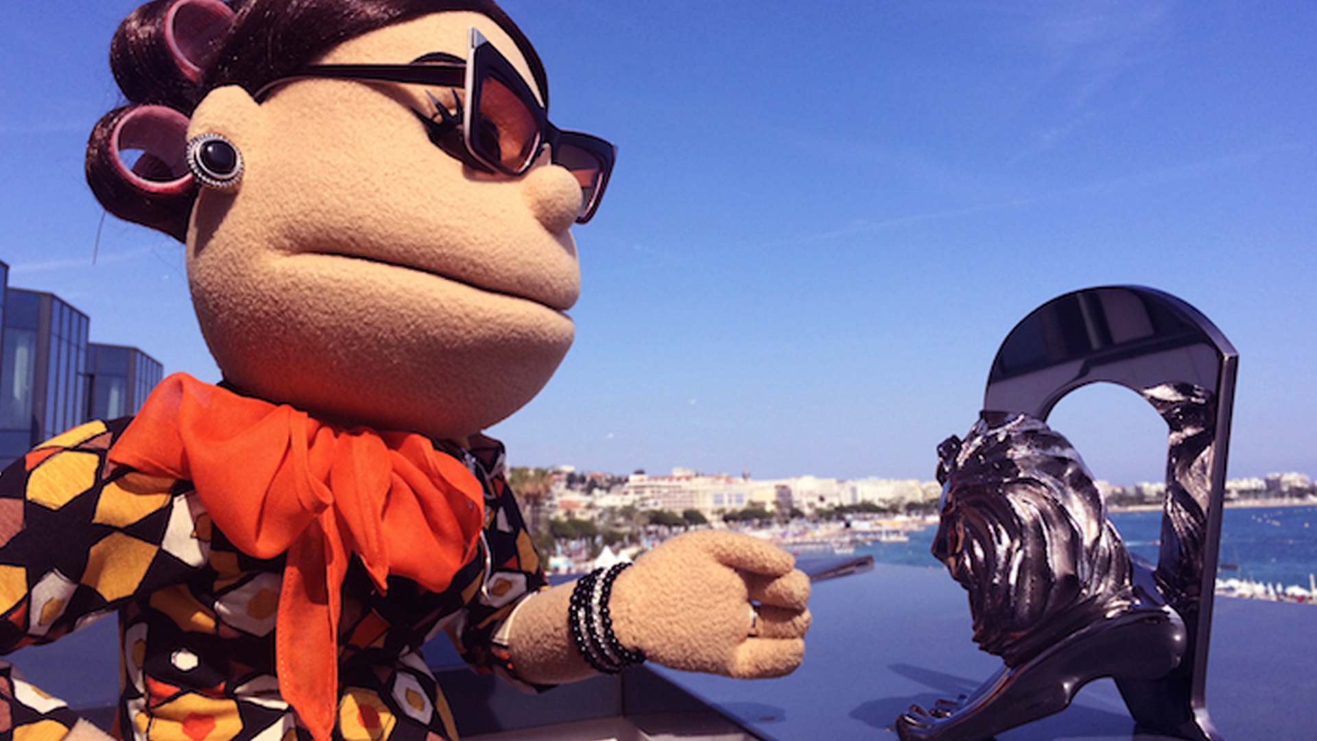
Cannes Lions, 2015 TITANIUM AND INTEGRATED TITANIUM
Brand: CBC
Media: Online
Agency: JWT, Cairo, Egypt
Category: TV/Radio Programs & Stations
Released: April 2015
She is an Egyptian satirical puppet character introduced online in 2010. She became famous on "Al Bernameg" with Bassem Youssef and launched her own show in 2014. Known for her sharp tongue and controversial humor, she is a beloved figure despite mixed reactions.
Thi is Egypt
DESCRIPTION
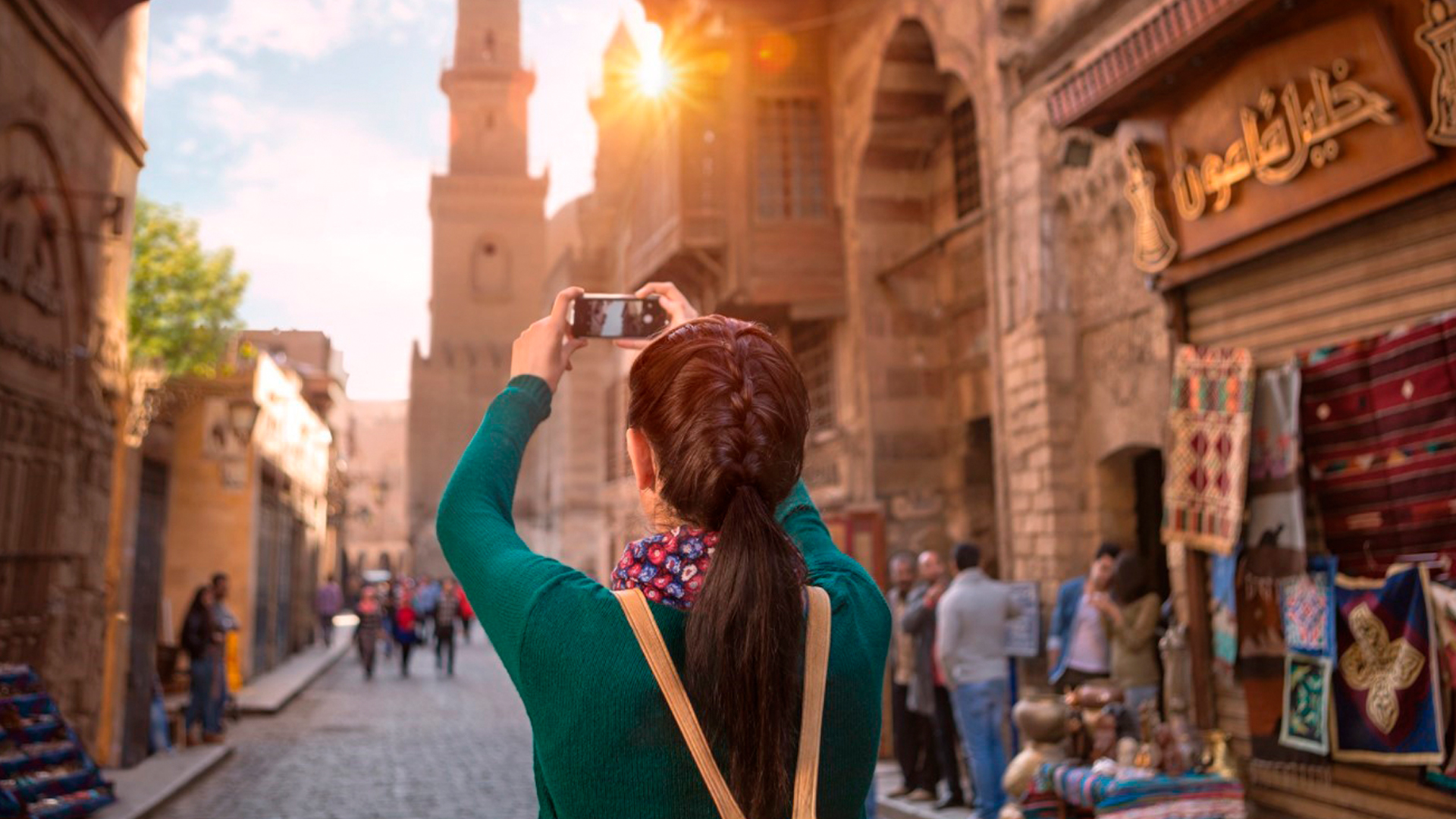
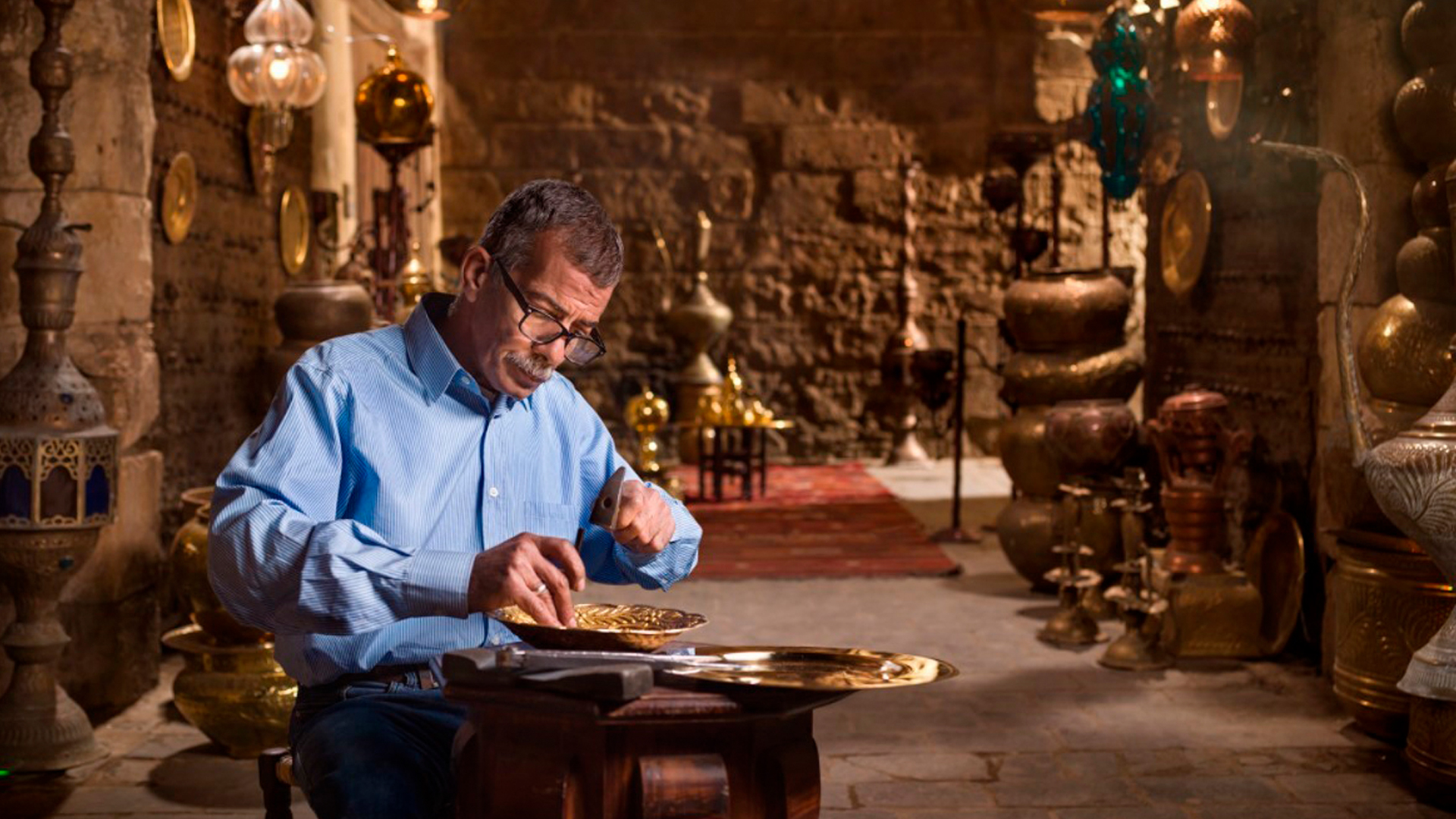
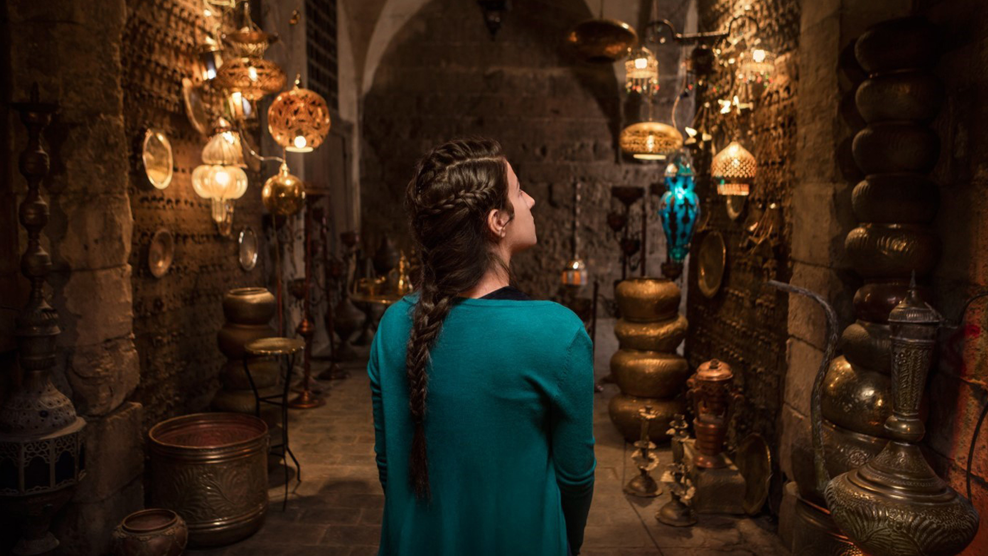
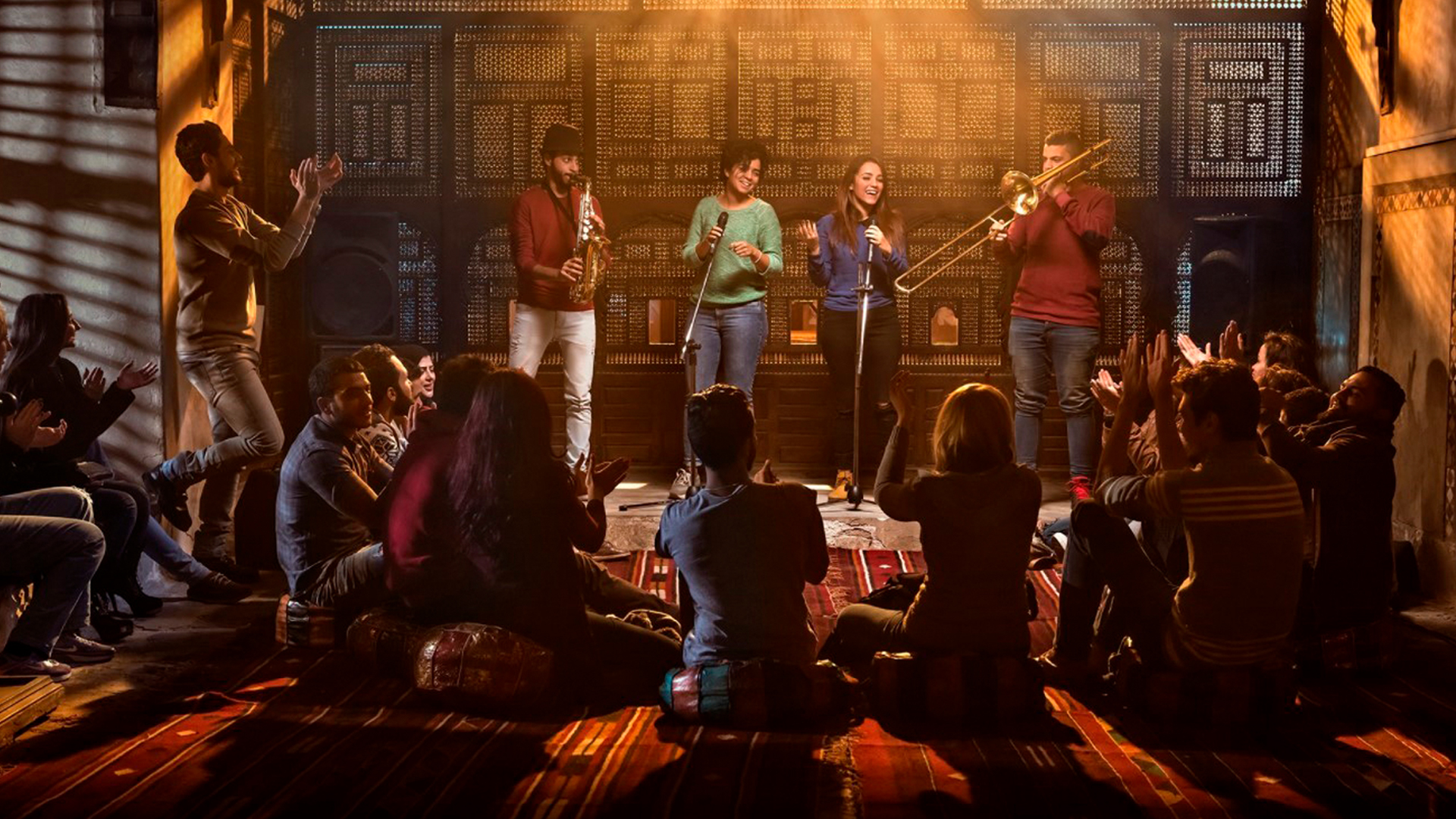
The “This is Egypt” tourism campaign, launched in October 2016 by the Egyptian Tourism Authority and JWT, won multiple MENA Effie Awards in 2018 for its positive impact on tourism.
It received Gold in the Travel category and Silver in the Renaissance category for its stunning depiction of Egyptian landmarks. Previously, the campaign's video won Best Promotional Video in the Middle East at the 2017 World Tourism Organization assembly in China.
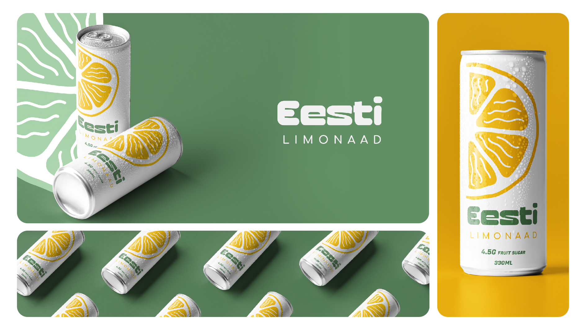
Eesti Limonaad LOGO, PACKAGING
DESCRIPTION
The logo and packaging design of Eesti Lemonaad capture the essence of Estonia's cherished lemonade tradition, appealing to modern consumers.
Sherif Makki 2024 LinkedIn